
‘It’s All Black And White‘ was the motto of a recent exhibition in London dedicated to Franco Grignani. However, not all of his artistic production was monochromatic, despite his colour blindness!
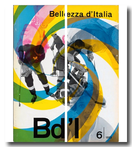
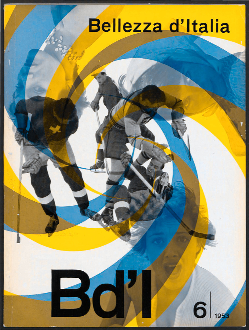
In fact, Grignani created hundreds of colourful ads and covers during the 1950s and 1960s, right up to his latest works in the late 1980s. During this time, Franco evolved his personal research by developing a series of paintings based on a zigzag pattern matrix with a remarkable chromatic effect (‘symbiotic structures’). But his challenges were not limited to colours; they also involved shades of grey.
Grignani discovered his colour blindness when he obtained his driver’s license in 1951.
So, how did he anticipate the colour rendering of his works?
His solution was straightforward: he consulted with his family or the collaborators in his studio to confirm the colours he was using or to verify if a specific colour combination worked.
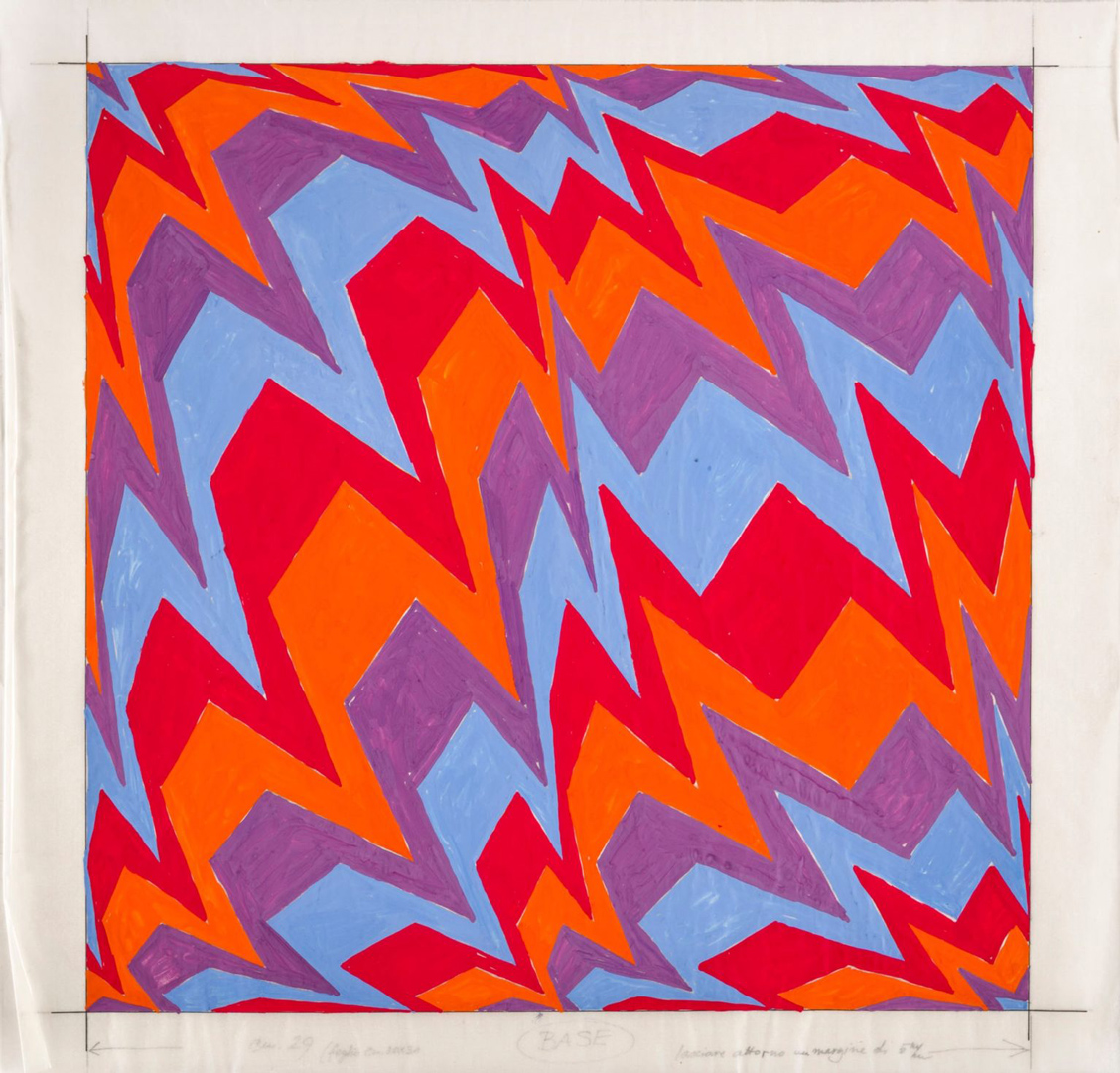
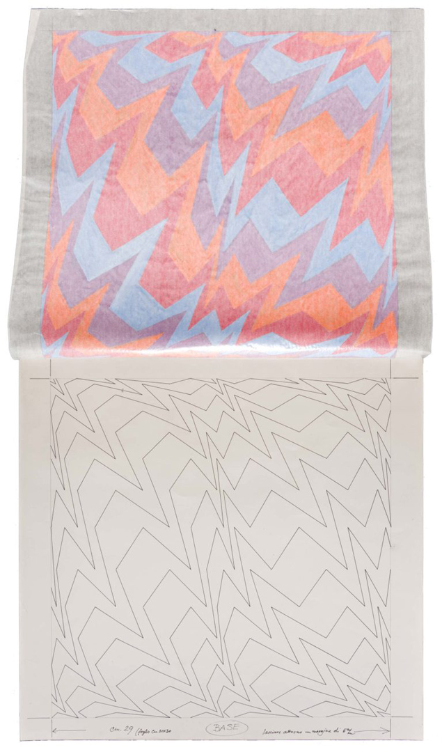
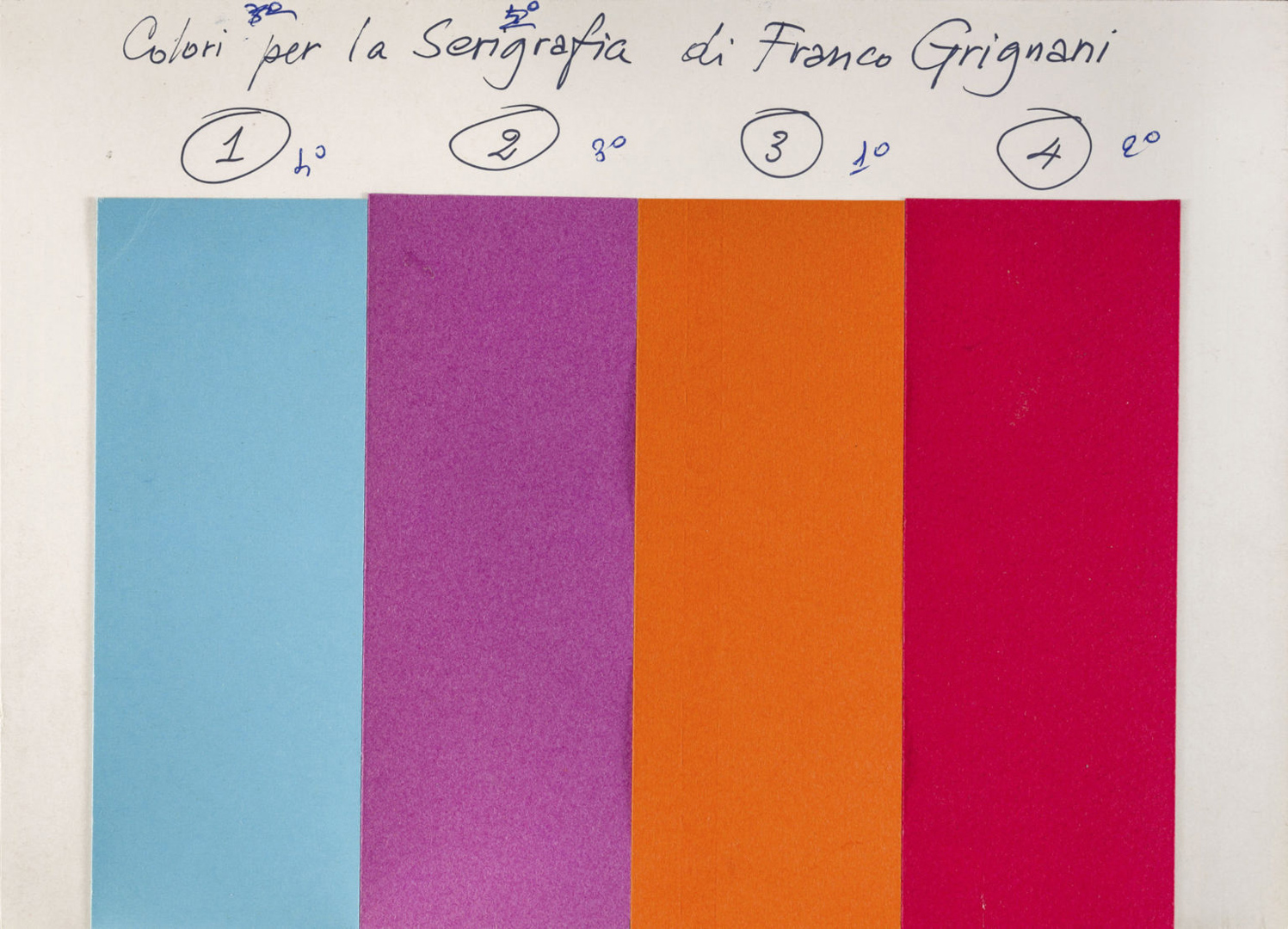
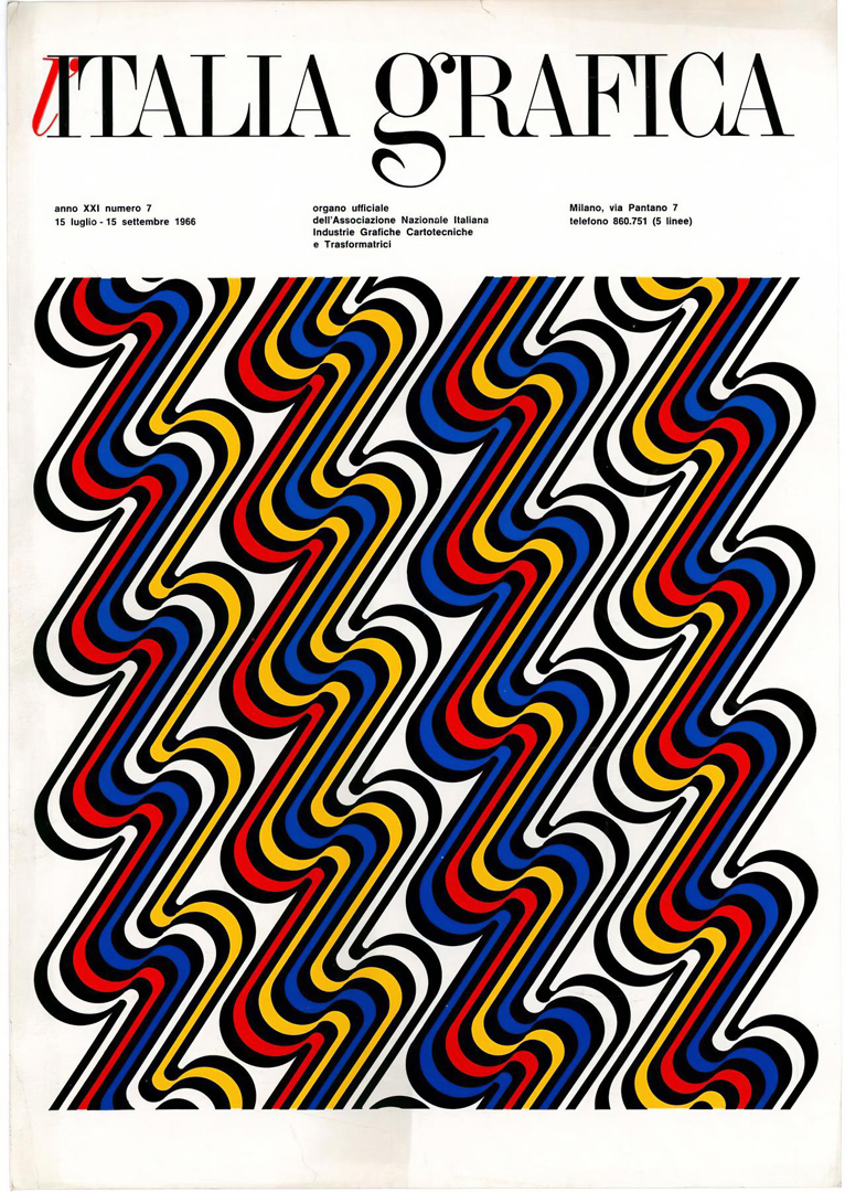
In this preparatory study for a silk-screen print, we can observe how he managed the choice of colour combinations without being forced to restart from the beginning with a new colour scheme. By using tempera on tracing paper, he was able to overlay different colour options on the underlying neutral texture drawn in black pen on cardboard:
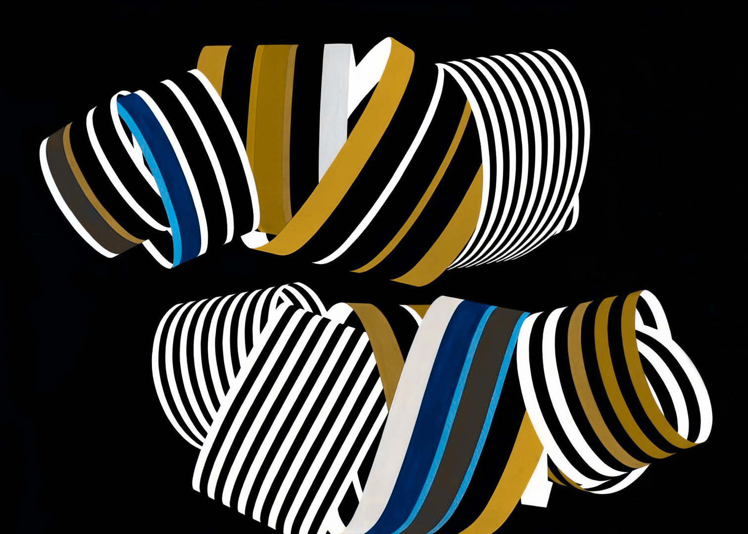
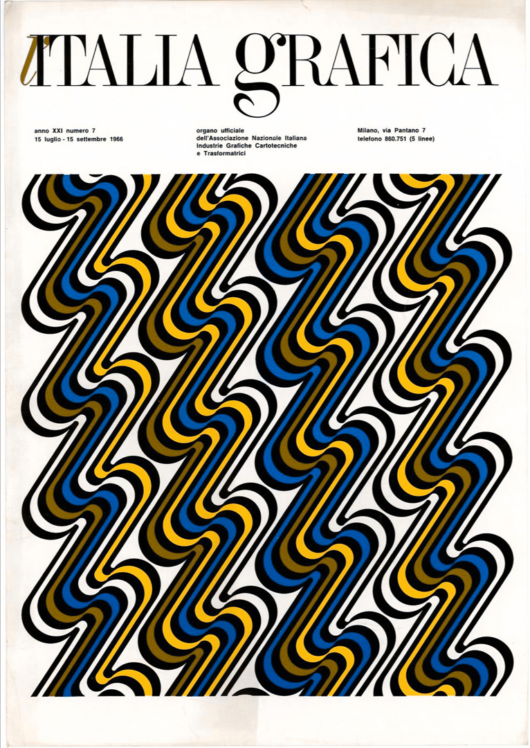
In 2019, Japanese scientist Kazunori Asada developed a simulator that enables us to experience colours precisely as individuals with various forms of colour blindness perceive them.
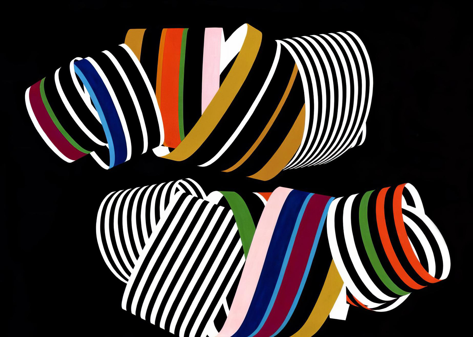
Considering Franco’s reported difficulty in distinguishing between red and orange colours, it is plausible that he had protanopia. Consequently, his artworks might have appeared like this to his eyes:
[6] GARADINERVI, courtesy of Robert Rebotti
[14] Artribune & Galleria Gruppo Credito Valtellinese
[31] la Repubblica & Galleria Gruppo Credito Valtellinese
[36] Art-Rite
Last Updated on 08/09/2024 by Emiliano