Covering the years 1963–1966, Typomundus 20 represented an international travelling exhibition of juried typographic design works that sought to represent a collected world of typography as art. With an initial call for entries in 1963, Typomundus received around 12,000 submissions from countries across the globe. The exhibition notice announced the show’s aim of being …
“the first worldwide exhibition of the most significant typography of the 20th century”
Typomundus was conceived under the auspices of the International Center for the Typographic Arts in New York. Founded in 1961, the original purposes of ICTA (which also sponsored the organization of Vision 65) were “to assemble, evaluate and document material in the field of visual and graphic communication that can be used for educational purposes, and to disseminate this material throughout the world to inspire, encourage and facilitate on an international basis the exchange of ideas, philosophies and material in matters dealing with every medium and process of the typographic arts” [a].
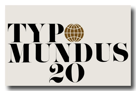
The nomenclature Typomundus ingeniously merges the Greek and Latin terms ‘typo’ and ‘mundus’, signifying ‘impression’ and ‘world’ respectively, underscoring the exhibition’s worldwide scope. This concept was visually conveyed on the cover of the exhibition catalogue, where the letter ‘O’ in ‘TYPO’ was replaced by a golden globe, symbolizing a world map.
As Cheryl Dipede has recently underlined, this travelling exhibition played a pivotal role in shaping a new narrative, fostering a sense of shared identity among typographers and communication designers by encouraging them to consider themselves as belonging to a unified, distinct community of ‘graphic designers’. It facilitated reflection on the status and role of graphic design in relation to high art, mass communication, and society at large. The exhibition advanced professional standards through expert judging and education, fostering an exchange of ideas among professionals and the international graphic design community. Not incidentally, the term ‘graphic designer‘ began to predominate more or less in the same period [a]: designers who had previously considered themselves as ‘typographic designers‘ eventually dropped the ‘typo‘. This shift reflected the expanded role of the professional designer in response to the ongoing media revolution in society.
During this period, Marshall McLuhan, a visionary philosopher, and media theorist, who was also a friend of Grignani, gained prominence for emphasizing the social role of typography in international communication and cooperation. His 1962 book, ‘The Gutenberg Galaxy‘, introduced three crucial concepts that resonated with the post-war design community. These ideas included the exploration of typography as a unifying cultural force, the recognition of print culture as a central organizer of social thought, and the prediction that individual societies would converge into a global village due to the influence of new electronic media.
Out of the 12,000 submissions received, only 612 entries were selected for the Typomundus 20 exhibition. Aaron Burns, the President and Director of ICTA, encouraged the twelve international jurors (none of them from Italy, as “Leo Lionni and Giovanni Pintori were unable to attend”, from Graphis issue n° 121, 1965) to assess the submissions according to aesthetic standards such as “form, beauty, appeal, and excellence of typographic artistry”. The jury set such high standards that Louis Dorfsman, a juror and design director of CBS [a], commented that …
“the standards of this show are so tough, I doubt whether Gutenberg’s Bible would make the show”
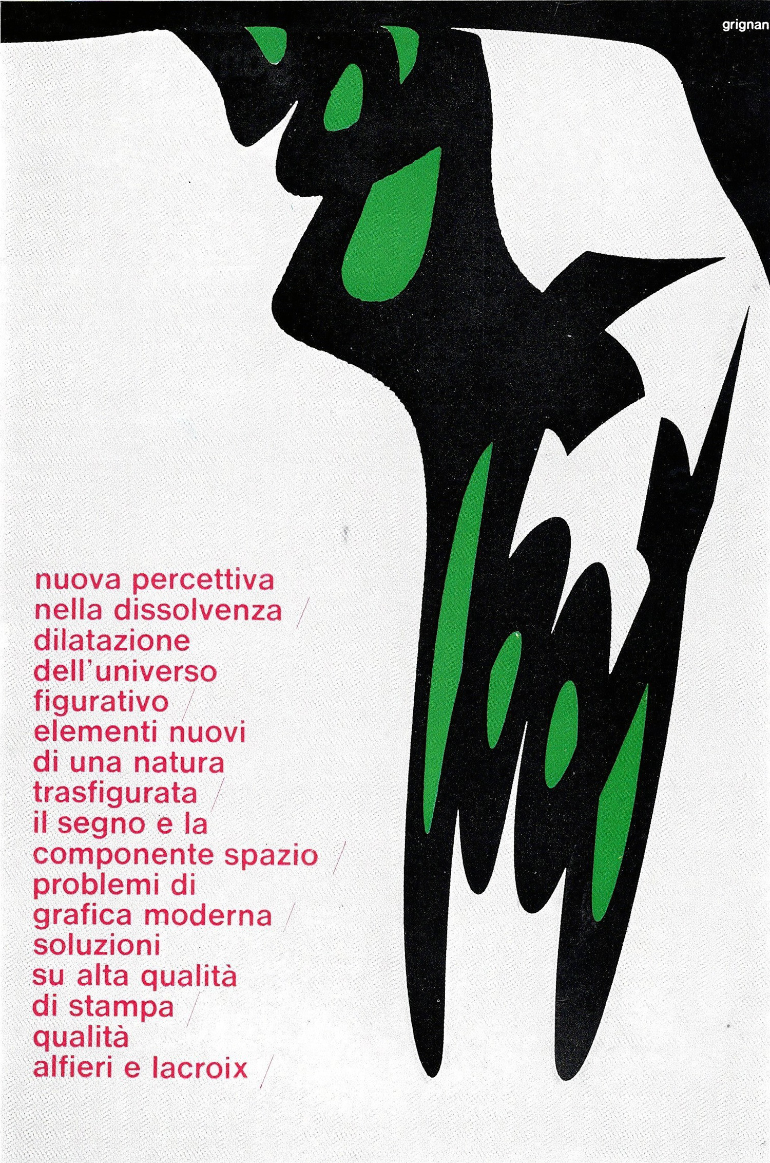
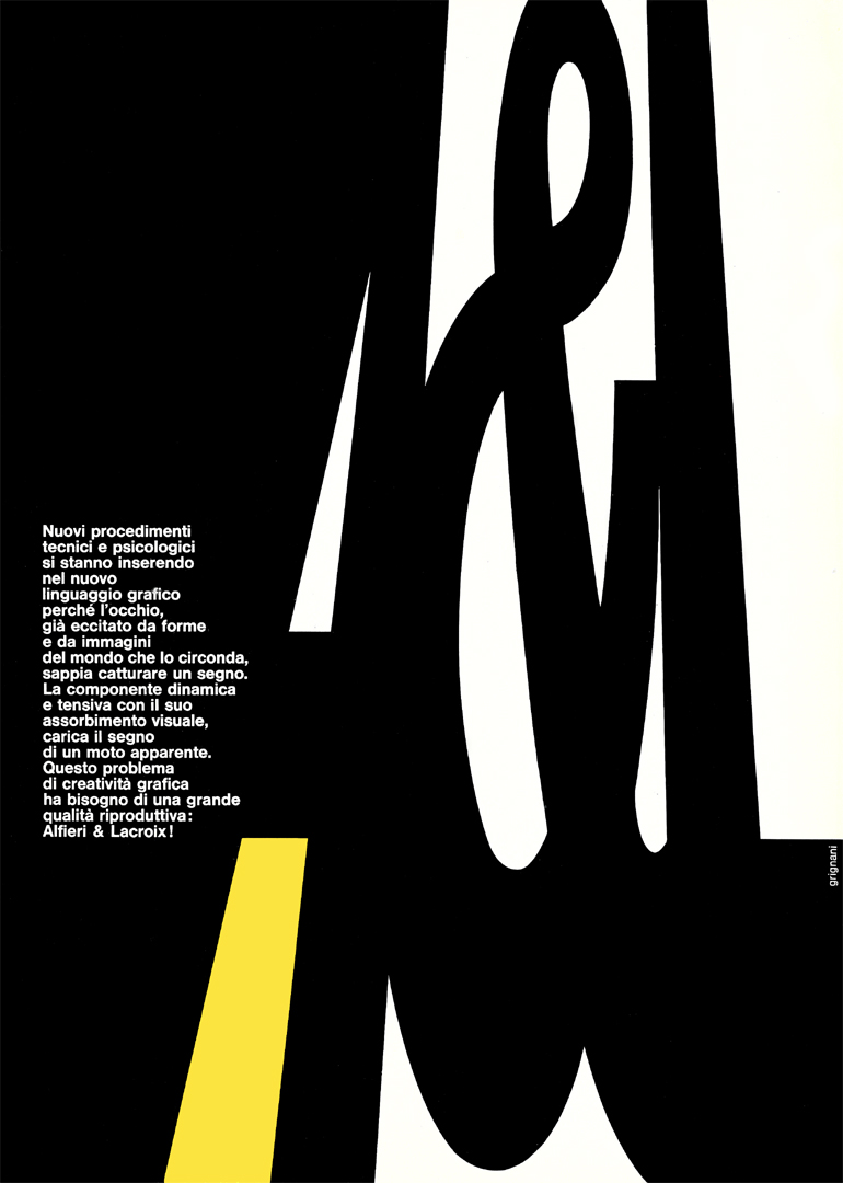
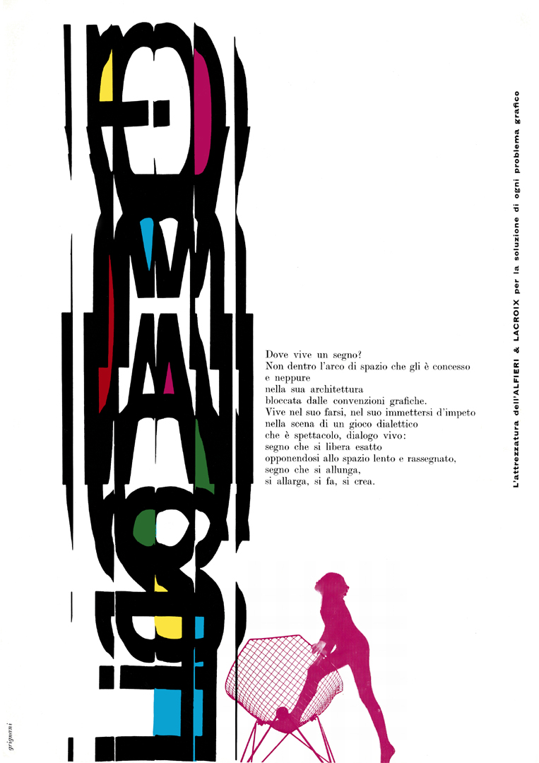
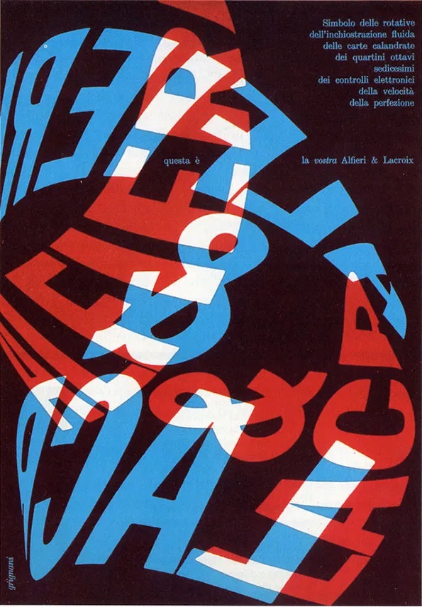
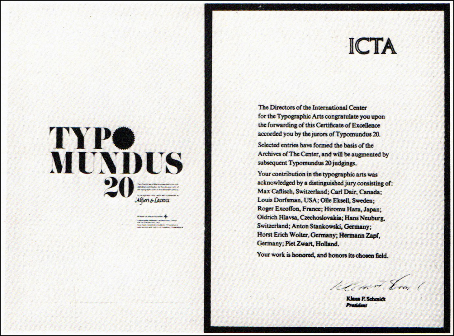
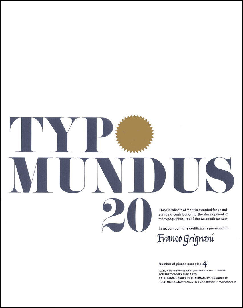
Franco Grignani contributed four ads for Alfieri & Lacroix, earning him the prestigious recognition of merit from ICTA for Typomundus 20:
Typomundus not only aimed to showcase selected entries but also had a broader mandate, which involved establishing a permanent archive at ICTA’s offices in New York. This archive was intended to serve as both a repository for the exhibited works and “a research centre for designers, educators, and students”. In essence, Typomundus embodied the aspirations of an international organization to not only exhibit but also to collect, preserve, and document a global history of typographic design spanning the first sixty years of the twentieth century.
Marilyn Hoffner, representing the ICTA’s Publicity Committee and serving as the sole observer admitted to the jury’s deliberations, expressed her hope that Typomundus 20 would contribute to establishing elevated international standards in typographic design with “a level of excellence for the whole world to emulate”.
Following the judging process in October 1964, the ICTA in New York and the Society of Typographic Designers of Canada, based in Toronto (the show was supposed to take place in New York but was moved to Toronto due to the height of the Cold War), intended to showcase the selected works in New York in April 1965. However, due to an inadvertent mishap, the entire collection ended up being mistakenly discarded in Toronto. Fortunately, a significant portion of the collection had been photographed beforehand in order to make it “available on 35 mm slides” [a]:
“The 10,000 pieces had been stored in a midtown rented room since last October. An unidentified landlord is said to have mistaken the collection for junk and sent it to the incinerator after someone neglected to pay him $55 monthly rent for the room. […] Aaron Burns, director of the Typographic Arts Centre in New York, described the loss as «beyond comprehension».”
[from The Gazette – Montréal, Jan 22, 1965]
The inadvertent disposal of the collection in Toronto led to a community effort, with local residents assisting in salvaging materials from the discarded items. Despite the setback, some participants were able to resubmit copies of their work for inclusion in the book (featured pic above). Published by Reinhold, New York, in 1966, the book featured a compilation of works, albeit minus 77 exhibits. Additionally, a travelling exhibition was organized and showcased in New York, “Stuttgart, Zurich, London, Paris, Prague, Leipzig, Tokyo, Toronto, and other major cities” [from Graphis issue n° 121, 1965], receiving widespread acclaim.
Future shows were originally intended to occur every three years following the initial exhibition, with one scheduled for 1967. However, these plans remained unannounced until May 1969, when ICTA issued a call for ‘Typomundus 20/2‘: “The International Center for the Typographic Arts has issued 200,000 calls for entries to typographers, designers, craftsmen, and art directors throughout the world for ‘Typomundus 20/2‘, the second world-wide exhibition documenting the most significant typographic designs of the 20th century. […] Judging will take place in September in Stuttgart, Germany by an international jury of ten renowned designers. Entries may include all forms of typographic design produced between 1900 and 1969: books, book jackets, catalogs, magazines and newspapers, printing for commerce and governments, posters, advertisements, packages, experimental design, trademarks, stamps. Photographs or slides may be submitted for typography in architecture, displays and exhibits, film titles and TV commercials.” [from The Publishers Weekly, Volume 195, May 5, 1969]
On this occasion, Franco Grignani, as the sole Italian representative, was honoured to participate in the jury.
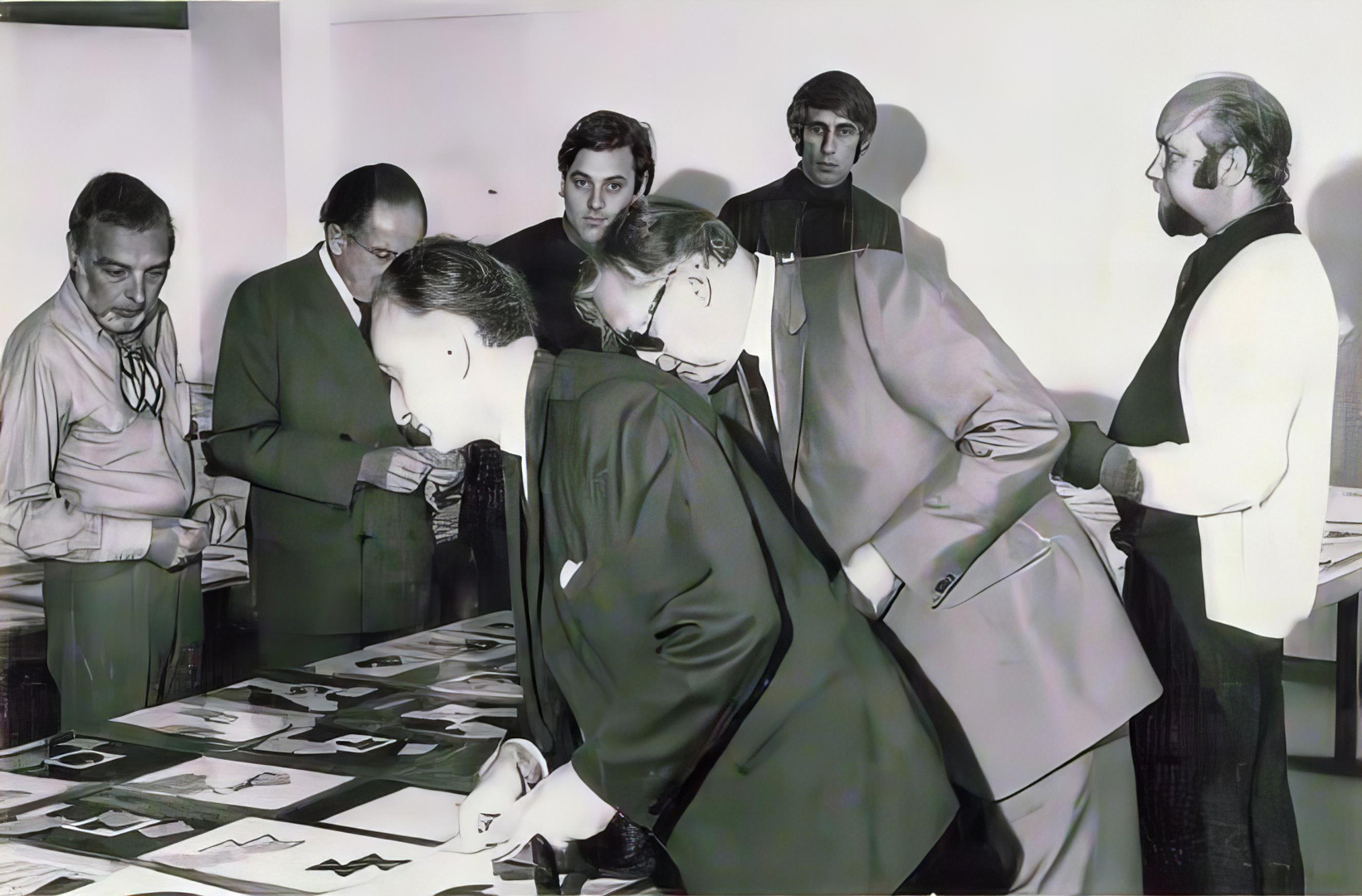
Eventually, 5700 entries from 31 countries were judged by seven jurors: (clockwise in the photo) Herb Lubalin (USA), Hans Schleger (Great Britain), Jean Widmer (France), Wim Crouwel (Netherlands), Tibor Szántó (Hungary), Franco Grignani (Italy), and Willy Fleckhaus (Federal Republic of Germany):
The awards were given to 570 works for “outstanding contributions to the development of the graphic arts in the 20th Century”. The first exhibition was held in Stuttgart, with further exhibits in major cities planned worldwide.
Regrettably, this turned out to be the last edition: due to the different typographical trends and differing viewpoints within the association, ICTA (founded in 1960) ceased its work in the early 1970s.
[*] courtesy of Daniela Grignani
[a] from ‘Modern Graphics’, 1969
[b] from “Dario Morani”, Pavia, 1982
[c] from Graphis issue n° 141, 1969
[1] graphéine
[this post is not CC BY-NC 4.0 due to some excerpts and adaptations from “Canadian Graphic Design in the 1950s and 1960s: The Shaping of a Profession” by Cheryl Dipede]
Last Updated on 25/07/2024 by Emiliano