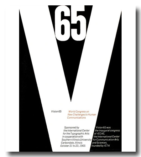

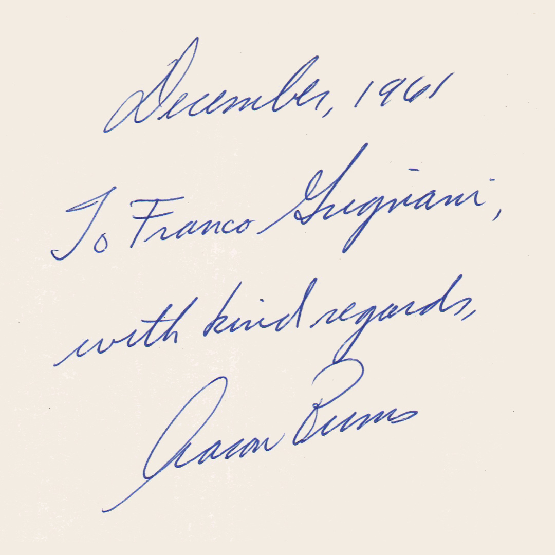
The ‘Vision 65’ conference, formally titled ”Vision 65: World Congress on New Challenges to Human Communication’, took place at the Southern Illinois University of Carbondale from October 21 to 23, 1965 (amid the early stages of student protests against the Vietnam War). It served as the inaugural congress of the International Center for the Communication Arts and Sciences (ICCAS), established by the International Center for the Typographic Arts (ICTA). Aaron Burns, a close friend of Grignani, served as the Director and also played a key role in organizing Typomundus 20.
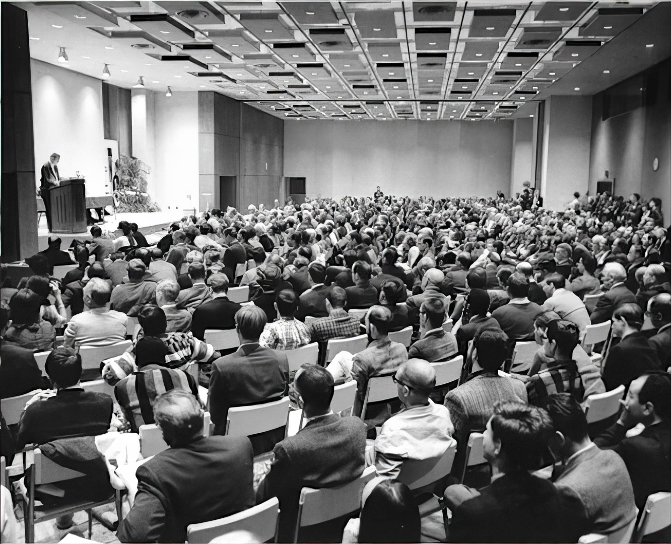
The conference aimed to tackle the formidable challenge of examining the impact of technological and social advancements on communication. Over 500 participants from various corners of the globe gathered for this ambitious undertaking.
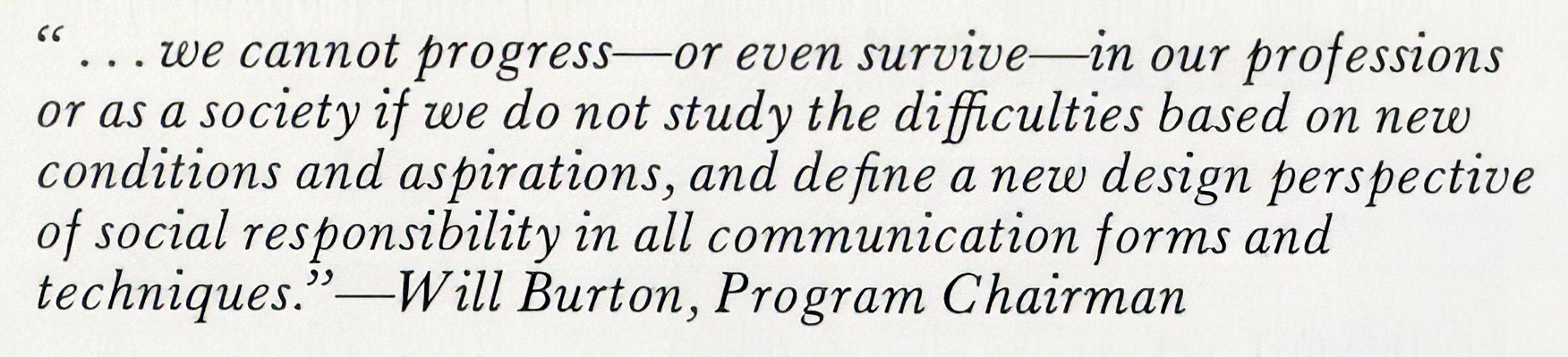
The Center’s President and Program Chairman, Will Burtin (who invited Grignani), declared during the opening ceremony: “This congress takes place at a time in history when fundamental social, intellectual and technological developments reshape the substance and meaning of reality. Every facet of our lives is affected and every value requestioned, as a steadily mounting pressure on the individual and on society is recognized. […] The time has come for the professional practitioner to review implications of his work as well as the standards and values on which it is based. […] Technology has made the world smaller and people interdependent. Conversely, the importance of communications has grown beyond any measure conceivable earlier. Their intellectual and esthetic improvement is now the major requirement for human survival and growth.”
Immediately after, the geodesic Architect R. Buckminster Fuller stated: “I know that the group who have come together here are unique. They are of the one-in-one-hundred-thousand type of thinker, who is realistically earnest in trying to find ways of making humanity successful. They have learned how to take the initiative. They don’t need or want to be told what to do.”
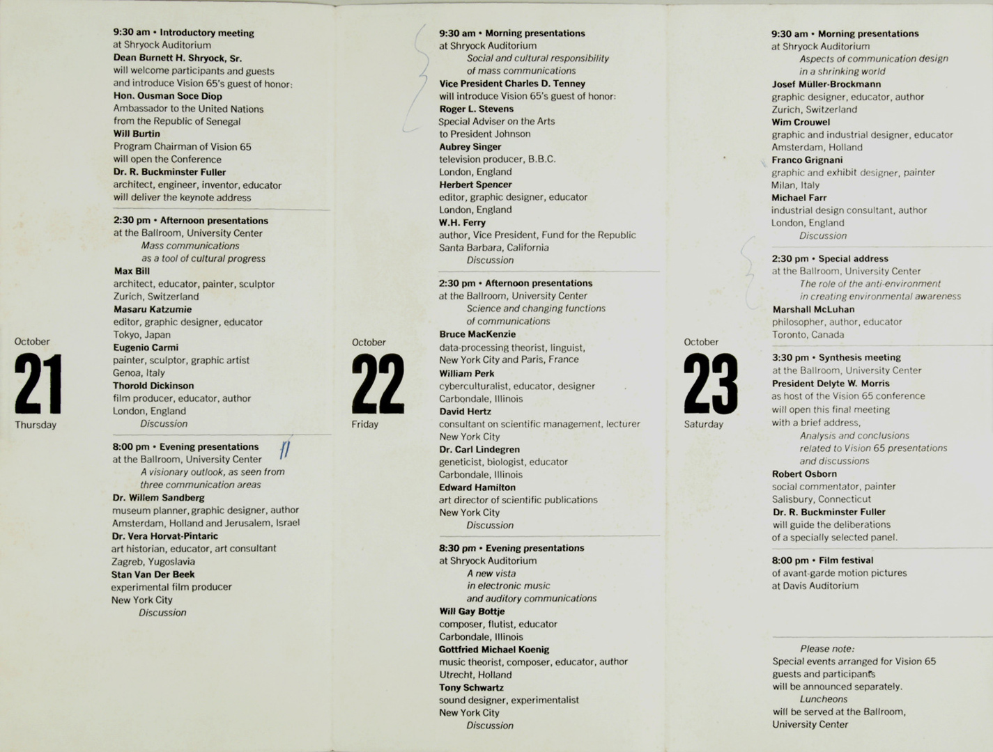

Franco Grignani’s lecture, titled ‘From Art to Science: Design in Transition’, was held on the morning of 23 October, as part of one of six transversal themes: ‘Aspects of communication design in a shrinking world’.
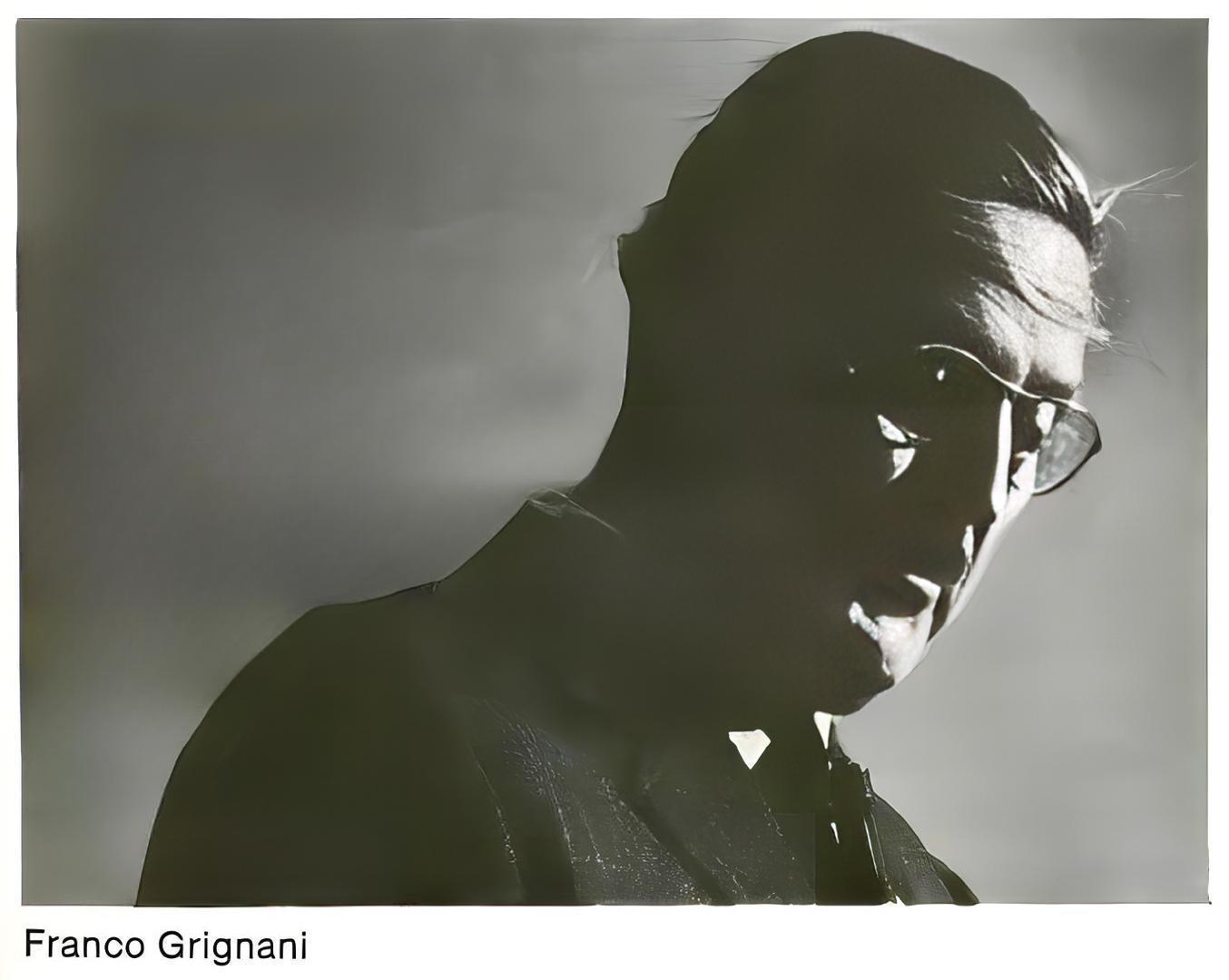
Since Franco did not speak English, he brought his daughter Daniela with him to the U.S. as his translator, and simultaneous translation was provided during his lecture.

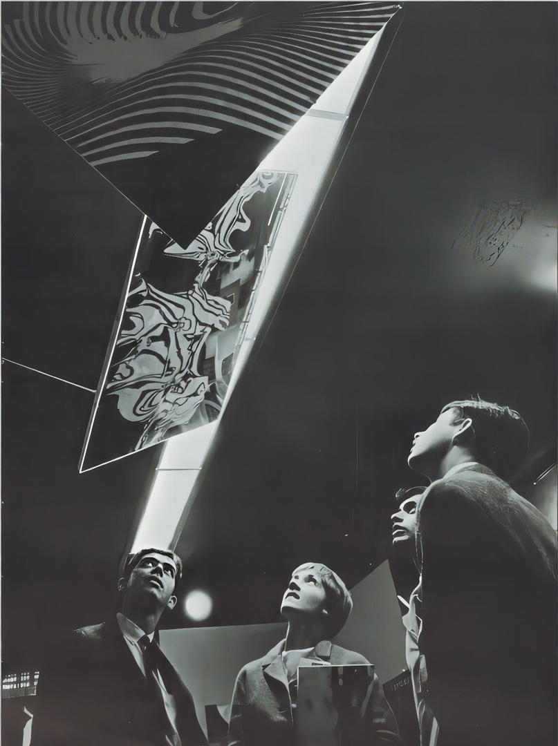
The journey was eventful; simultaneously, Franco Grignani was featured in the collective exhibition at the Mitchell Art Gallery in Carbondale. The exhibition showcased posters, graphics, and other objects designed by the conference speakers, including works from Typomundus 20.

Later, accompanied by his daughter Daniela, Franco Grignani spent three days in Chicago as guests of the Society of Typographic Arts (STA). During their visit, they explored the Institute of Design and the University’s Institute of Technology. Subsequently, Franco Grignani had the chance to exhibit some of his works at the ‘500d Gallery’ in April 1966. Additionally, a solo exhibition was planned for December 1965 at the Container Corporation of America Gallery. Following their time in Chicago, they travelled to New York, joined by Wim Crouwel.
This experience left indelible memories; upon his return to Italy in November 1965, Franco granted an interview to Fabio Mataloni: “The country is boundless, it never ceases to surprise the Europeans. I remember the four hours on the train from St. Louis to Carbondale […] In the Carbondale hotel, each room had a small machine that made the bed tremble with a 25-cent coin. A coin lullaby” [from ‘Linea Grafica’, n° 6, Nov. 1965]. In 2020, his daughter Daniela still remembers: “After a 14-hour flight with a stopover in Canada we arrived in Saint Louis, Missouri. At that point, my dad remembered that he had not communicated the time of his arrival at the airport to the University of Carbondale, so there was no one to pick us up. It was evening and we went to a small station where we could not find a train to take us to our destination. At that point, we had to find accommodation for the night. We had too much luggage with us, and then my dad decided to find a hotel and left me alone in the station. After a while, and I was already a bit desperate, without money, etc. he reappeared looking a little surprised and told me that first, he had found a hotel for women only. The next morning, we took a milk train that slowly crossed the countryside with cows and through the slums.”


The following are the original translations read at the Congress and the original Italian text taken from Franco Grignani – pitture, sperimentali, grafica – Ricerca come arte, exhibition catalogue, Rondòttanta Centro culturale, Sesto San Giovanni, 1979.
During the reading, 150 plates of Grignani’s painting, research, and design works were projected.
Within a foreseeable future we can assert with confidence that all mankind will be on an equal footing as to what is available to it; and to imagine what the future will be like means for me to help build it through determining its objectives and indicating methods for reaching them.
In dealing with vast eras of dramatic import, man has often found himself trapped by unforeseen events; and the laws of survival, more than theories and book learning, have taught him how to derive from these events experience and growth. And it is precisely in our own times that an unheralded phalanx of sensory messages–tactile, visual, auditory, (sounds, whether noisy or musical), and olfactive–is besieging us and depriving us of control over our own processes of growth, physically prejudicial even to our very way of life.
The very means of communication, with greatly inflated values, are re-creating new sensations impinging on the daily life of individuals. For example, the visual media, which with their increasing abundance and variety of images, ever-changing yet persisting, permanent yet constantly obsolescent, are steadily gaining ground over aural media, through the retina to the various brain centers and thence to the complex nerve-circuits, they are constantly fanning out and disseminating ever-new mental mechanisms which produce thoughts and mutations in the forms of life. Unfortunately, many of the disciplines that have grown up around these phenomena have given rise to organs and techniques tending to abuse these very means of persuasion. The moral order is a product of thousands of thousands of years, and its stability rests in its ability to withstand the tests of crises, revolts, schisms and doubts. Everyone has attempted to raise again a note of condemnation because behind the formulations of rational theories, justifiable only by study, are mixed personal interests and destructive thoughts.
The media of information and communication too are constantly mushrooming out and occupying more physical space. In all our cities, advertising and signs have grown to architectonic proportions. In our cities there has risen a city made of signs and advertising. Geographical distances we now measure in hours and minutes. Before our very eyes the figurative world itself has upset its load.
I belong to the graphics profession. Every day the blank whiteness of a sheet of paper awaits my invention of some design. At my back presses the weight of commercial necessities, to be countered by attempts to turn it aside in the artist’s desire for new means of expression. My duty, as for other design specialists, is to analyze and convey, through filters devised by our own intuition, all the new formations and to bring them into balance with continually evolving techniques.
The very first symbols used by commercial advertising were the crowing cock and the trumpet, which were in their abstract concept more sounds than visual images. The picture carried a message that was nothing more than visual fact. As fast as newspapers were read and thrown away, new words were written, words made descriptive and explosive with superlatives, and in the same way even today, alas, that the writing is done in the copy of some advertisers. But there does exist another style of utterance that calls for superior intelligence: it speaks with the accent of command and it makes use of coercion. We are not willing to judge a message’s efficacy in terms of what it will pull in commercially, so much as we would judge its value in the instilling of education, culture, and in the stimulating of the imagination.
Advertising is an enormous machine, thought out and built up so as to produce communications for the purposes of business interests. But if indeed this is its sole function, we must nevertheless draw up some day a list of its by-products in the form of vain flattery, erroneous assertions, and schemes promoted by an oligarchy of specialists. Rather, the repeated use of such systems in certain forms of advertising has aroused apprehensiveness and suspicion in many sensitive spirits. Even the art-work falls under this shadow, and the frantic searching for the superlative almost always ends in rhetoric and bad taste.
There is another kind of advertising, too: informative, precise, useful. It poses problems and solves them; it is an optimistic thing because it is wholesome and it lives in an honesty of communication; it is a rational type of advertising relying on intellectual appeal. The consumer is therefore no mere automaton, but can keep and defend his own personality and is aware of his power. At the same time, whereas these characteristics indicated provide us with the frameworks of the procedures which will characterize a good, healthy state of affairs, it is true also that the enormous and constant consumption of our symbols and designs goads our activity onward toward great creative efforts, because the supporting bases of society have changed, the machine age has urged the masses on to achieve a higher standard of living. Needs and the demand for goods have increased; with this demand, productivity has become gigantic; and along with broad merchandising and marketing techniques, creativity is occupied in continual efforts of self-renewal.
One may even say that the cultural level of the whole earth has risen in step with the development of the technological world: working hours have decreased and the time thus freed, instead of being devoted to idle play, has taken on considerable importance for cultural improvement and improvement in one’s line of specialization.
No more nowadays does man sweat, no more are his hands calloused from having his fingers all the time on levers and controls. What the machine he operates today produces is labor, understood as means of synthesis. Man is not a machine, but is learning the language of the machine, the methodical qualities and orderliness of machines. With this attitude he can see that there is intelligence value in machines, he is coming to esteem them, even to humanize them; their sounds are becoming part of modern forms of music. The speed of labor is translated into appreciation of tempo, and still other machines are turning out infinitesimally fine-screened picture work, for recapturing an illusory reality. Millions of advertising messages cover the walls, the streets, tables, hands, eyes….
All this requires perfect order, and experts of good order, who are–designers. Almost invariably design-work lags behind the pictures called up by technical advances. Just to take a frivolous instance, shortly after astronaut flights, fashion makes lipsticks smile beneath space-helmets, and our silks and cotton prints forsake flower designs for street signs. But the designer may also get his new-idea takeoffs from comparing and checking, from new processes, or even from essays in a cultural contest.
Although sometimes the advent of thinking machines has given us the feeling that the end of human agency in the world’s activity is in sight, yet man’s intuitive capacity and the claims of free imagination have him still anchored firmly in his pre-eminent position. Though some trends in the world of design, in the teaching that is done in the schools, are for stressing the need for balance among similar spaces, to produce a feeling of contemplative motionlessness, all the rules of strict form and all balanced structurings yield silence. Furthermore, it would be desirable that students in graphics classes be taught not only “to do” but more particularly to “see.” To see means to create a receptive, open mind, richer in vibrant sensitivity, because in our profession the developing of the powers of invention, perception, and insight precedes and greatly surpasses in value any dexterity in the technical skills, however sophisticated these may be.
Already the experiments being done in one kind of graphic art in page layout relationships and the observation of shapes and signs in space are indicative of structural tensions designed to produce reactions in the form of psychological predispositions in the beholder.
So there does exist a psychology of form, a study directed toward seeking relationships and reactions through formulation of new symbols.
If, following the lead of our objectives and systems of thought, our hypotheses and controls, communications graphics has found it possible to work out new techniques, the same cannot be said for the theater, the movies, nor for television, whose transmission values depend, for the present at least, on what the insight and intelligence of the idea men can come up with.
One factor is going to be the designing of sets and staging. Another and a different factor is that of visual and communicative value.
This latter point is being studied in depth as to the bridging of the gap between image and spectator, and as to the relations among sounds, words and picture, in an interdependence of time and tempo.
One must give consideration in part to the exceptional contribution of Saul Bass. The example of his portentous introductions to films has not been completely accepted by other producers so that even today they use hackneyed themes in television transmission… libraries, motion pictures, record collections.
In television programs it is not enough that the viewer be able to read, as it were, the pictures as they are, but in the small television screen it will be the foreground, the movement, the meeting of gaze–right in the eyes–the sense of nearness and touchableness, the feeling of being right there, the voice lowered to a whisper–it is all that, that must fill the physical void that is there facing the frozen, sedentary immobility of the TV consumer. “To see” is merely passive; “to observe” gives a possibility of taking advantage of the presence of the image, with all its communicative force.
When we increase our sensory activity, our reactivities are sharpened at the same time. The outstanding men in creative communications research have practically all come from the ranks of the arts. We must admit, however, that the art-and-man exclusive dual concept of the past is now entering upon its decline. Gone are the ambiguous professionals with their musketeer beards. Gone are the disorder of inspiration and fanaticism in ideas, the absolute, the sublime. The designer today, like the scientist, performs experiments; lucid in the use of signs, able to make syntheses, dealing in essences, he makes use of the processes and products of technology, his themes, charts, materials, space relations, symbols and special languages. The designer pours his art into the forms of objects, into the utility of objects.
In photography, films and slides, we have a complete documentation of the universe; we are familiar with almost everything through a scale of relationships different from the natural one. Life itself is becoming a document, a library, a cinematheque, a discotheque.
Science, with all of its amazing truth, its means and its spread, has led to the transformations and alterations of design. At one time the “design” was almost a byproduct of the official picture today: schools, programs, currents. Design reflects the scientific atmosphere, accepts abstract photography yielded from the diagrams of the chemists, itself designs an astronomical world, laying itself out in mathematical formula as in an explosive title page. The designer in his daily search prefers memory to fantasy and so his documents show sympathy for the forms of many and prepare them for measure. The design and the picture as real documents of life have now been rejected. Science has taught us to see things in their more physical aspect and not conditioned by intervening subjectivity. To tell the truth, it takes a timid soul who can mix a cinematographic mind with form layouts. More than the solution to a problem, the picture is a fragment of time that possesses us unnoticed, perhaps with some regret, but the feelings and the material means of the representation causes us to run aground. But the latitude where the picture and art in general work is too large to be able to synthesize its infinite aspects.
The press is tending toward a machine technology with a high degree of automation. There exists already such a thing as magnetic ink for the processing of data, and the type faces resulting from it have made the calligraphic values of traditional typefaces a thing of the past. There are also high-speed methods of type-setting, and “photo-composition” with computers and perforating devices.
It is now time to think of electronic writing and a way of reading it. We need pay no attention to the dusted-off “revivals” that we meet with every so often, especially in the graphic arts, with their “assemblings” of greatly diverse type faces and their “liberty” flourishes; such signs of weariness and sophistry can only serve as receptacles for their tipsiness.
The future is in us because our design is in the future (II futuro sta in noi perché il nostro disegno sta nel futuro).
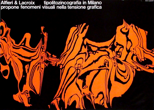
In 1952 I was asked by a large Italian printing establishment, Alfieri and Lacroix, to devise a program of advertising. This firm, after it came through the war, had been built up again and had doctored its war wounds. It was established in 1890 and had always been considered a pioneer in the printing field for having been the first to introduce certain technical procedures up to that time unknown in Italy. When it was made over new it needed to get back to its position of leadership.
A commercial publicity house would have had few developmental connections and this would have been reflected under the heads of quality of work, service and drawing power, and the competition could have talked along just the same lines.
Needing to find my directions in the advertising world and among technicians and graphists, that is, in a category of people with specialized training, I suggested that I be allowed a certain latitude in which to manipulate a bit, so as to dig into the typographic business and prepare an entirely new language based on experimental graphics.
Here was the problem: What was this new typography to be? How could I visualize the new scripts as regards speed and reading time? What should be the form and design of the letters? What should be this new symbolic language? Alteration of vision as seeking and as expressive comment? How to define the boundaries between signs and space? How to create and then refer to my symbols? How to conduct studies on tensions and on graphic induction?
This kind of graphics taught me freedom and courage; it also aided the experimentation of other graphists. I obtained the “Golden Palms” for the quality and originality of my work and it brought Alfieri and Lacroix very great prestige.
Cooperating toward the construction of an idea, one isn’t afraid of fatigue. My own contribution has been to emphasize the need for freedom, to which every designer has the right, because the ideas of the creative world are made of enthusiasm…the sky.
Nei limiti della nostra preveggenza nel futuro noi possiamo affermare che tutta l’umanità sarà posta sullo stesso piano di ricezione e, immaginare il futuro, per noi, vuol dire aiutare la sua costruzione attraverso la determinazione degli obiettivi e l’indicazione dei metodi per raggiungerli.
Negli spazi storici di alte caratteristiche sovente l’uomo si è intrappolato in avvenimenti non previsti e la legge della sopravvivenza, più che le cognizioni, gli hanno insegnato a trarne esperienze e sviluppi. Ed è proprio in questa nostra età che una improvvisa valanga di comunicazioni tattili, visive, auditive, sonore, olfattive, ci investe e ci toglie l’esercizio del controllo sui processi di evoluzione con pregiudizio fisico anche nell’ordine vitale nostro.
I mezzi della comunicazione, giunti ai loro valori ipertrofici, rimodellano nuovi impulsi nella vita quotidiana degli individui. Ad esempio i mezzi visivi che acquistano sempre più peso di quelli auditivi con la loro eterogeneità di immagini mobili e diacroniche, fisse ed obsolescenti, irradiano, attraverso la visione retinica ai centri celebrali collegati poi a circuiti nervosi complessi, nuove meccaniche mentali produttrici di pensieri e di mutamenti di forme di vita. Molte discipline sorte nell’area di questi fenomeni, purtroppo, hanno dato vita ad organismi e tecniche per il maggior sfruttamento di questi mezzi di coercizione.
L’ordine morale è un prodotto di millenni e la sua solidità sta nel suo decantamento delle prove di crisi, rivolgimenti, scismi e dubbi. Tutti i tentativi di creare nuovi sentimenti sono da condannare perché dietro le formulazioni teoriche razionali, giustificabili solo come studi, si mascherano interessi e volontà distruttrici.
I mezzi di informazione e di comunicazione sempre più si vanno configurando in termini fisici: nelle nostre città la pubblicità e le segnaletiche hanno acquistato una dimensione architettonica: due città si addossano; le distanze geografiche si misurano ad ore e minuti; il mondo figurale ha rovesciato tutto il suo carico davanti ai nostri occhi.
Io appartengo al professionismo grafico. Ogni giorno lo spazio bianco di un foglio aspetta l’invenzione del segno. Dietro di me il peso di una imposizione commerciale preme contro i tentativi di deviazione per la ricerca di nuovi linguaggi. Il mio compito, come quello di altri grafici, è quello di analizzare e convogliare, attraverso filtri intuitivi, le nuove figurazioni per adeguarle alle tecniche in continua evoluzione.
I primi simboli della pubblicità commerciale sono stati il “gallo” e la “tromba”; nel loro concetto astratto più che visioni erano suoni. L’annunciazione nella pittura era pure un fatto verbale. Le parole si scrissero quando si usarono i giornali: parole aggettivate ed esplosive di superlativi, e così, purtroppo, si scrive ancora oggi nei testi di una certa pubblicità. Ma esiste anche un linguaggio che si arroga un’intelligenza superiore: ha il grido di un comando e si avvale della coercizione. Non vogliamo giudicare l’efficacia del messaggio nella sua resa commerciale quanto il suo valore nell’inserimento dell’educazione, evocazione e cultura.
La pubblicità è una macchina enorme, pensata e costruita per produrre comunicazioni ai fini di interessi. Ma, se tale è la sola sua funzione, noi dovremo un giorno elencare i suoi sottoprodotti in lusinghe, affermazioni errate, tranelli promossi da una oligarchia di specialisti. Anzi, il ripetuto uso di tali sistemi in certe forme pubblicitarie, ha fatto nascere nei più sensibili la diffidenza ed il sospetto. Anche le figurazioni cadono sotto questo aspetto e l’affannosa ricerca del superlativo collima quasi sempre con il retorico ed il cattivo gusto.
Esiste anche un’altra pubblicità commerciale: informativa, precisa, utile, che pone problemi e risolve dubbi, ottimista perché sana e vive nel programma della fiducia: una pubblicità razionale che si appoggia alla sfera mentale; il fruitore non è dunque un automa ma ha e difende la sua personalità e conosce le sue azioni. Però, se queste indicazioni ci danno l’inquadramento dei metodi che stanno all’ordine della buona normalità, l’enorme e persistente consumo dei simboli e delle figurazioni pungolano la nostra attività verso il più grande sforzo creativo perché i supporti della società si sono alterati, la macchina ha spinto le masse verso un più alto tenore di vita, sono aumentati i bisogni ed i consumi, e con i consumi la produttività si è ingigantita, e, con le organizzazioni e le tecniche di vendita, la creatività è impegnata su continui processi di rinnovamento. Anche il livello culturale di tutta l’umanità è salito con l’evoluzione del mondo tecnologico: i tempi di lavoro sono diminuiti, il tempo libero, non inteso come svago, ha acquistato una grande importanza per la preparazione culturale e specialistica. L’uomo non suda più, le mani non più callose, le dita sui pulsanti e sui segnali. La macchina che egli manovra produce un lavoro che è capito come sintesi. L’uomo non è una macchina ma ne impara il linguaggio, le metodologie e l’ordine. Si può apprezzare l’intelligenza della macchina, la si stima, la si umanizza, i suoi rumori entrano nelle formulazioni delle nuove musiche. La velocità del lavoro è tradotta nell’apprezzamento del tempo e altre macchine ancora fabbricano immagini con retini infinitamente piccoli per il riscatto di una realtà illusoria. Milioni di messaggi coprono i muri, le strade, i tavoli, le mani, gli occhi …
Necessita l’ordine, necessitano gli specialisti dell’ordine: sono gli uomini del disegno. Quasi sempre il disegno è in ritardo rispetto alle figurazioni proposte dalla tecnologia. Dopo i voli astronautici, la moda, pur nel suo modesto ruolo, fa sorridere i rossetti sotto i caschi spaziali e le sete ed i cotoni abbandonano i fiori per i disegni della segnaletica. Ma le verifiche, i confronti, i metodi e le indagini in un contesto culturale offrono il riscatto al disegno.
Anche se talvolta le macchine pesanti hanno fatto sospettare la fine dell’intervento umano, le capacità intuitive dell’uomo e i diritti della libertà fantastica lo hanno riancorato alla sua preminente posizione. Certe correnti del mondo del disegno espletando i propri insegnamenti nelle scuole inculcano il bisogno di equilibrio entro spazi omogenei per ricavarne una immobilità contemplativa. Tutte le regole del modulo e le strutturazioni bilanciate ci offrono invece il silenzio. Sarebbe inoltre augurabile che nelle scuole grafiche non si insegnasse soltanto a fare ma, e soprattutto, a vedere. Vedere vuol dire un’apertura mentale più ricca di sensibilità vibratile, perché in questa professione lo sviluppo dei poteri di invenzione, di percezione e di intuizione, precede e supera di molto, in valore, l’addestramento nelle abilità tecniche, per quanto sofisticate esse siano. Già i tentativi di una certa grafica attraverso rapporti impaginativi e l’osservazione di segni nello spazio denunciano tensioni strutturali atte a sollecitare condizioni di stato d’animo nell’osservatore. Esiste dunque la psicologia della forma, uno studio inteso a cercare rapporti e reazioni per la formulazione di nuovi simboli.
Se seguendo obiettivi e sistemi, ipotesi e controlli, la grafica nelle comunicazioni ha potuto formulare nuove tecniche, non possiamo dire lo stesso per il teatro, il cinema, la televisione, i cui valori di trasmissione dipendono, per ora dalla carica intuitiva e dall’intelligenza dei proponenti.
Un conto è la regia scenica, un conto è quella visiva e comunicativa. Quest’ultima va studiata profondamente nello spazio tra la visione e lo spettatore nei rapporti di suono, parole ed immagini, in una interdipendenza di tempo.
È da considerarsi a parte, l’eccezionale apporto di Saul Bass. L’esempio delle sue portentose introduzioni ai films non sono state totalmente accolte da altri produttori che, ancora oggi, usano schemi ormai tramontati.
Nelle trasmissioni televisive non basta decifrare le immagini come tali ma, nel piccolo televisore, il primo piano, il movimento, l’incontro degli sguardi, il senso del vicino e del toccabile, il sentirsi presente, le voci basse del sussurro, devono colmare il vuoto fisico che sta davanti alla immobilità sedentaria del fruitore. “Vedere” è passivo, “osservare” è la possibilità di valorizzare la presenza dell’immagine nella sua forza comunicativa. Aumentando le nostre attività sensorie si affinano anche le nostre reattività.
Gli uomini preposti alle ricerche creative nelle comunicazioni vengono quasi tutti dal ceppo dell’arte. Bisogna convenire, però, che il binomio arte-uomo, nel senso del passato, è ormai tramontato. Sono finite le ambigue professioni con barbe alla moschettiera, è finito il disordine delle ispirazioni, il fanatismo delle idee, l’assoluto, il sublime. Oggi il designer, al pari dello scienziato, sperimenta; lucido nel segno, sintetico, essenziale, usa i mezzi ed i prodotti della tecnologia. I suoi temi sono gli schemi, le materie, i rapporti negli spazi, i simboli, i linguaggi. Il designer versa l’arte nelle forme delle cose, nell’utile delle cose.
La documentazione dell’universo sta nella fotografia, nei films, nel cliché; conosciamo quasi tutto attraverso una scala di rapporti diversi dal naturale. Tutta la vita diventa un documento, biblioteche, cineteche, discoteche.
La scienza, con tutte le sue magiche verità, i suoi mezzi e le sue aperture, ha influito alla trasformazione e alterazione del disegno. Una volta il disegno era quasi un sottoprodotto della pittura ufficiale, oggi esistono scuole, programmi, correnti: il disegno riflette le grafiche scientifiche, si accetta la fotografia astratta ricavata da elaborazioni chimiche, si disegna il mondo astronomico, si impagina una formula matematica come un titolo esplosivo. Il designer, nella quotidiana ricerca, preferisce la memoria alla fantasia, si documenta, ha simpatia per la forma dei numeri e gli apparecchi di misura.
Il disegno e la pittura come documento reale della vita sono stati ormai rifiutati. La scienza ci ha insegnato a vedere le cose nei loro aspetti più fisici e non attraverso condizionamenti di interposte soggettività. Al vero si è sostituita una timida figurativa che mescola sensibilità cinetiche, con tracce formali. Più che soluzioni di un problema la pittura è un frammento di quel tempo che ci sfugge, forse con un angoscioso rimpianto, ma che la crisi dei nostri sentimenti e i mezzi materiali della rappresentazione ci fa arenare la mano; ma le latitudini dove operano la pittura e l’arte in genere sono troppo immense per poter sintetizzare i loro infiniti aspetti. La stampa tende verso una tecnologia meccanica con un alto grado di automazione. Esistono già inchiostri magnetici per la elaborazione di dati e, i caratteri da stampa che ne derivano, hanno fatto dimenticare i valori calligrafici dei caratteri tradizionali; esistono, inoltre, tipografie ad alta velocità, foto composizioni, con calcolatori e tastiere perforatrici.
È ora di pensare ad una scrittura elettronica e alla sua lettura. Non diamo importanza agli spolverati revival che ogni tanto si incontrano, specialmente nella grafica con “assemblage” di diversi caratteri tipografici e con i ghirigori liberty; questi segni della stanchezza e del sofismo sono solo dei riempitivi di titubanze. Ai vertici della nostra civiltà industriale, il designer si carica di quel ruolo che naturalmente gli compete.
I suoi sforzi coordinati alla ricerca di metodi e di tecniche nelle comunicazioni, potranno offrire all’umanità il maggior beneficio nella guida verso il benessere e le libertà spirituali.
Il futuro sta in noi perché il nostro disegno sta nel futuro.
Nel 1952 fui chiamato da una grande tipografia italiana: Alfieri & Lacroix, per iniziare un piano di pubblicità. Questa tipografia, uscita dalla guerra, si era ricostruita medicando le ferite subite. Sorta nel 1890 è sempre stata considerata una pioniera nel campo della stampa per aver introdotto, per prima in Italia, procedimenti tecnici allora sconosciuti. Rifatta a nuovo doveva dunque riprendere il suo ruolo.
Una pubblicità commerciale avrebbe avuto poche articolazioni di sviluppo e si sarebbe riflettuta sull’elencazione di qualità di lavoro, di servizio e di attrezzatura e la concorrenza avrebbe potuto parlare allo stesso modo.
Dovendomi indirizzare al mondo della pubblicità, ai tecnici ed ai grafici, cioè verso una categoria di preparazione specialistica, suggerii di lasciarmi un certo spazio di manovra per entrare a fondo nei problemi della tipografia per preparare un nuovo dialogo fatto di grafica sperimentale.
Problemi: cos’era la nuova tipografia; le nuove visualizzazioni di scritte in rapporto alla velocità, al tempo di osservazione; la lettera tipografica come forma e disegno; nuovo linguaggio simbolico; le alterazioni visive come ricerca e commento espressivo; tentativi di definire momenti tra segni e spazio; creazione e allusione a simboli; studi sulla tensione, sull’induzione grafica.
Questa grafica insegnò la libertà, il coraggio, aiutò anche tutti i tentativi di altri grafici, si ebbe la “Palma d’Oro” per la sua qualità e la sua originalità e portò ad Alfieri & Lacroix un grande successo di prestigio.
Si può collaborare con ogni mezzo alla costruzione di una idea quando non si teme la fatica; io, nel mio apporto, ho voluto sottolineare il bisogno di libertà di cui ogni designer ha diritto, perché le idee del mondo creativo sono fatte di entusiasmi e di cielo.
Lavoro tuttora a questa forma di pubblicità ed è la prova più sicura della sua validità anche in campo economico.
Forse io sono il meno adatto a parlare del mio lavoro, però devo confessare che questa avventura grafica è servita anche alla mia esperienza per salire la scala del mio lavoro.
[this post has been edited thanks to the precious contribution of Aaron M. Lisec, Research Specialist at Morris Library – Southern Illinois University]
[*] courtesy of Daniela Grignani
[°] Design Reviewed, courtesy of Matt Lamont
[6] GARADINERVI, courtesy of Robert Rebotti
[7] AIAP / CDPG Centro di Documentazione sul Progetto Grafico, courtesy of Lorenzo Grazzani
Last Updated on 23/06/2024 by Emiliano