
This text by Franco Grignani was originally published in English as the introduction to the 1967 volume “3x trademarks“, published by the Total Design agency in Amsterdam, with Wim Crouwel among its founders.
A slightly modified Italian version was later published to coincide with the monographic exhibition on Franco Grignani (Progetti di grafica e comunicazione visiva. La riscoperta di un protagonista della grafica italiana), held at the Aiap Gallery in Milan in June 1995.
The design of a mark, for a designer, is one of the most autonomous and exciting tasks as he tries to pour into the design of a mark all his graphic sensibility: ability, knowledge, the synthesis of sign language.
To design a mark means to do it immediately, putting it before any other job and doing it with an urgency that flows from an accumulation of energy.
To work on a mark means to design a hundred, five hundred, maybe even a thousand in order to find a solution. But the right mark may well be the one designed tomorrow!
It’s at this point that the designer realises that his symbol is the same as the symbols of all other designers, as the extreme simplification, the schematization leads ineluctably to a unification, therefore to similarity.
The creative problem of designing a mark must be faced with expressive energy possibly together with an emblematic form. More than sign it should be the symbol of a significant, physical and substantial world.
To create a mark one must consider its lasting value disregarding fashion, its legibility, its mnemonic power, its constructive uniqueness, its facility of being reproduced on different materials. its attractiveness and evocation.
The mark is, under certain conditions, a compelling sign; often existing in asymmetrical space, other times imperatively symmetrical.
The mark is a physiognomical and emblematical expression emanating all its powers of suggestion. At times it is a symbol of honour, perfection, order, a sign without time, an accumulation of values, unchangeable in its permanence.
In order to achieve this lasting quality in the face of competitive symbols the designer must avoid the levelling of fashion or the generalization of symbols that invariably leads to transiency. The symbol is always an act of personification, but as it is usually the first act of a commercial enterprise, it might happen that inexperience brings with it all the dangers of temporariness and dilettantism. More than ever if it is born from urgency or expressed with niceties – a negative conditioning for its span of life.
At times the symbol is ‘built’ within the commercial enterprise by designers who have no graphic training; in this case we have the originality of incompetence.
Almost all of advertising creativity is transitory and ephemeral, but not the symbol which conquers time and use. In the future it alone remains after the decanting of current images. If we go through the books on symbols published in the last ten years we can realise how few are successful, the remainder are copies of copies.
To those intangible symbols, permanent and significant, correspond the names of those designers in whose works there is always a constant originality, freshness and perfection. This means then, that to design a symbol is not work for everyone, but it is a work for that élite that can infuse the smallest, simplest sign with a lasting purity, a pleasant expressivity, an optical visuality, a physical objectivation, a symbol that will hold out against the consumption rate of our civilisation, proof moreover of victory over time.
Disegnare un marchio è, per un disegnatore, l’incarico più autonomo e più eccitante perché dentro l’area di un segno-simbolo egli cerca di rovesciare tutta la sua sensibilità grafica: l’abilità, il sapere, la sintesi segnica.
Disegnare un marchio vuol dire farlo subito, anteponendolo ad ogni impegno di lavoro, con quella urgenza che sgorga da un accumulo estemporaneo di vitalità; progettare un marchio vuol dire disegnare cento, cinquecento, forse mille segni alla ricerca di un simbolo oggettivante, ma il segno felice sarà forse quello che disegnerà domani. È a questo punto che il grafico si accorge che il suo segno è uguale al segno di tutti gli altri grafici perché l’estrema semplificazione, la schematizzazione porta ineluttabilmente ad una unificazione, quindi ad una similarità.
Il problema creativo di un marchio va affrontato con una virulenza espressiva possibilmente legata alla forma emblematica; più che segno dovrà essere simbolo per un mondo significante, fisico e sostanziale con la sua carica visuale unica e con la sua simmetria speculare.
Nel creare un marchio bisogna approntare il valore della sua durabilità, scevra da mode, della sua leggibilità o della ricordabilità mnemonica, della sua unicità costruttiva, della sua facilità ripetitiva su supporti di materiali diversi, della sua simpatia, della sua evocazione.
Il marchio è sotto un certo aspetto un segno costrittivo, vive sovente in un rispetto spaziale, asimmetrico; altre volte imperativamente simmetrico: espressione fisionomica ed emblematica emanante tutto il suo potere di suggestione, altre volte ancora è simbolo di onore, perfezione, di ordine, segno senza tempo, accumulo di valori, immodificabile nella sua fissità. È questa durevolezza una delle fatiche che il grafico dovrà affrontare con la presa in esame di tutti i simboli concorrenziali, con l’assenza di quella moda pianificatrice o quella generalizzazione di segni che portano invariabilmente alla labilità.
Il marchio è sempre un atto di personificazione, ma essendo quasi sempre il primo atto di un’impresa commerciale, può accadere che l’inesperienza porti con sé tutti i pericoli di provvisorietà e di dilettantismo, tanto più se egli nasce pungolato da urgenza o espresso tra parametri di graziosità, rischi negativamente condizionanti in tutto l’arco della sua vita rappresentativa.
Talvolta viene ‘fabbricato’ all’interno stesso della ditta da disegnatori di nessuna specializzazione grafica; avremo allora l’originalità dell’incompetenza.
Quasi tutta la creatività pubblicitaria ha un aspetto transitorio ed effimero. Il marchio no, vince il tempo e l’usura, si proietta nel futuro come unico segno rimasto da un decantamento di immagini.
Se noi sfogliamo le raccolte di marchi uscite in pubblicazioni nel periodo di un decennio, possiamo constatare che i simboli riusciti sono pochi, gli altri sono le copie delle copie.
Ai simboli intangibili, permanenti e significanti corrispondono i nomi di quei grafici nella cui produzione creativa ricorre sempre una costante di originalità, freschezza e perfezione; vuoi dire allora che disegnare un marchio non è lavoro di tutti ma è il lavoro di quella élite che sa trarre dal più piccolo, semplice segno l’oggettivazione più carica, più fisica; la sua purezza più durevole, la sua espressività più simpatica, la sua visualità più ottica, segno che forse rimarrà dai filtri del consumo della nostra civiltà, segno e simbolo ancora della vittoria sul tempo.
original Italian text, written with his Olivetti Lexikon 80 typewriter:
On the theme of trademarks and logotypes, I’ve already published a post about a dozen of trademarks that appeared published and explained in a 1979 special issue of the Japanese magazine ‘Idea‘, another one on the story behind the Piaggio logo, one on the detailed story of Woolmark and how to recreate it using Abobe Illustrator®, and finally one on how to recreate the Peccolo Gallery logo as well. Some are also displayed in the Gallery.
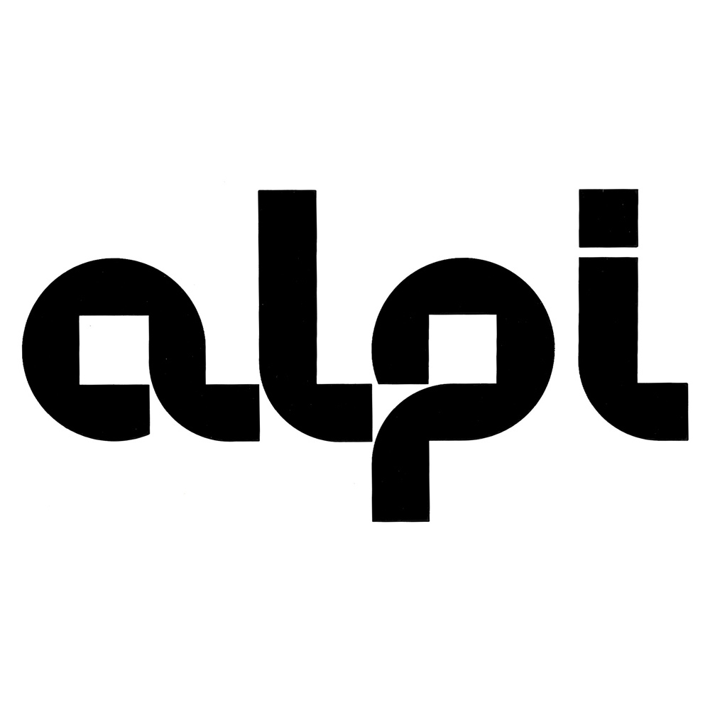
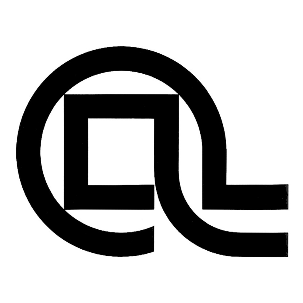
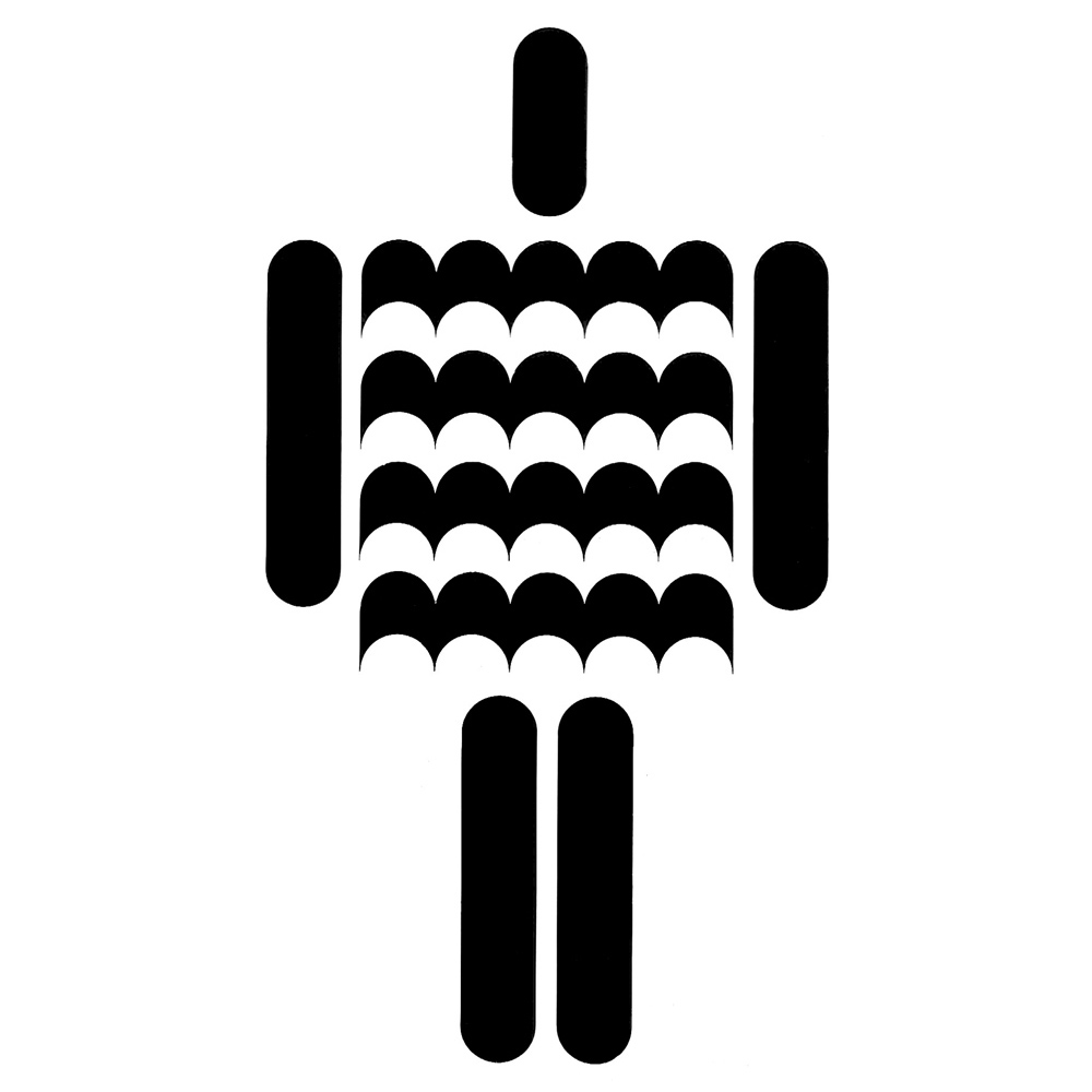
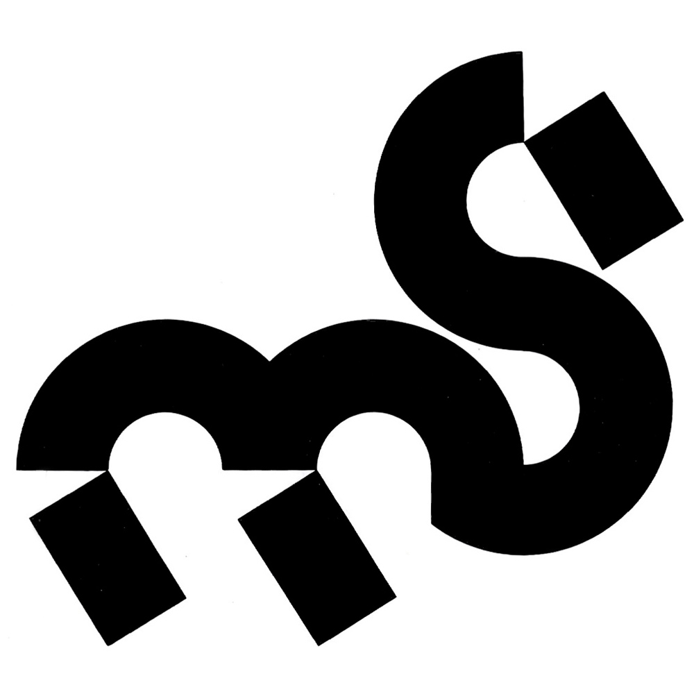
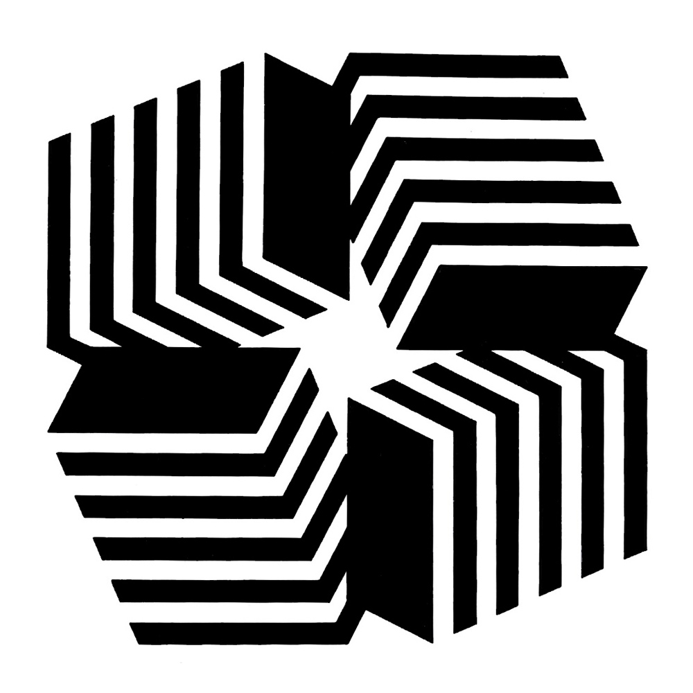
Below is a summary of all the trademarks I had the chance to find in the Grignani archive, categorized by client type:


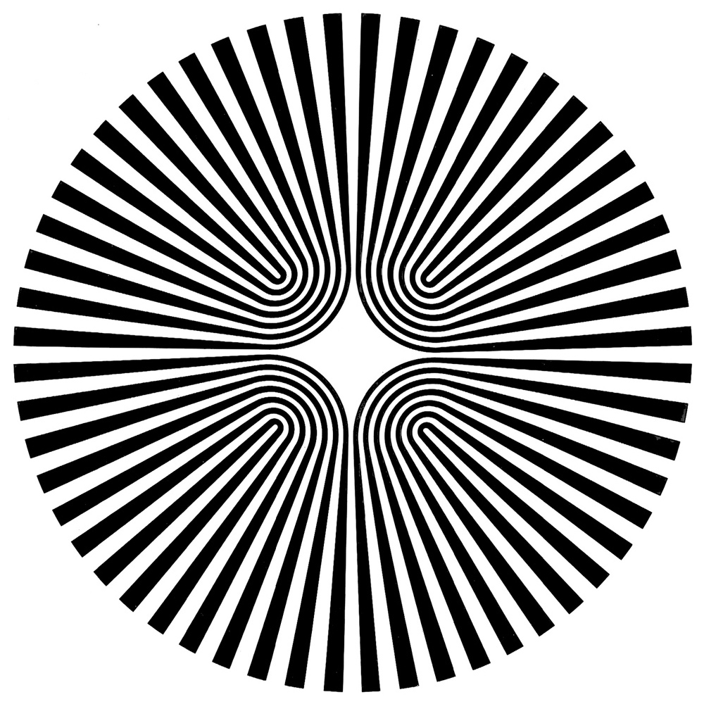
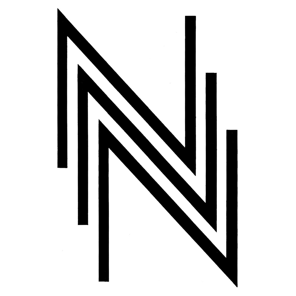

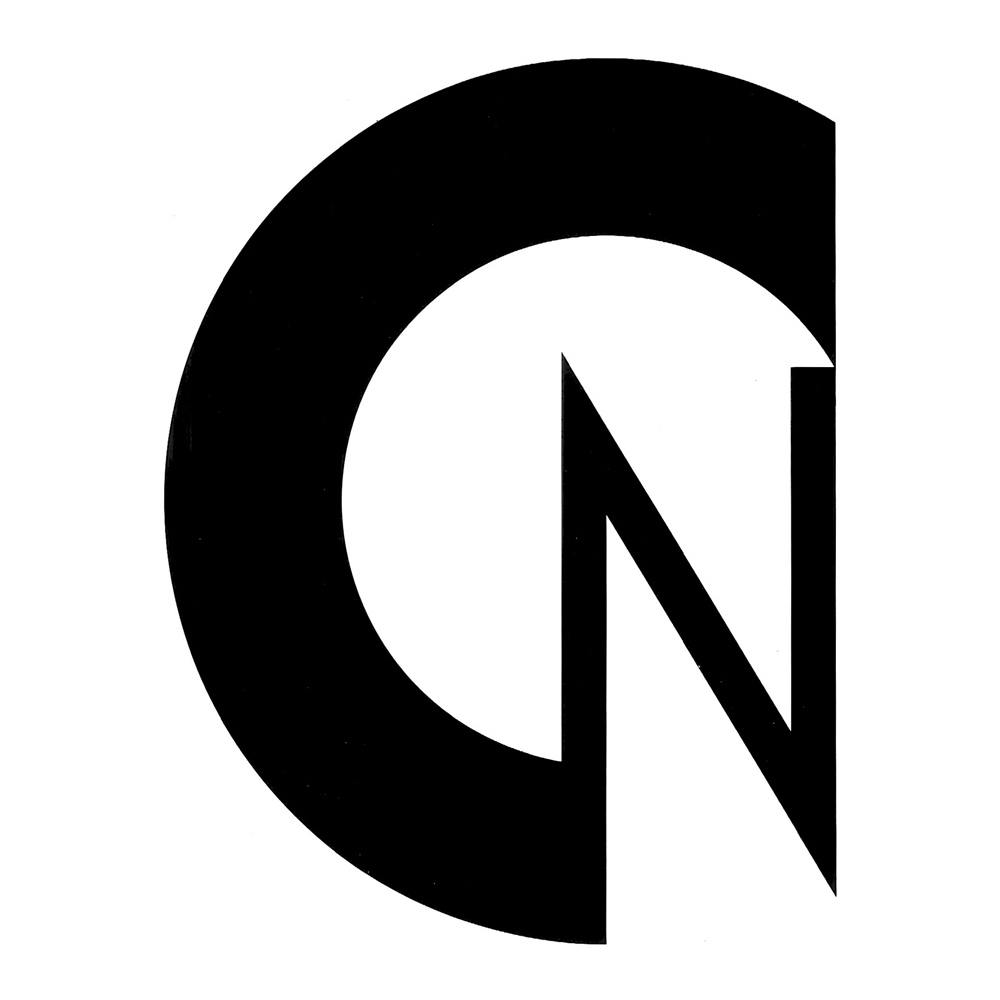
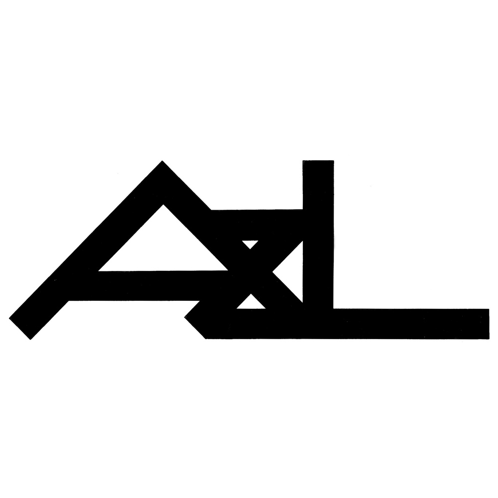


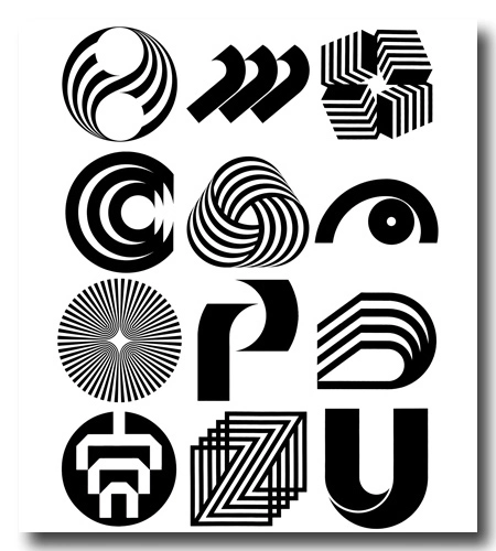
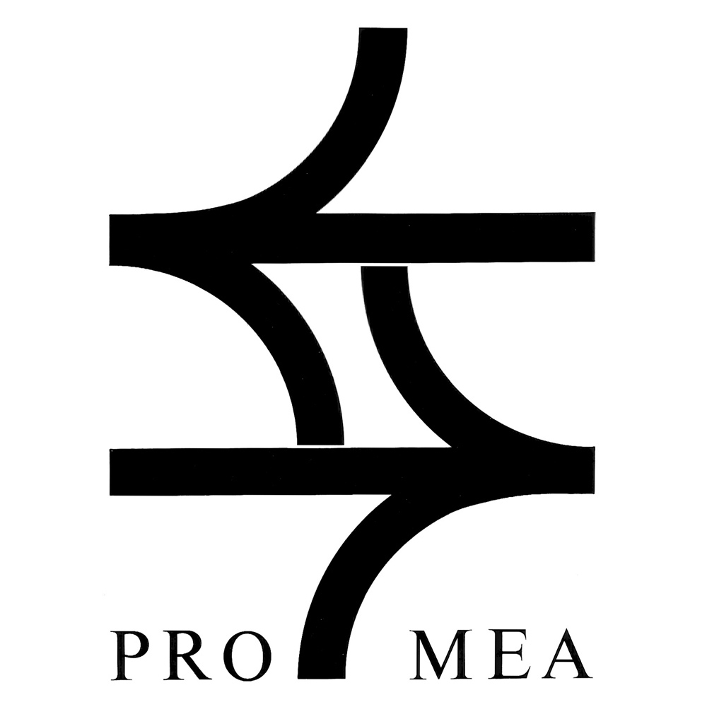
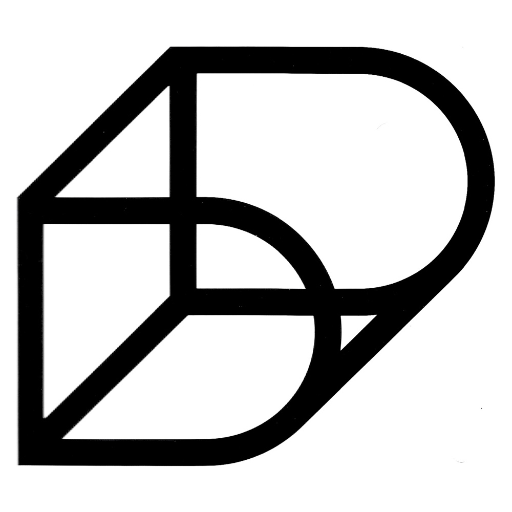
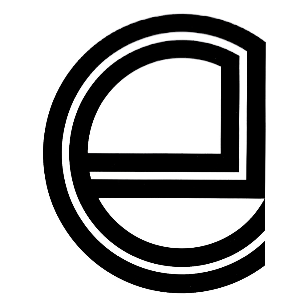
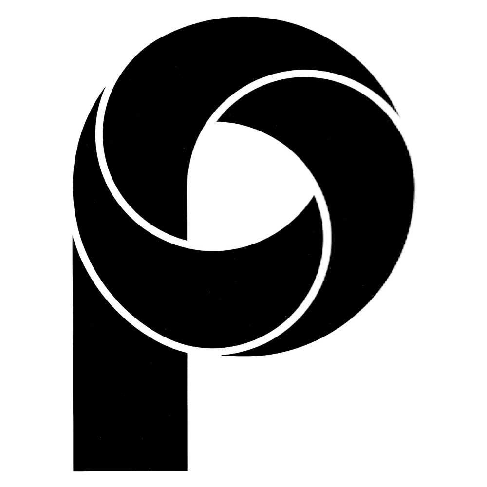
Finally, these are about two dozen more logos, which unfortunately I have not been able to identify until now:


[all pics from Grignani archive – courtesy of Daniela Grignani]
Last Updated on 21/07/2024 by Emiliano