While many of us use fonts in our word processing software on our computers, not everyone realizes that behind each typeface lies a story…
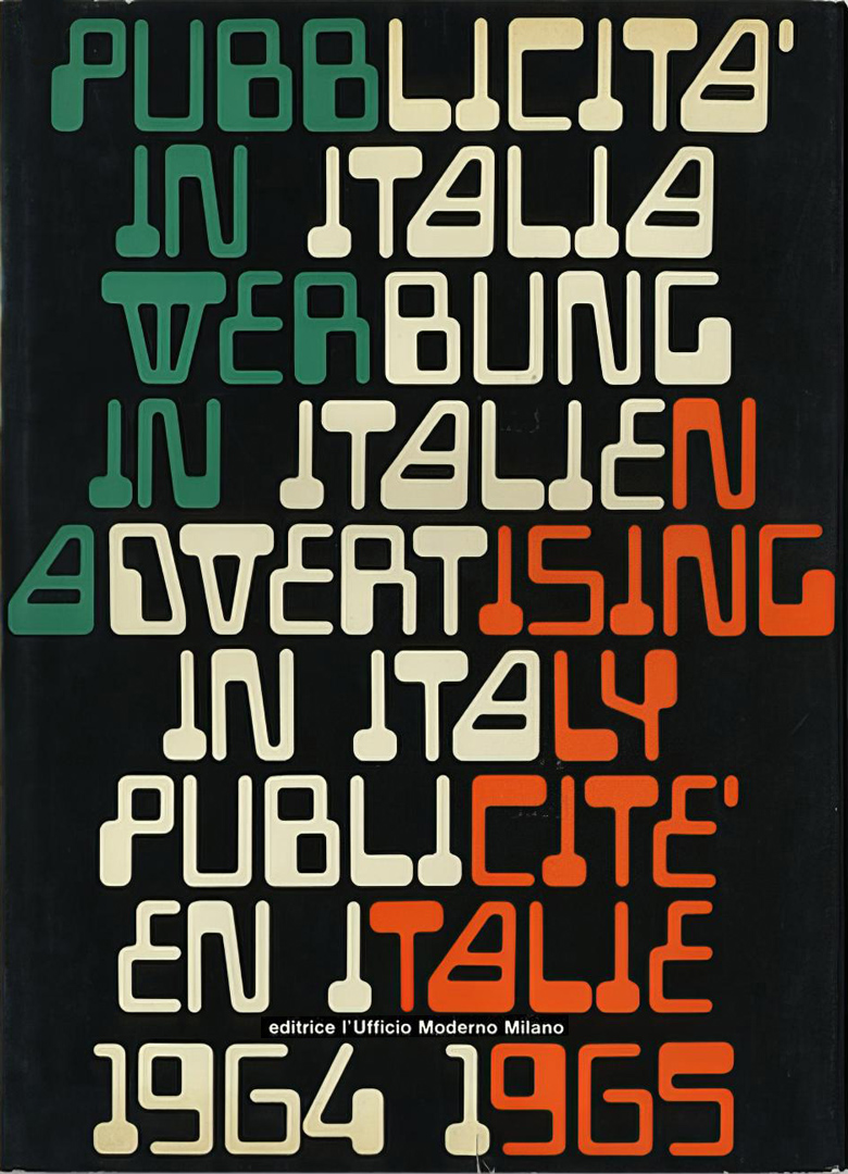
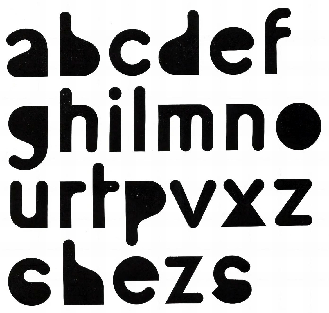
Franco Grignani, as early as 1964, drew the Magnetic font, inspired by the IBM numbers and printed with magnetic inks. Twenty years later, in 1984, he recalled: “I was doubtful about its lack of legibility (even though I had used them for the cover of ‘Pubblicità in Italia’ 1964-1965) but by 1966 these characters were picked up in America, transferred to photocomposition and immediately applied to the futuristic titling in thousands of publications” [probably and unsurprisingly under the name Gemini by Filmotype™, a name that might have drawn inspiration from NASA’s second human spaceflight program conducted from 1965 to 1966 – Ed.].
He then added: “Over the last few years, there has been a flourishing of new alphabets that no longer suffer from the limitation of difficult readability because, through our continuous experiments with new graphical elements, logos, signs, and free graphic expressions, the eye has gained greater interpretative speed in reading. […] Until a few years ago, modern graphics was managed through modules, seeking order, harmony in composition, resulting in a static concept. Now, however, it is not looking for balance, or stability, but for a field of visual stimuli in a continuous transformation that revitalizes the possibilities and qualities of its sign.”
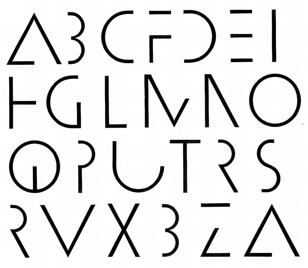
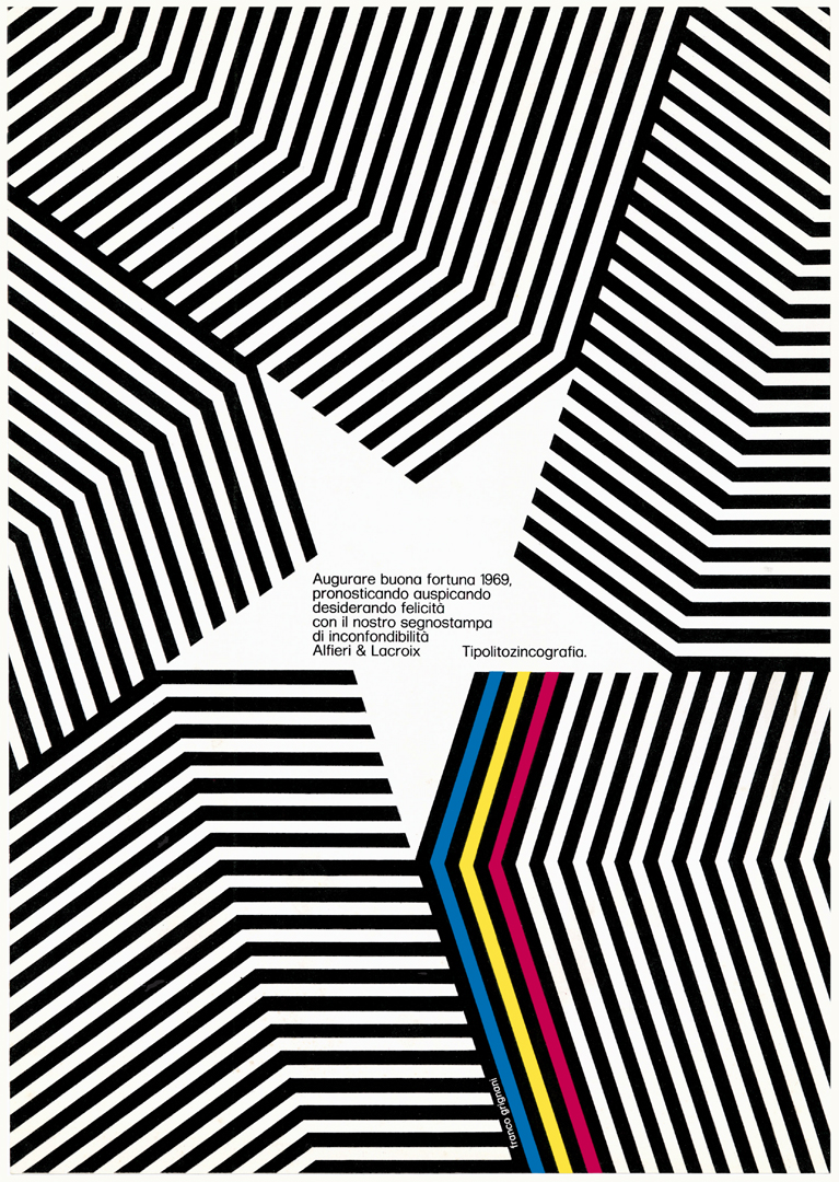
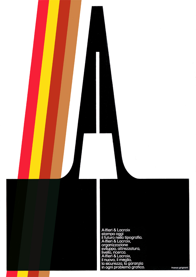
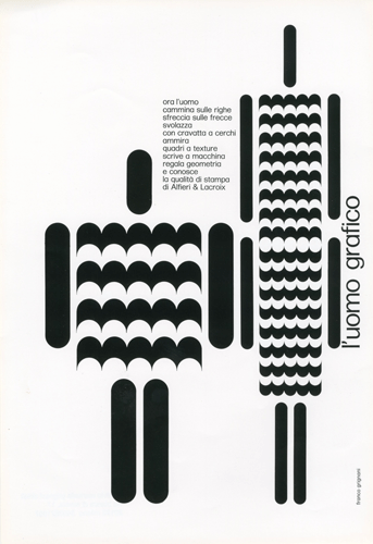
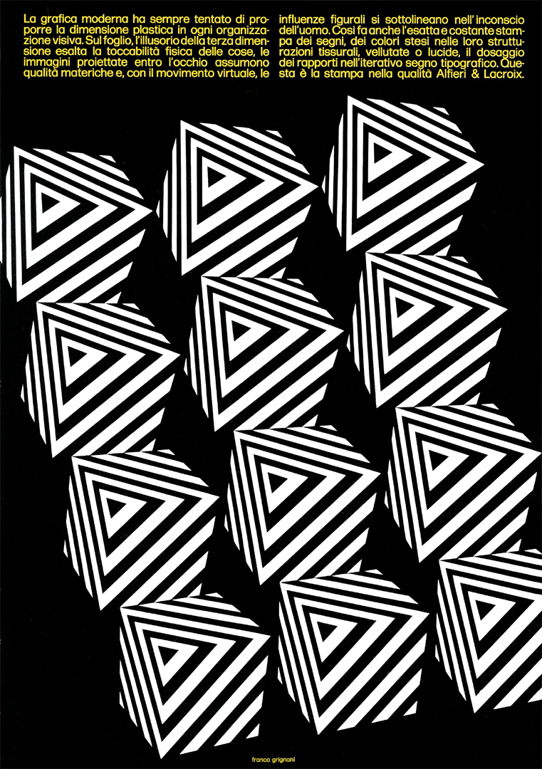
Magnetic was not an isolated example; Franco Grignani frequently created typefaces for purely experimental purposes, intending them to serve as inspiration for future graphic applications:
But let’s go back to the mid-’60s in Italy…
The Nebiolo foundry of Turin, established in 1852, was once the largest manufacturer of type and printing equipment in Italy. However, by the early 1960s, it was facing financial difficulties due to the rapid advancements in photocomposition and offset printing technologies. In 1964, the Italian bank IMI took over ownership of Nebiolo to address these challenges.
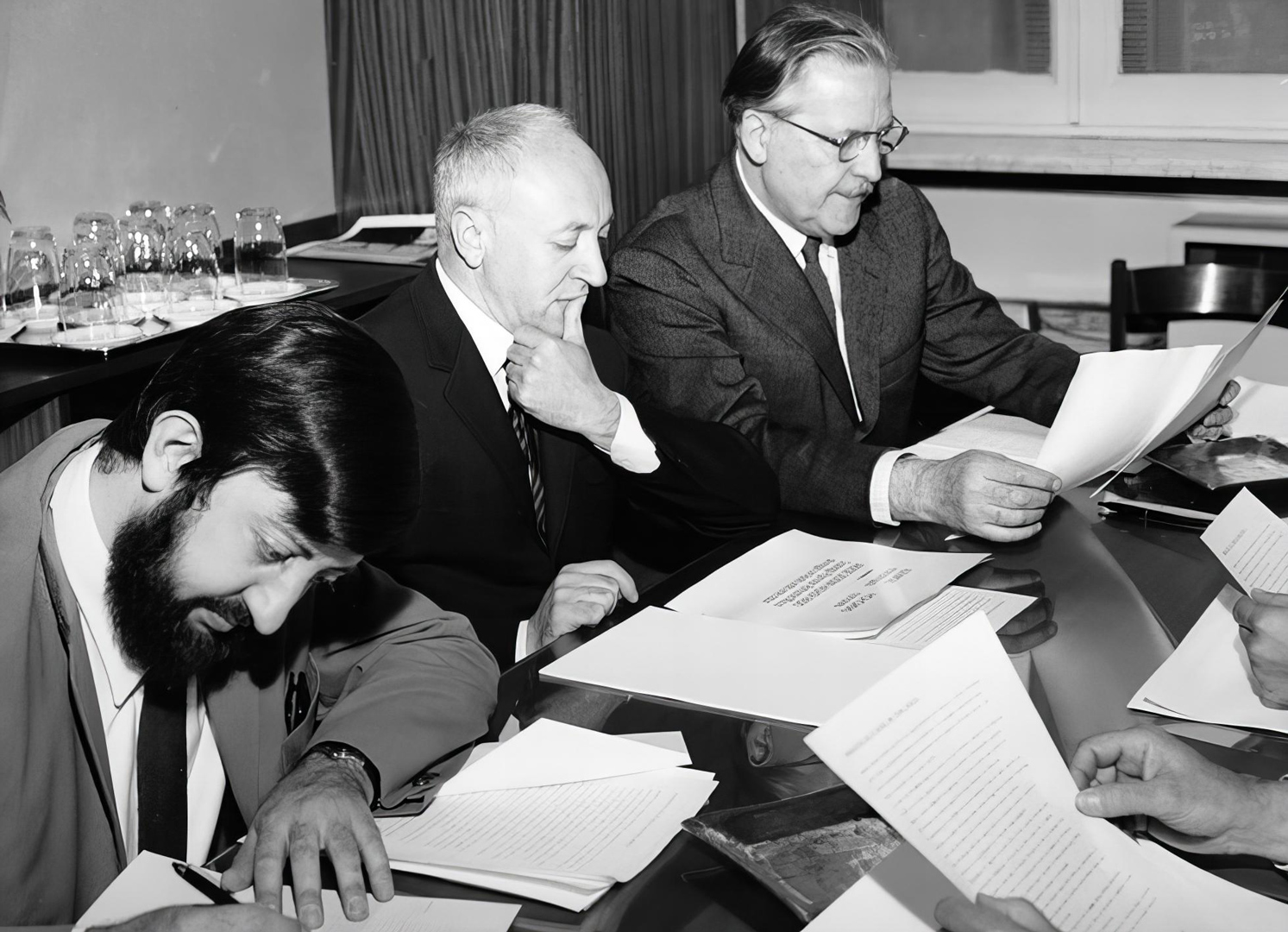
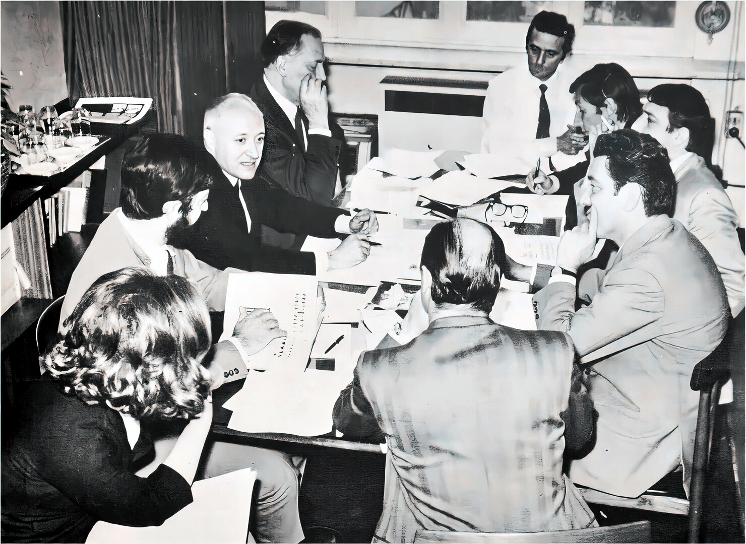
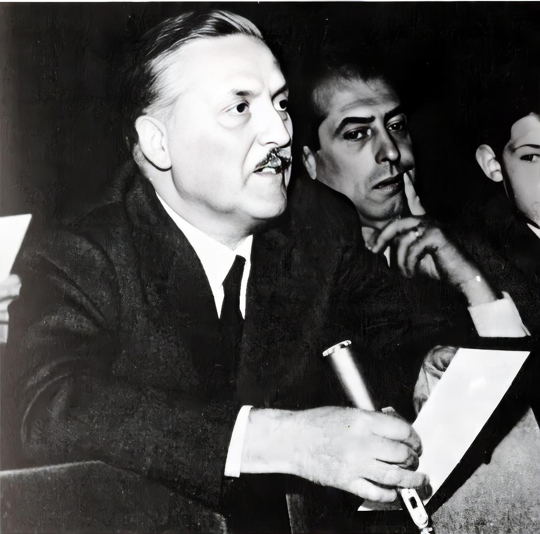
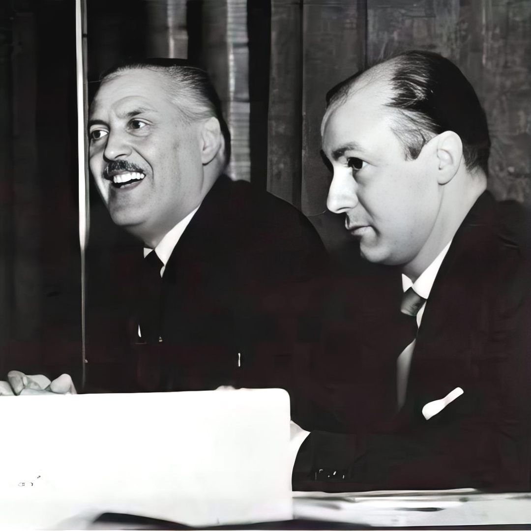
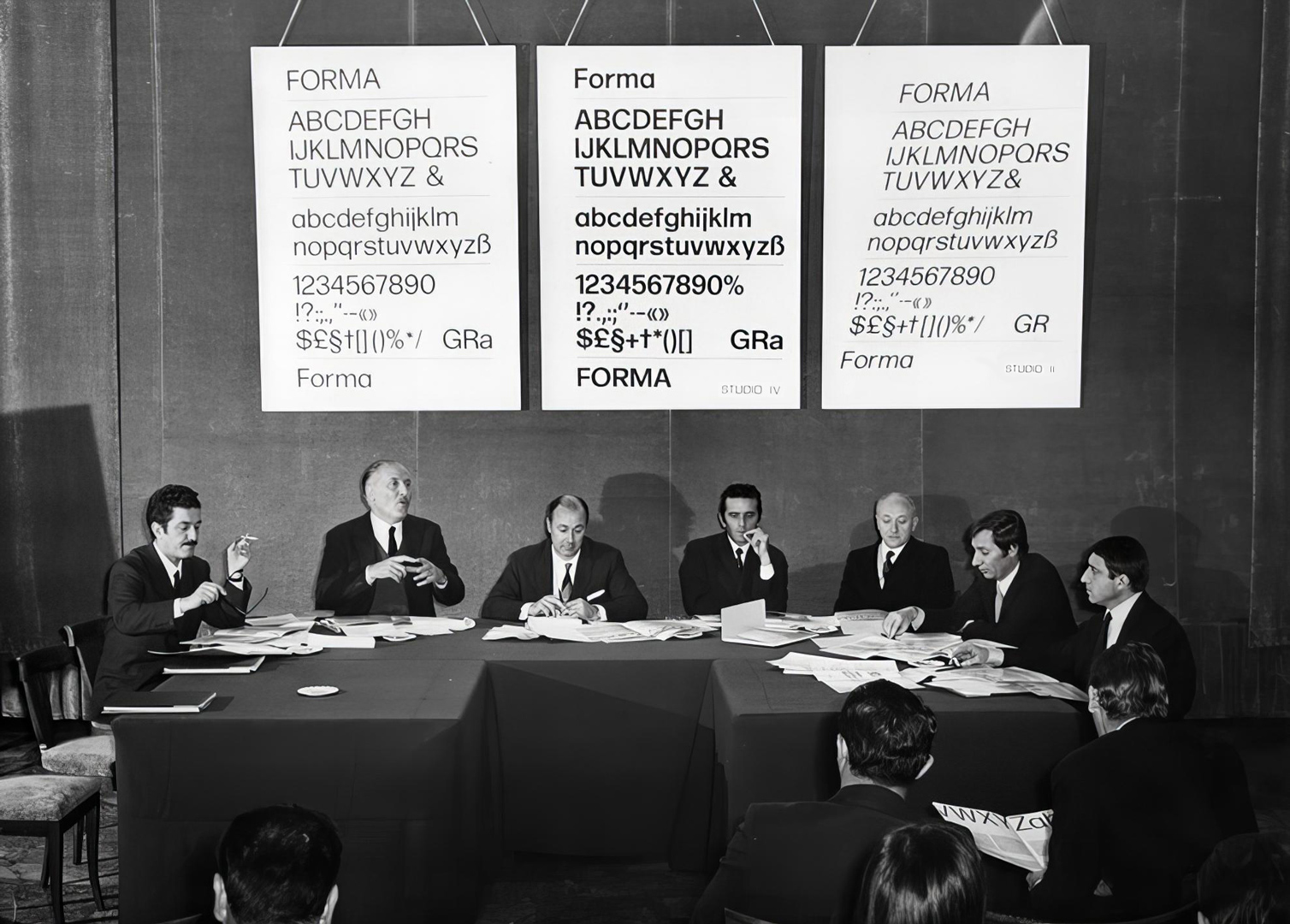
As a result, in May 1965, the management of the foundry established a research committee of graphic designers to work alongside Aldo Novarese, who had been the director of Nebiolo’s ‘Studio Artistico’ since 1952. This working group consisted of three prominent figures from Milan’s graphic design community, including Franco Grignani and Pino Tovaglia initially, and later expanded to include Giancarlo Iliprandi, Bruno Munari, Ilio Negri, Till Neuburg, and Luigi Oriani. Their collaborative effort aimed to create new typefaces in conjunction with Nebiolo’s advertising department.
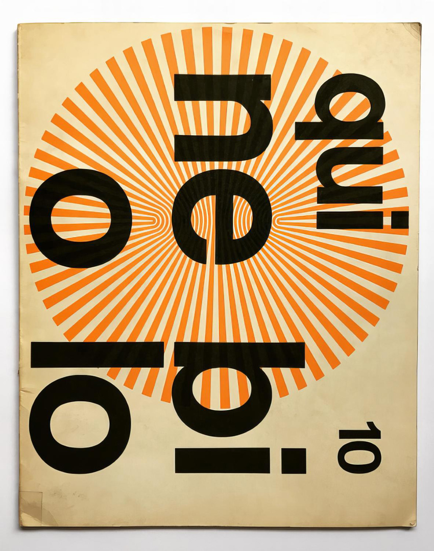
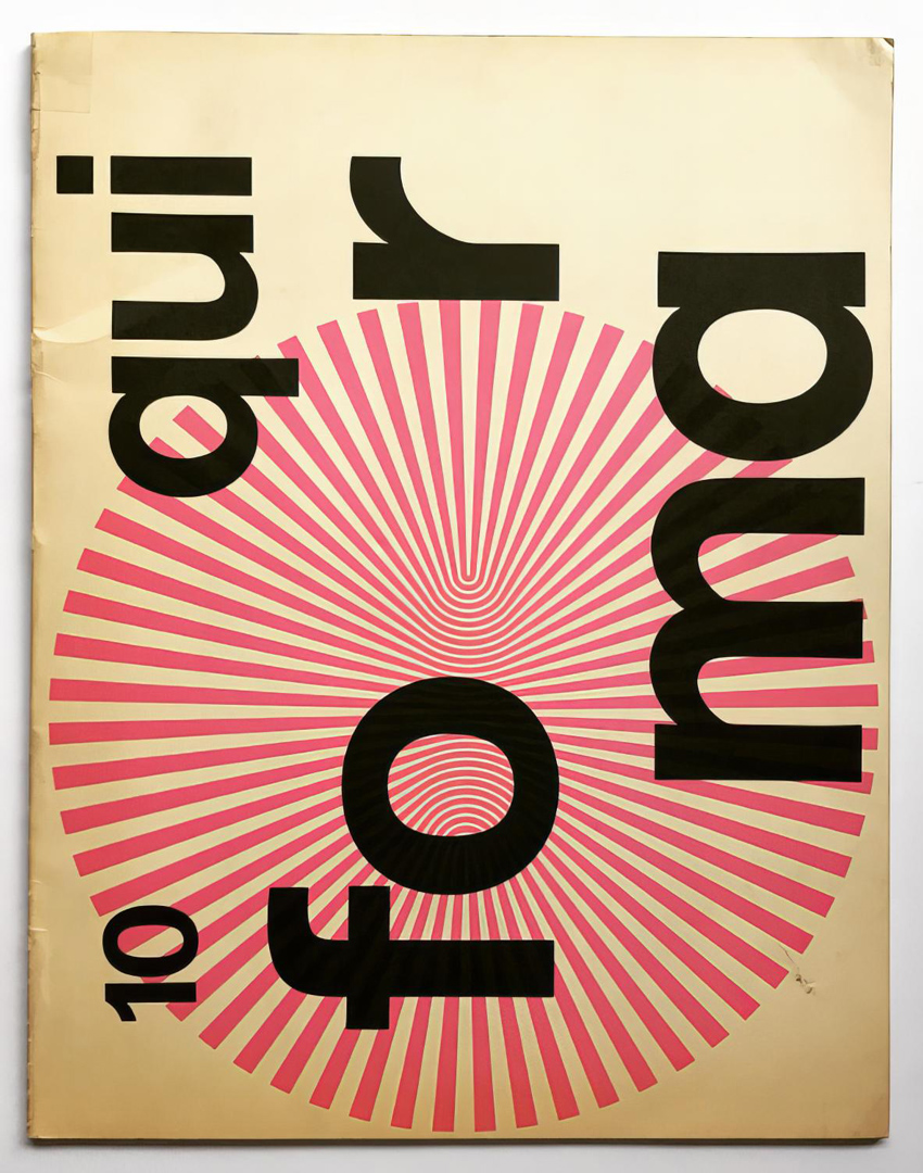
The discussions not only revolved around creating new typefaces but also the structure in which to incorporate them, which was a groundbreaking approach at the time. This unique design process was well-documented in the issue of Nebiolo’s corporate magazine ‘Qui Nebiolo’ n° 10, 1969 (cover by Grignani), with many interventions by Grignani. Surprisingly, this team of designers, often referred to as the ‘Dream Team‘, remained active for over a decade, continuing their work even after Aldo Novarese’s retirement. It’s worth noting that all these designers provided their expertise on a voluntary basis during this extended period of collaboration.
During the mid-1960s, Nebiolo’s type offerings were considered somewhat outdated when compared to the demand for a commercially competitive font to rival other popular European grotesque typefaces like Univers, Helvetica, Folio, Akzidenz Grotesk. These typefaces were preferred by leading Italian graphic designers of that era. The influence of these typefaces on mainstream culture can be seen in this documentary on Helvetica, which was released in 2007, coinciding with the 50th anniversary of Helvetica’s introduction. This documentary serves as a representation of the prevalent typographic culture during that time and in the following years:
Grignani himself occasionally used Helvetica and Univers in his work, especially in ads (he often signed his ads in Helvetica and in lower case).
During this time, the field of visual communication was still emerging in Italy, and a noticeable gap existed in the market between tradition-bound printers and graphic designers for an ‘objective’ typeface.
Professor Alessandro Colizzi, a former professor at the School of Design of UQAM in Montréal and currently at Milan Polytechnic – Communication Design, has pointed out in an extensive article (part 1 & part 2, also available in pdf) that Nebiolo’s traditional market mainly consisted of Italian printers who held conservative expectations. On the other hand, Italian graphic designers were increasingly looking abroad for more contemporary and versatile typefaces. This gap between traditional printers and progressive graphic designers highlighted the need for a new typeface that could cater to the changing demands of the design industry.
The situation was summed up by Grignani [I]:
“We are typographers who use few typefaces, only those which represent the spirit, the architecture of modern graphics.”
In their pursuit of an ‘ideal’ typeface, the key considerations were visual perception, optimal legibility, neutrality, and reading speed.
Within the group of strong-willed personalities, diverse opinions emerged, leading to spirited debates and pointed critiques. For instance, Armando Testa, who was present at the first meeting in 1965, argued that “we know well how in American advertising not only more typefaces are used, but even typical typefaces are sought, linked to a specific advertising case …”, while on the other hand, according to Franco Grignani “creating a typeface that is used only for business cards rather than for writing paper is useless […] Some typefaces have fewer defects, for example, when printed on one type of paper rather than another. After all, Nebiolo is interested in preparing typefaces that are not personal creations, but universal types, like the Bodoni could have been …” [II]
This statement by Franco Grignani captures the essence of the conflict [III]:
“In my opinion, there is a fracture between your work [Nebiolo/Novarese, Ed.], which is close to traditional typography, and ours, which is closer to the problems of aesthetics in graphic design […] Someone who only ever draws typefaces cannot know the secrets of another part of the world that deals instead with other visual problems…”
In this podcast (ITA), Federica Novarese, provides insight into the contrasting perspectives between her father, Aldo, and the team of designers.
Thus underlining the distinction between typefaces designed for traditional typography, adhering to established patterns and optical conventions, and typefaces intended for commercial graphic and advertising design, as envisioned by Grignani, which were considered to be “less predetermined and more forward-looking”.
Grignani’s concluding question, “at this point, I wonder «…how do we get rid of the traditional character?…»” [IV], encapsulates his desire to break away from traditional typographic norms and embrace a more innovative approach in typeface design.
As outlined by the aforementioned Professor Alessandro Colizzi, the process which followed was indeed laborious, with meetings extending over two years, during which various iterations were created and compared. The team of designers eventually reached an agreement. Grignani expressed his satisfaction: “We wanted an impersonal typeface, and we got it, therefore it cannot belong to just one designer. But if it is true that it reflects, in the entirety of its characters, the informative judgment of the study group, it follows as a direct consequence that Forma is the typeface of the team” [V]. It was the typeface they were looking for: grey, uniform, depersonalized, with characteristics of good readability and maximum versatility, receptive to the personality of the design it would be used for. And as for personalization, at an animated public round-table discussion held at the Hotel Principe & Savoia in Milan on December 11, 1968 (entitled “Evolution of a research: the Forma typeface”, so well depicted in the pages of issue n° 10 of ‘Qui Nebiolo’), Grignani replied to criticism about the apparent monotony, “excessive perfection, and exaggerated tranquillity” of the typeface, while “with advertising, we want instead to provoke” (Horst Blachian), as follows [VI]:
“… but it is me as a graphic designer who must know how to create this provocation. The typeface is a block, I have to give it the movement. A typeface has the responsibility of being readable, and as such it requires a mechanical order that is the expression of a mental order.”
Grignani’s response highlighted the balance between the typeface’s structured readability and the designer’s responsibility to use it effectively to create visual impact and provoke engagement in advertising and communication.
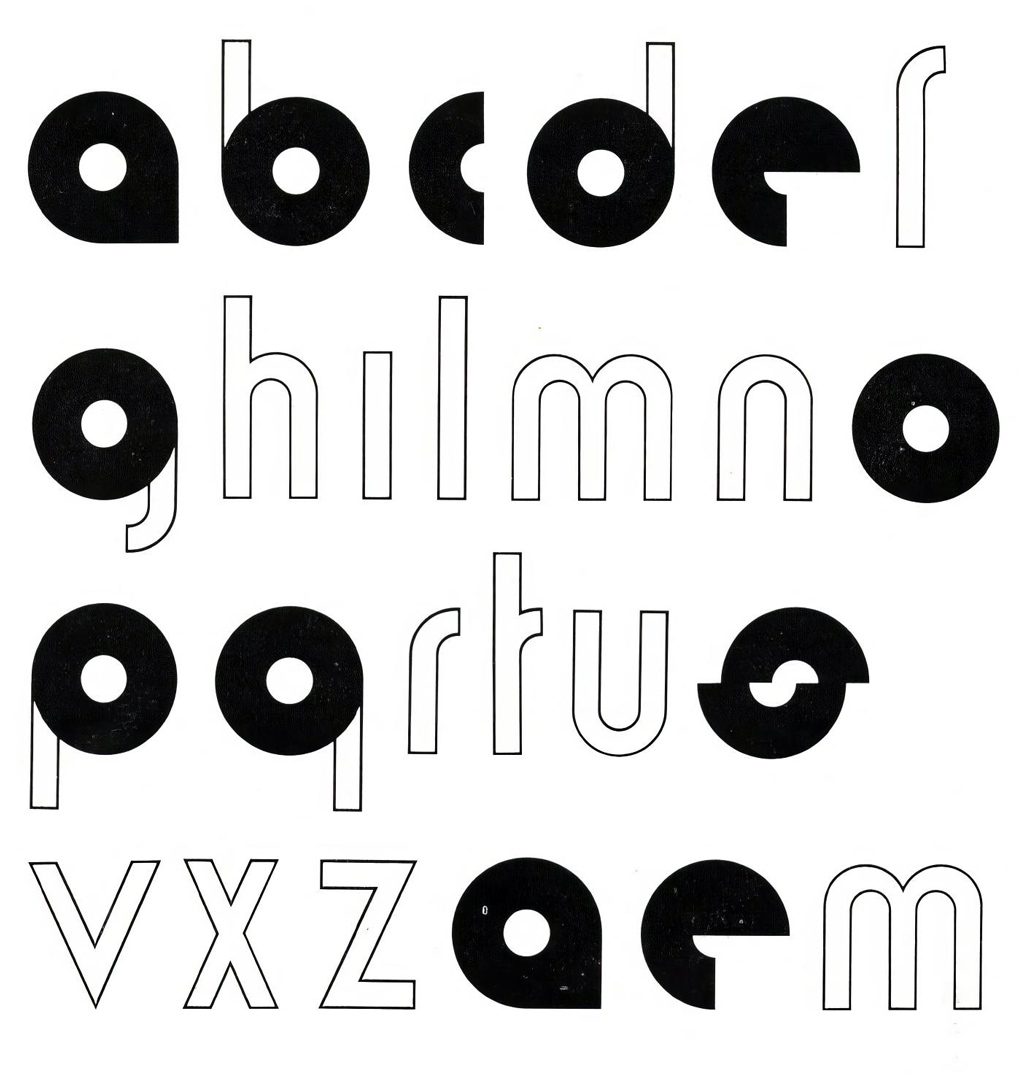
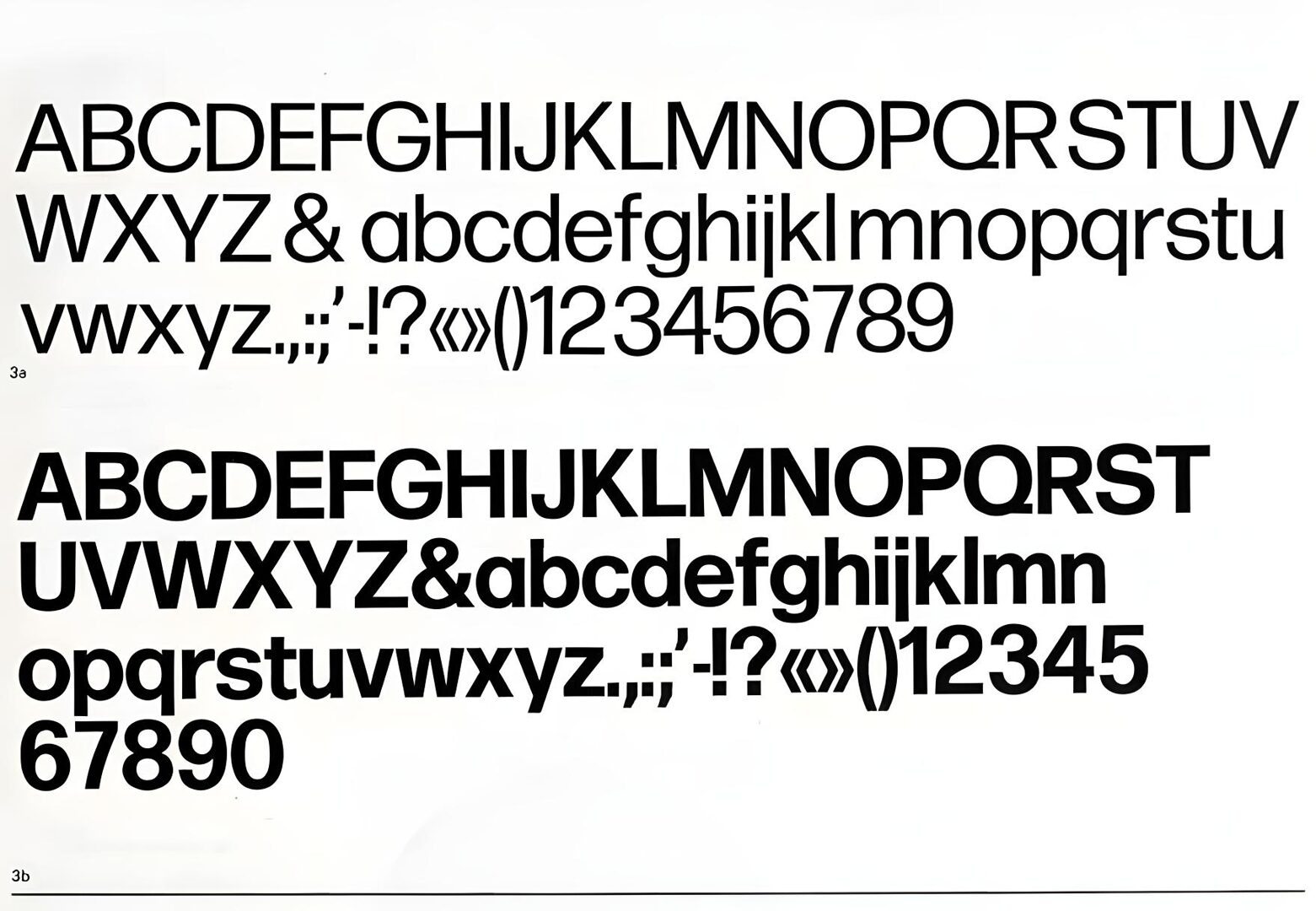
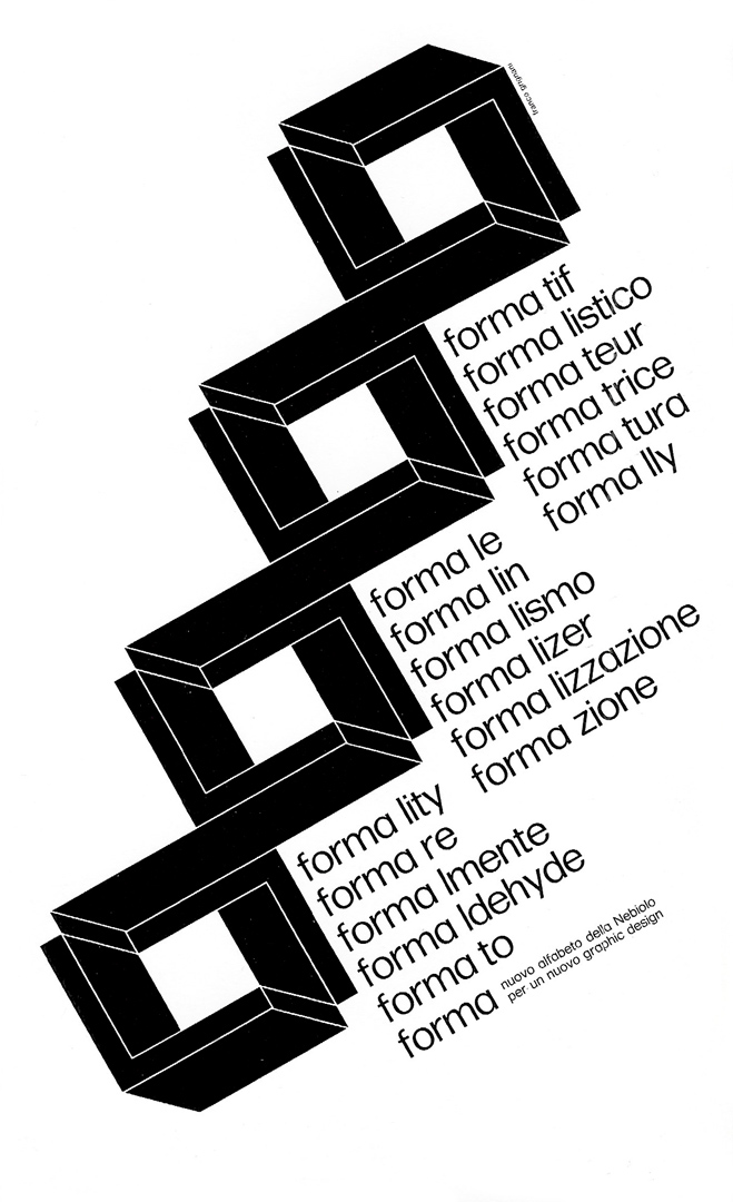
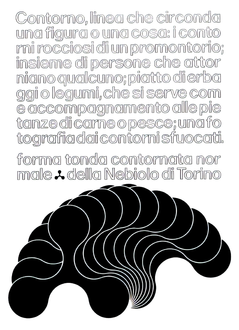
Forma, as it came to be known from 1967 onward, was conceived as a versatile sans-serif typeface that strived to be practical and highly legible. It was designed to compete with market-leading typefaces while addressing the needs of modern graphic design and the demands of offset and photogravure printing for photocomposition. The name ‘Forma’ itself implied its purpose of representing the ideal letterform of its time. The typeface aimed for neutrality and self-effacement, making it suitable for a wide range of applications. It was intended to be equally useful for continuous text and titling, appealing to graphic designers, advertising art directors, and printers, much like the renowned Swiss school of typefaces that had gained popularity during that era. Forma sought to be a pragmatic and versatile choice for professionals in various design and print-related fields.
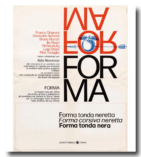
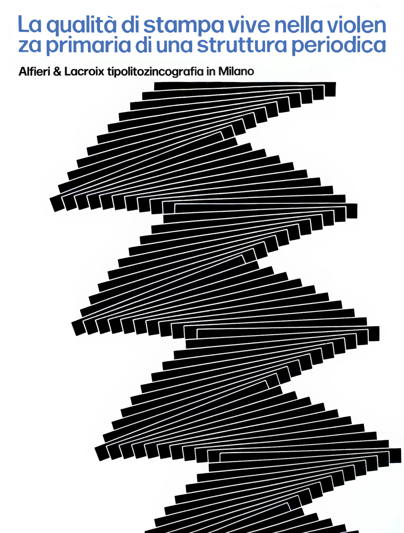
In 1968, the designs for Forma were completed and entered the pre-production stage. To promote the typeface, each designer from the team was tasked with creating specimens and advertisements. These promotional materials were featured in prominent publications in Italy and abroad [1, 2 & 3, still of interest by collectors]. Franco Grignani also designed a poster for Forma, which was showcased at the ‘V Warsaw International Poster Biennale’ in 1974. This extensive marketing effort aimed to introduce Forma to a wider audience and highlight its unique characteristics.
Forma was Italy’s response to the overuse of Helvetica, which had become monotonous since the mid-1970s. Interestingly, Hoffmann, principal of the Haas typefoundry, defined it “a blatant copy of Helvetica”. Forma offered a fresh alternative and gained recognition for its innovative design. In 1970, it received a special mention at the Compasso d’Oro, which is the oldest and most authoritative world award for industrial design presented by ADI (‘Associazione per il Disegno Industriale’ – ‘Industrial Design Association’). This was a historic achievement, as it marked the first time a typeface had been honoured with such an award. Forma also earned another special mention at Gute Form 1970, an annual design award presented by the Internationale Design-Zentrum in Berlin. Forma specifically targeted the newspaper market, as many Italian newspapers were still setting headlines manually, and its versatile design made it a suitable choice for this application.
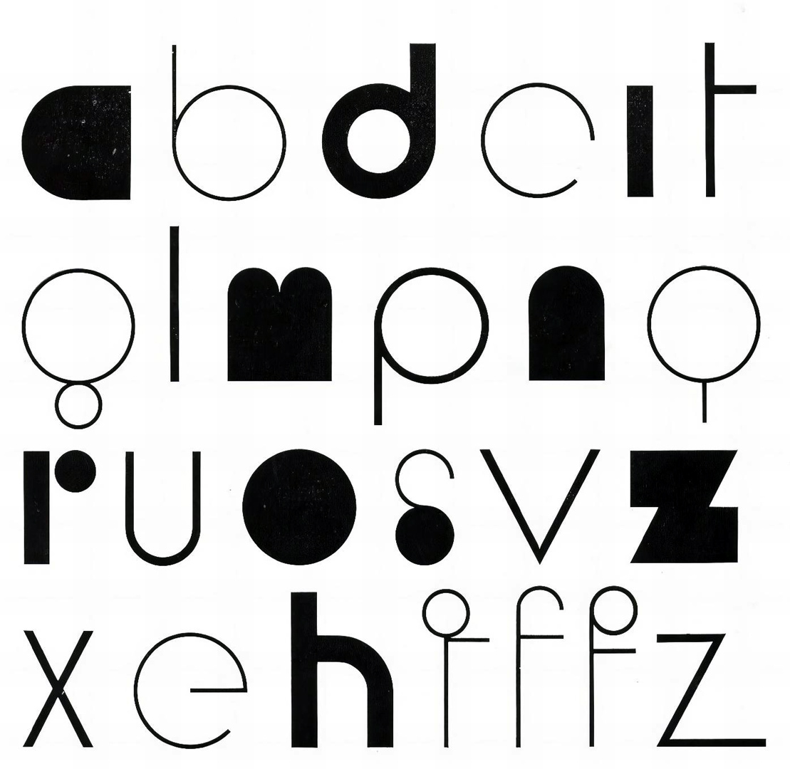
The collaborative efforts of the design team didn’t stop with Forma’s release. Building on the positive reception of Forma and in response to the popular Times New Roman, Nebiolo introduced the Magister typeface in 1968. Magister aimed to serve as a suitable companion to Forma. Following this success, there was a demand for another typeface that reflected typewriter aesthetics. This typeface was named Dattilo and was released in 1972.
Dattilo received an even more favourable response from the graphic design community and produced positive marketing results. In a 1972 advertising article for Dattilo, Nebiolo introduced Franco Grignani as a “well-known, very well-known graphic-painter, painter-graphic. Rigorous interpreter of a visual dynamics that translates a set of tensions into balance. The kinetic structure as a constant solicitation for active participation of the beholder. A precise belief in the typeface understood in its more rational structure as a reading tool”.

The collaboration between graphic designers and psychologists was quite unusual at the time, as it wasn’t common for graphic designers to engage in such scientific practices. By inviting the psychologist Gaetano Kanizsa, a representative of Gestalt Psychology known for his work on perception, the group was pioneering new approaches to legibility studies.
Unfortunately, work on a third typeface called Modulo was halted shortly before its completion due to the Nebiolo foundry ceasing its operations. Nonetheless, in recognition of its merits, Modulo was posthumously awarded the Compasso d’Oro in 1979.
Nebiolo’s struggle to compete in the changing typeface market, which was rapidly transitioning from photo to digital/CRT photocomposition, ultimately led to its decline. While other major type foundries were adapting to digital technologies, Nebiolo continued to support hand-setting, which had become obsolete by the mid-1970s (even if, in the aforementioned first meeting of May 1965, it was noted by Ornella Linke Bossi: “I would draw a typeface that could find use only in twenty years, a typeface that will be imposed to us by electronic machines and that practically does not need any drawing, i.e. a typeface based on Cartesian coordinates”). The market was already saturated with competitor typefaces that were compatible with the main composing systems (in 1963 Compugraphic Corporation brought into the market the Linasce, a typesetting computer, thus marking the beginning of the computer age in the American market, while, in the same year, Univers was offered in the IBM-72 Selectric type catalogue), making it difficult for Nebiolo to maintain a competitive edge.
Despite efforts to reorganize the company, including Fiat’s involvement as the main shareholder in 1976, Nebiolo could not recover, and it declared bankruptcy in 1978. The closure of the foundry marked the end of an era in Italian typography and type design.
The fate of Nebiolo’s assets, including punches and matrices, was shrouded in rumour and uncertainty after the foundry ceased production. There were reports suggesting that everything had been lost or scrapped. This may have contributed to the absence of Forma in the digital era for many years.
However, in 2013, a surprising discovery was made when a metal font of Forma Light, still in its original package, was found in a drawer of a print shop in Dresden. This unexpected find brought Forma back into the spotlight after being absent from the typographic scene for 40 years. The font’s revival allowed Forma to make a fresh and contemporary appearance in the digital realm. Today, publications like Women’s Wear Daily and the new Hong Kong Tatler feature the new digital Forma, and in 2023, in the wake of this success, also tech giant HP Inc. switched to it (expanding the family to include Arabic, Devanagari, Greek, Hebrew, and Thai scripts), showcasing its enduring relevance and versatility in modern typography.
“Gazing at his old type specimens, we […] saw the culmination of an entire era of typography: an era when formal purity was the ultimate design achievement, when the spacing of headlines was outrageously tight, and when neutral neo-grotesque sans serifs were actually something fresh and exciting to read.”
David Jonathan Ross, author of Forma DJR
‘Franco Grignani’s blog’ would therefore appear like this:

In 2024, David Jonathan Ross granted me the license for Forma DJR, in honour of the precious historical contribution by Franco Grignani, making it the custom font for francogrignani.info.
[a] ‘Qui Nebiolo’ issue n° 10, 1969
[b] from pinotovaglia.it, courtesy of Irene Tovaglia
[c] ‘Modern Publicity’ issue n° 39, 1970
[1] graphéine
[3] CAST, courtesy of Alessandro Colizzi
[6] & featured pic from GARADINERVI, courtesy of Robert Rebotti
[7] AIAP / CDPG Centro di Documentazione sul Progetto Grafico, courtesy of Lorenzo Grazzani
[this post is not CC BY-NC 4.0 due to some adaptations from CAST (part 1 & part 2) by Alessandro Colizzi, djr.typenetwork, fontbureau.typenetwork]
[further information [ITA] can also be found at the Pino Tovaglia Archive]
ITA original texts from ‘Qui Nebiolo’ issue n° 10, 1969:
[I] “Noi siamo dei tipografi che usano pochi caratteri… caratteri che rappresentano lo spirito, l’architettura della grafica moderna…”
[II] “Fare un carattere che viene usato solo per i biglietti da visita anziché per carta da lettera non serve a nulla […] Certi caratteri hanno meno difetti per esempio se stampati su una carta piuttosto che su un’altra. In fondo alla Nebiolo interessa nel futuro preparare dei caratteri che non siano dei fatti personali, ma tipi universali, come può essere stato il Bodoni…”
[III] “Per me c’è questa frattura fra il vostro lavoro [Nebiolo/Novarese, Ed.], che è vicino alla tipografia tradizionale ed il nostro, che è vicino ai problemi di estetica grafica […] Chi disegna sempre caratteri non può conoscere i segreti di una altra parte del mondo che si occupa invece di altri problemi visivi…”
[IV] “a questo punto mi domando «…come si fa ad uscire dal carattere tradizionale?…»”
[V] “Volevamo un carattere impersonale, questo lo è, pertanto non può essere più di un unico disegnatore, ma se è vero che rispecchia nella totalità dei suoi segni il giudizio informatore del gruppo di studio, ne deriva per diretta conseguenza che il Forma è il carattere dell’équipe.”
[VI]: “…ma sono io come grafico che devo saper creare questa provocazione. Il carattere è blocco, io gli devo dare il movimento. Un carattere ha la responsabilità di farsi leggere, e come tale vuole un ordine meccanico che è espressione di un ordine mentale.”
Last Updated on 23/09/2024 by Emiliano