
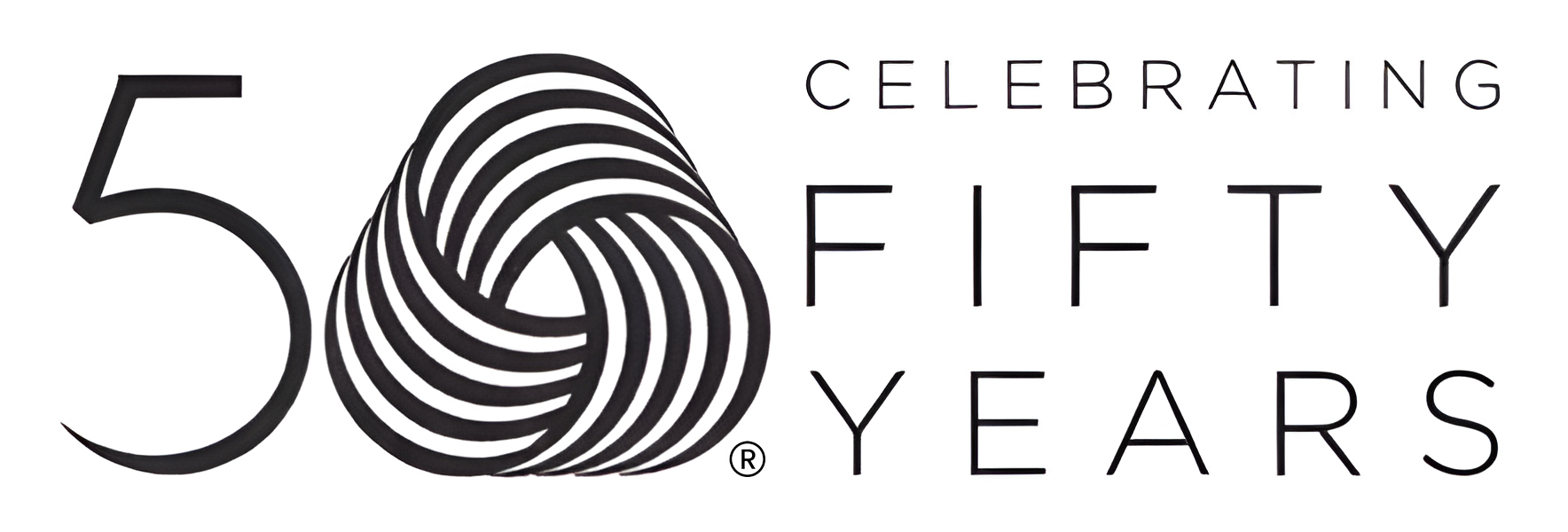
2014 marked its 50th anniversary:
We’re all familiar with it. Woolmark logo – applied to more than five billion items worldwide – is frequently credited for being a concise and powerful symbol. In fact, in 2011, Creative Review, a British monthly magazine, hailed it as the best logo ever, and in 2013, GDUSA, a prominent USA graphic design journal, ranked it as the 11th favourite logo of the past half-century.
Yet, its story is so terribly tangled that it seems to lie somewhere between legend and something along the lines of a spy story…
“Early in the 1960’s the world’s wool growers faced up to the brutal reality that synthetic fibers were becoming a very serious threat” [from ‘Famous American trademarks’, 1971]. “In short, in the words of the managing director of the International Wool Secretariat [a non-profit organization established in 1937 that gathered wool producers from over 30 countries, Ed.], Mr Bill Vines, the prices the world has been prepared to pay for wool have been substantially determined by the price levels of the various synthetic alternatives. […] It would be disastrous for wool to attempt to follow the synthetics down in an attempt to retain a part of the mass fibre market. […] wool prices have to be stabilised. […] How can this be done? Mr Vines and his IWS board representing the woolgrowers of Australia, New Zealand and South Africa have come up with their answer. They are setting out to establish for wool products a quality – as opposed to a luxury – image in the minds of the consumer. […] To help in achieving this objective, the IWS proposes to establish under its legal ownership a series of national wool trademarks, linked by an internationally common basic design. It will promote these trademarks until they become household names to millions of people in each major wool-using country. […] The trademark project will be part of a five-year IWS plan to expand world wool promotion” [from ‘Critical Era for Wool’ in ‘The Bulletin’, 11 May 1963].
“the most ambitious textile labelling scheme ever attempted”
(‘Woolmark News’ – Sept. 18, 1964)
“Funnily enough, the Woolmark idea was first produced 10 years ago by the J. Walter Thompson Agency in New York […]. The agency let the idea lapse. They could not see how it would work. They ran up the flag and no one saluted”, wrote ‘The Bullettin’ in 1965.
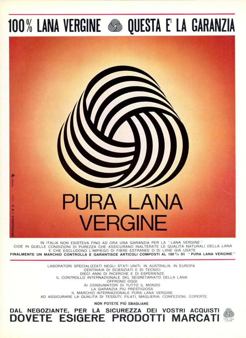
At the end of 1962, the IWS announced the project to create a global graphic identity for wool that would “hold consumer confidence and represent quality standards”, dispelling “the confusion caused by various fibers claimed to be ‘like wool’ or ‘good as wool'” [from ‘Ada Evening News’, 10/01/1965]. “Its purpose is to give a clear identity to products made of pure new wool, to invest them accordingly with the stamp of quality and so, in the long-term, free wool from a restrictive price relationship with synthetics” [from ‘The Second Annual Report of the Australian Wool Board for year 1963-64‘].
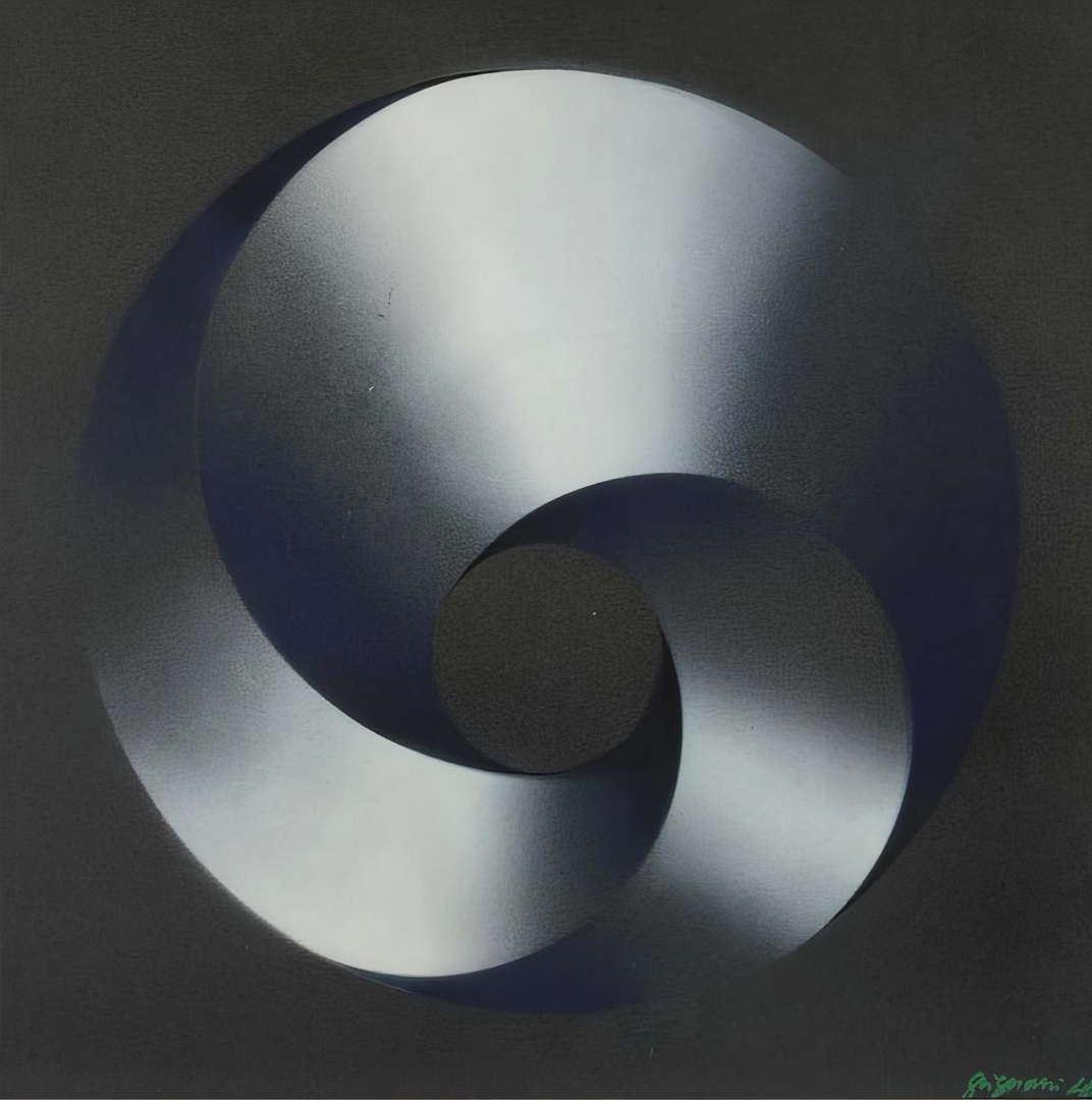
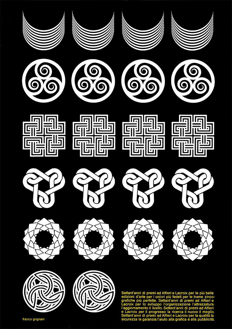
Franco Grignani had been invited to join the jury of 6 internationally-known experts (plus Sir Gordon Russell – one of Britain’s foremost design experts and director of the Council of Industrial Design – serving as Chairman of the selection panel). Their task was to choose the final design for the Woolmark logo. Shortly before his scheduled departure for London at the end of 1963 (bearing in mind that Franco didn’t speak English, he enlisted his daughter Daniela to accompany him), a Mr Spiriti showed up at Grignani’s studio. I found his name on the back covers of some leaflets from the mid-1950s, which were distributed for the IWS at trade fairs and in fashion stores, exalting the qualities of wool (one featured the drawings of Jeanne Grignani). Spiriti was an appointee [°] for the advertising agency who worked for the Italian Pure Wool Secretariat (‘Studio 37 Pubblicità‘: incidentally, that same year, the ‘Palma d’Oro della Pubblicità’ – the ‘Golden Palm-tree for advertising’ – was not awarded, but a gold medal was nonetheless conferred to the IWS for the colour pages in the periodical press produced by Studio 37 Pubblicità in Milan – from ‘Corriere della Sera’, 7 Oct. 1963). Mr Spiriti also oversaw the collecting of the graphic material to be exhibited by the selection panel and expressed his intention to submit the entries gathered up to that point to Grignani. However, discouraged by the inadequacy of the proposals, Grignani decided to withdraw from the jury and sent his resignation to London. Mr Spiriti, concerned by his reaction, insisted that he reconsider by suggesting that he, at the very least, submit something of his own, as time was running out. London was pressing Grignani not to decline the invitation to be on the jury, and Spiriti was pressing him to enter some of his own designs. Consequently, Grignani began working on something that would represent the high-quality level of Italian design. Legend has it that one day during lunch, he sketched rotating lines with arches using the prongs of his fork on a white tablecloth, giving birth to the concept of the renowned ‘wool ball’. At the time, my grandmother Jeanne was passionate about knitting and always had some balls of the famous ‘Lana Gatto‘; she had collaborated on the previous IWS Italian campaign called ‘Vesti Bene, Vesti LANA‘ (‘Dress Well, Dress in WOOL’). The logo was originally fashioned by assembling three copies of a single nine-striped band in black and white, as evidenced by some photographic negatives – taken by Grignani for archive purposes – rediscovered after his passing and also used for the recent ‘green Woolmark‘ (introduced to reinforce the ‘eco’ credentials of wool within The Campaign for Wool, which began in Oct. 2010). Franco Grignani made some variations by experimenting with different line thicknesses. It was a stylized sign, an experiment in black and white graphics that echoed his distinctive visual language (see this ad), “with swirling lines which have a constant movement symbolizing both the timelessness of wool and its modernity in the space age” [from ‘Ada Evening News’, 10/01/1965].
The plans for the creation of a “quality image in wool trademark” were initially formulated in 1962. Speaking in Melbourne, the managing director Mr Vines declared that “the I.W.S. plans to finalize the design of the symbol by the end of 1962” [from ‘The Times’, 2 Nov. 1962]. However, obtaining a trademark in 90 different countries turned out to be legally more complex than expected and “the symbol is the result of two years intensive research and design work throughout the world by IWS staff and advisors. Thousands of man-hours have been spent sifting through countless trade and company marks. Findings of the special research team caused many potential symbols to be discarded because they might have been confused with existing trademarks or did not meet the high standard set by the IWS” [from ‘Western Herald’, 21/02/1964].
It’s worth mentioning that, as of now, I haven’t come across any official ‘call for entries’ for a public competition for the ‘wool symbol’ during the period 1962-1963. This information remains elusive even after an extensive search, including a direct inquiry at the National Library of Australia in Canberra. Therefore, it is unclear whether it was formally a public competition or, more likely, a request for international collaboration on an R&D project; however, the proposals of (only) 13 “internationally-known experts” [from ‘The Canberra Times’, 12/02/1964] were involved in the final selection process.
Perhaps he was naive to believe that he was unlikely to win such a prestigious international selection, or most likely, there was a miscommunication with Mr Spiriti. However, Grignani’s disbelief was palpable when the participants in the jury – immediately and unanimously – favoured his logo among the eighty-six competitors, with the only exclusion of Grignani himself who, fully aware of being in an embarrassing situation, continued to vote against his own work until the very end. He returned to his hotel feeling broken, and at the final dinner of the two-day event in London in 1963, everybody kept asking him why he had voted against something so beautiful that could only have been created by him. “The International Wool Secretariat has spent two years developing a symbol for wool […] When the search for a woolmark began, the secretariat thought it would not take long – until they discovered that many ideas are already protected by existing symbols. As a result, it commissioned 13 designers to put up suggestions, and these were vetted by a legal team before being presented to a panel of international design experts to judge. The experts, under the chairmanship of Sir Gordon Russel, took 10 hours to make their decision, despite the fact that there was a surprising amount of agreement between them as to which symbols might be acceptable and which could be discounted right from the start. The final choice does away with lettering – partly because the initials of the IWS vary from country to country – and relies upon a purely pictorial idea” [from ‘Design’, n° 185, May 1964].

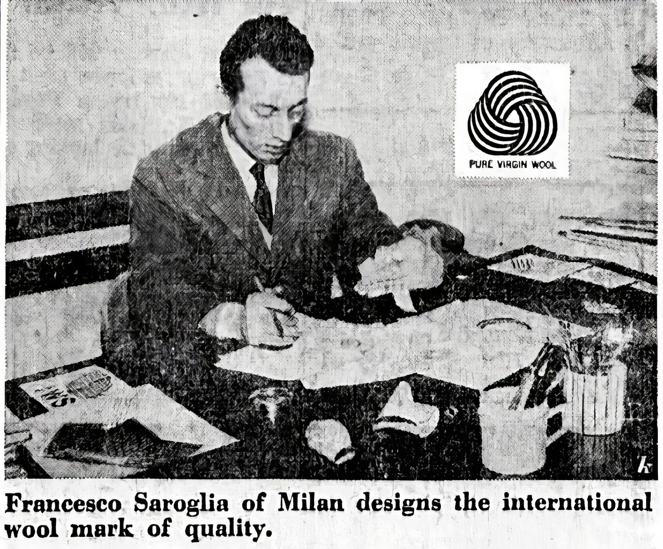
Mr Spiriti suddenly passed away shortly after [°°: see Ed. note], leaving the facts unclarified. Consequently, for a long time, the logo had been credited to a certain Francesco Saroglia (see, for example, ‘Trademarks & Symbols’ volume 2, 1973, pages 123 & 173), since Grignani didn’t reveal his authorship except to his closest collaborators.
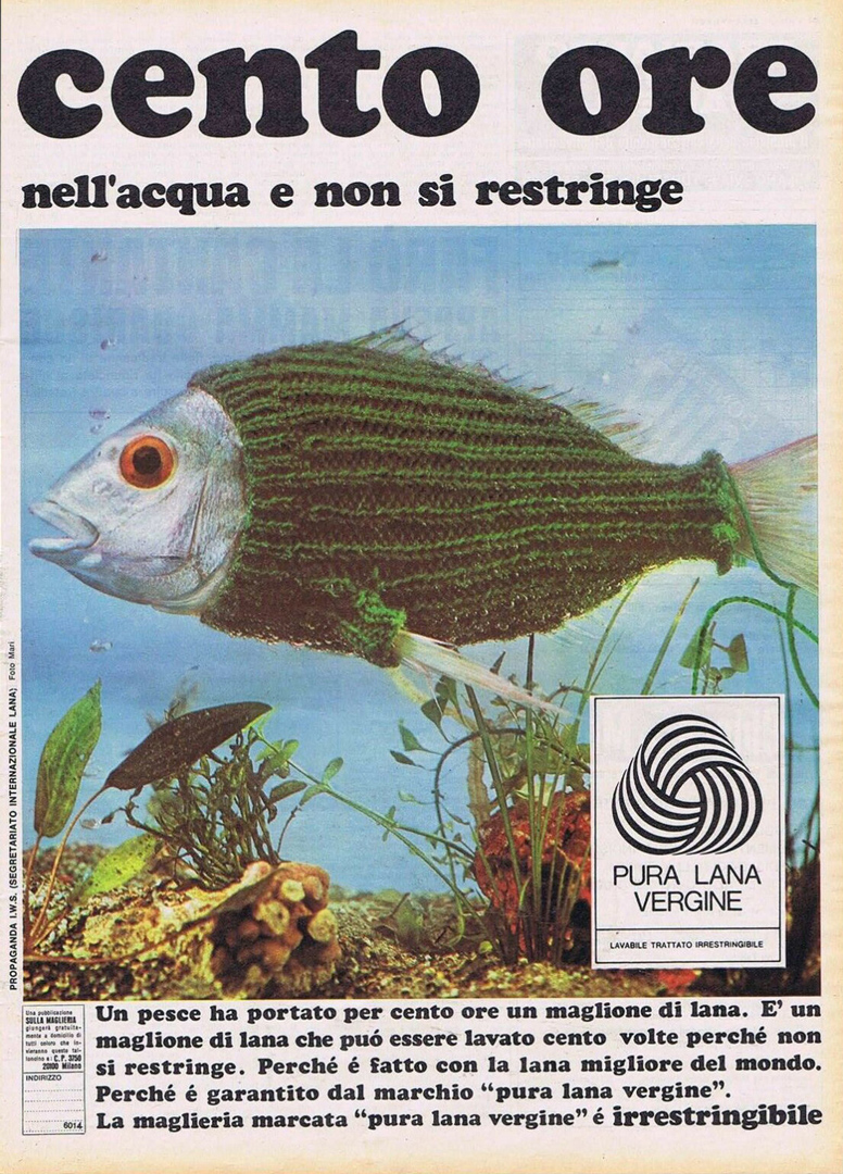
«Grignani was one of the very few masters of graphic design in the 50s and 60s, and his work is very recognisable, most of it in the Woolmark mode.»
(interview with Massimo Vignelli in ‘Creative Review’ – April 2011)
It has been assumed that the Italian Secretariat decided to select an employee from their graphics department as the official author of the logo. Thus, Saroglia (“Seraglio” for the prestigious AGI) was indeed a real person affiliated with the IWS, and not just an alias chosen by Grignani. The hypothesis from a few years ago, which claimed that Francesco Saroglia was merely a pseudonym, is objectively incorrect. However, in the digital age of ‘copy-&-paste’, this misconception has unfortunately gained some traction on the web. Recent historical sources I uncovered support the contrary view: an ad for the Italian branch of the IWS that appeared in the British magazine ‘Modern Publicity’ n° 39, 1970 is referred to as “Saroglia Francesco – Saroglia Studio Pubblicità – viale Piceno 19, Milan” [°°°: see Ed. note]. Saroglia used the ‘woolly fish’ photographed by Edoardo Mari (who collaborated as a photographer in various ads for IWS Italy) which won the ‘Palma d’Oro’ in 1962, but the ad displays the Woolmark and various adaptations are dated after 1964, including a commercial. As a result, Saroglia kept on advertising ‘his’ logo. However, the extent of his involvement in promoting the logo remains unclear since the IWS ads in Italy rarely credited the art director. “The months since have been busy ones for Mr Saroglia. He is design chief of the advertising agency handling the Secretariat’s publicity in Italy, and he has had a part in the greatly expanded advertising campaign centred around his mark” [from ‘Woolmark News’ – March 25, 1965].
But the lack of other significant works signed by Saroglia, and the fact that he did not even appear at the presentation of the logo to the press at the IWS headquarters in Milan in front of 500 people (February 19, 1965), contributed to the mystery surrounding this person, recently leading to the hasty and erroneous equation: “no works = no person”. In 1965, the IWS released a photo that showed Francesco Saroglia seemingly drawing inspiration from a black and white Möbius-like strip. With evident reference to this image, a completely different version of the birth of the logo idea was spread in 1965 in these terms [from the Dutch magazine Ariadne]: “‘Coincidence’, intuition, helped Saroglia in the design, thanks to his special knowledge of macro-photography. Saroglia’s starting point was: the mark should reproduce the structure of a woollen thread and he started to strip paper marked with black and white lines. Twisting, bending, and shaping the forms thus obtained, he made strong photographic enlargements that he accidentally [sic, Ed.] saw reflected in a mirror – and the international woolmark was born!”, thus forgetting that the studies submitted by Grignani had been far more than a single one. Already in 1964, the same magazine pointed out: “Saroglia has a hobby, which he pursues alongside his work as art director of Studio 37 Pubblicità [°°: see Ed. note] in Milan. That is macro-photography. He incorporates objects or parts thereof in close-up, enlarges them and thus obtains new shapes and compositions”. The ‘Canberra Times’ wrote in 1972 more details on Francesco Saroglia: “Mr Saroglia, who is married and has three children, has been an artist all his working life. He was born at Turin, Italy, and trained for three years at the Albertina Academy of Fine Arts, Turin. At the end of World War II he moved to Milan and went into advertising. Since then he has been art director of a number of Italian advertising agencies”; and, finally, in 1987, the same periodical changed once more the aforementioned version, stating that “Saroglia said he was inspired to produce his design from the winter frost patterns on a window of his home”…


“Of his successful Woolmark design he [Saroglia, Ed.] says modestly: «It was just one of those ideas that come into one’s mind perhaps once in a lifetime and is successful because of a happy combination of circumstances.»” [from ‘Woolmark News’ – magazine from International Wool Secretariat HQ Press Office in London – 2nd June, 1964]
«I think this one will last, and I think people see its meaning»
(interview with Francesco Saroglia in ‘Woolmark News’ – March 25, 1965)

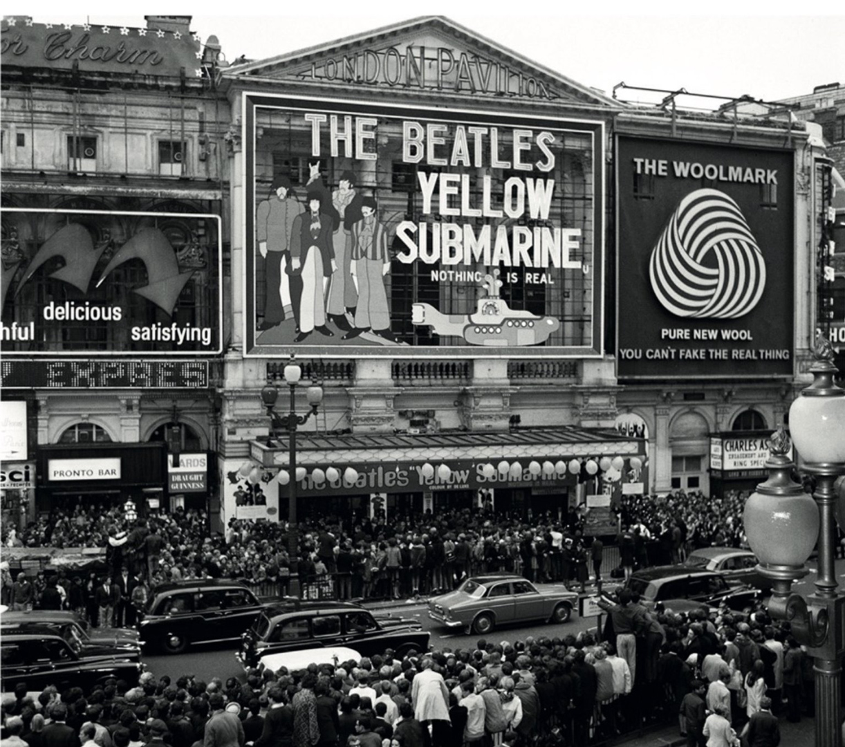
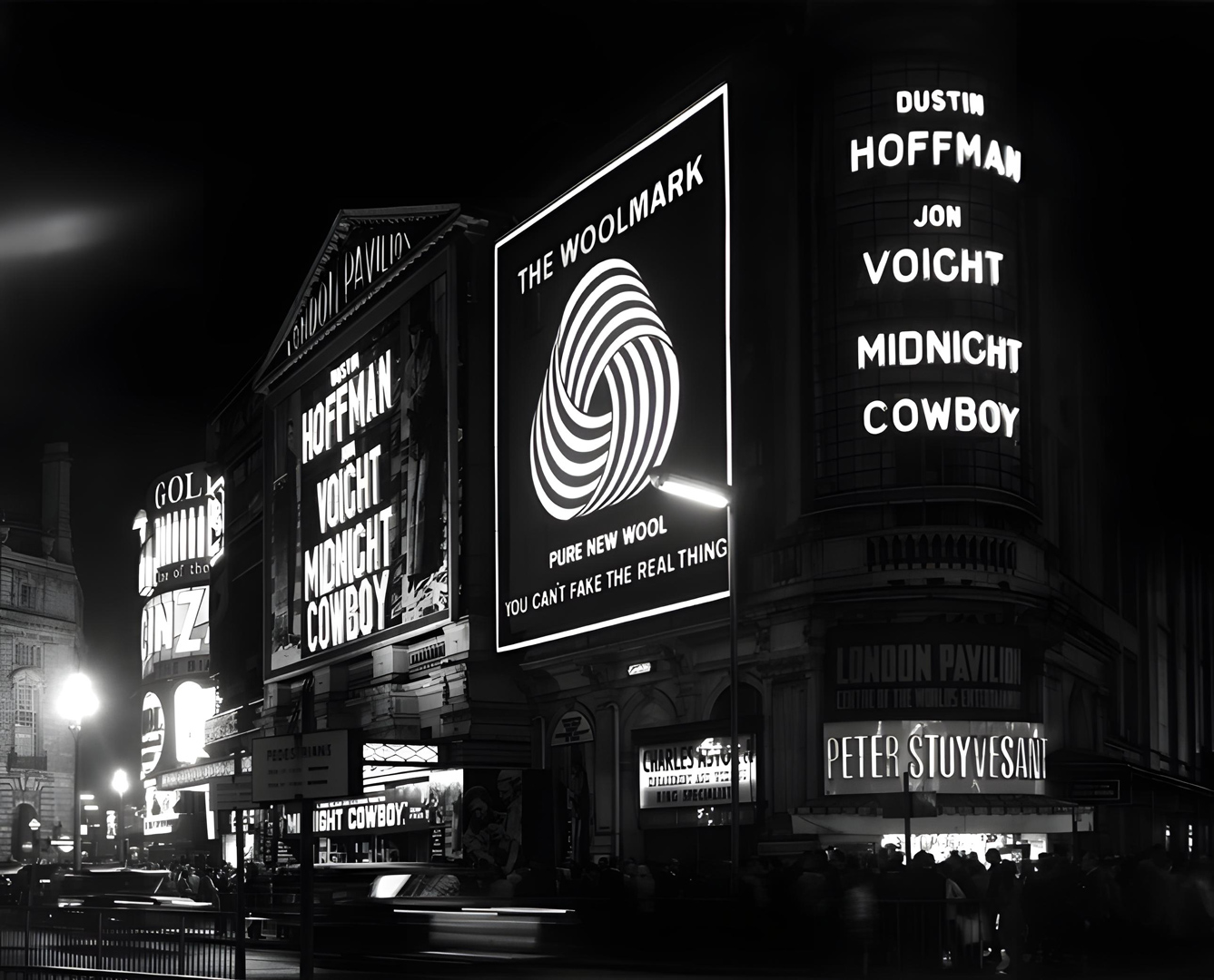
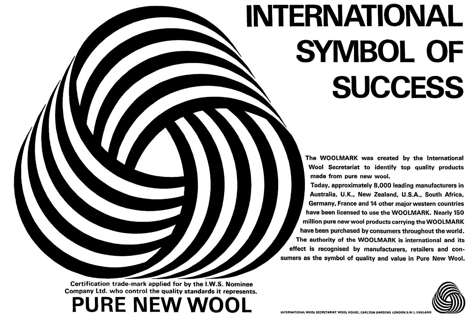
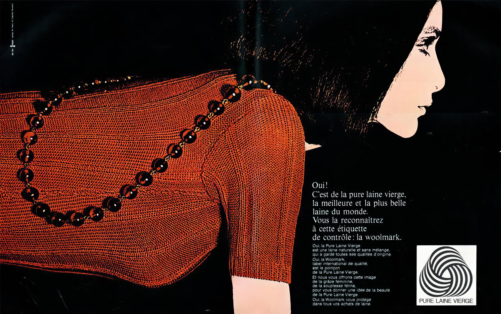
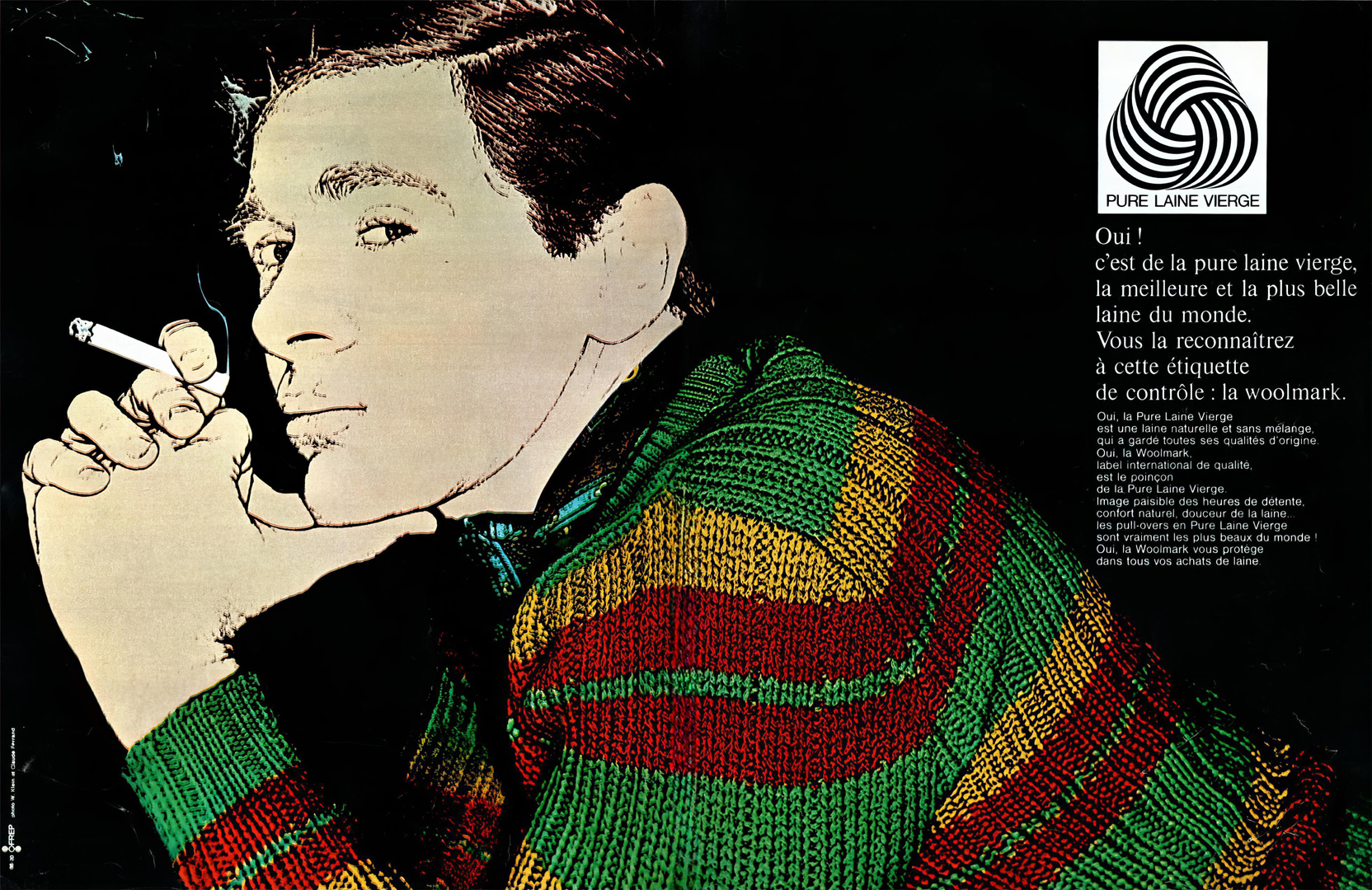
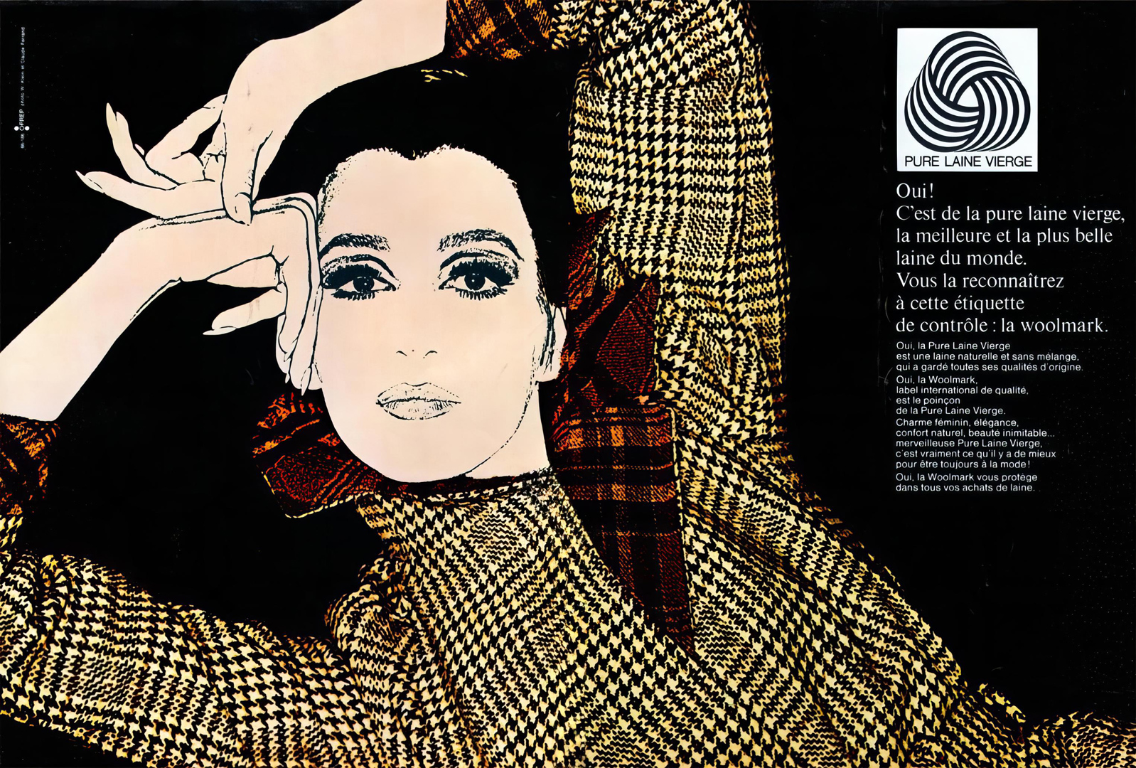
Announced in Britain on January 17, 1964 [from ‘Birmingham Daily Post’, 18/01/1964], and launched on September 18, 1964 – only for worsteds and knitwear and, from 1965, spread to other woolens [from ‘Birmingham Daily Post’, 17/09/1964] – the elegant logo (called “Woolmark” from 1964), according to the Woolmark Company, “has helped reinvent the global perception of wool as a natural, contemporary and glamorous fiber”, and by 1997 more than $1 billion was said to have been spent in promoting it (recognized in 1987 by more than 400 million people all over the world), but Grignani never got a penny in royalties for it.
“Less conventional promotions were mounted: the Pope blessed the mark in the Vatican for the Italian launch; English sailor hero Sir Francis Chichester sailed single-handed round the world against prevailing winds and currents with the symbol on his cap and bows; wool-clad athletes ran the length of America’s Death Valley; Miss World carried the symbol to countless fashion shows in 1966…”
(John Wilcox, IWS Area Director 1963-1980)
20-years-old Ann Sidney from Dorset, crowned ‘Miss World 1964‘, also signed up as the wool ambassador throughout her ‘reign’, with the aim of helping to launch the Woolmark internationally with a planned journey of 50,000 miles [from ‘Coventry Evening Telegraph’, 26/11/1964]. “The signing was made because the Secretariat wanted a public relations vehicle to get through to the teenage and early twenties market” [from ‘Wool Industry Act – Annual Report of the Australian Wool Board, for Year 1964-65‘], despite not being a “top professional model” [from ‘The Bulletin’, 10/07/1965].


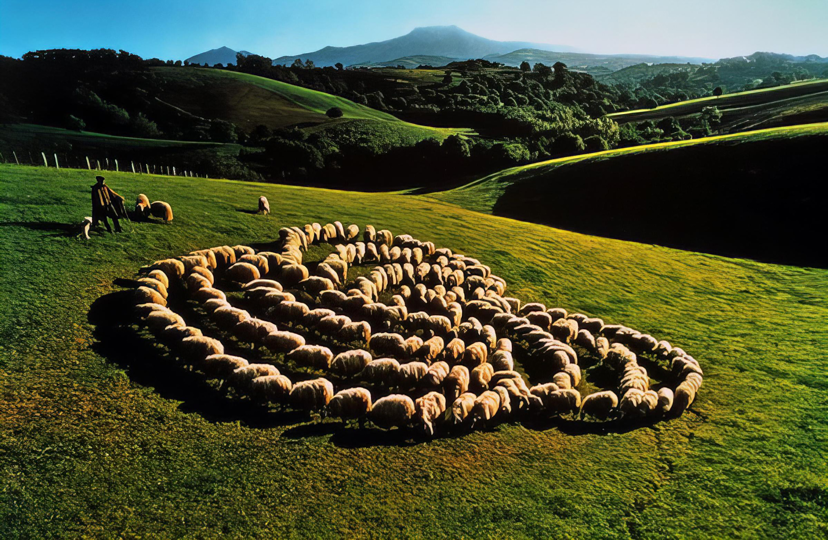
The French poster above intrigued everyone who saw it. “The concept was brilliant and the team who solved the problem of finding the right location, the right shepherd and the right photographic solution to produce the final subtle effect, provide a supreme example of co-ordination”, wrote the British magazine ‘Modern Publicity’ in 1975, dedicating its cover to it. Photographer Daniel Aron took this photo without any special effects, except for the fact that the sheep were all attached to a stake … as was detected by the public during the pre-tests.
“For the Japanese launching, a tower 54 feet high, illuminating the symbol in neon, caught the eyes of thousands when it was switched on by Daitobo, the large wool textile firm that erected it” (from ‘Woolmark News’, Sept. 18, 1964 – when Tokyo hosted the first Olympic Games held in Asia).

The U.S. was awarded a ‘Silver Anvil’ award (which symbolise the forging of public opinion) from the Public Relations Society of America for its skilled launching of the Woolmark logo (from ‘Foreign Agriculture’, July 5, 1965), and by the end of 1966, the logo was voted as the best “trade stimulator” of America’s heavily-promoted consumer symbols (from ‘Woolmark News’, Jan. 3, 1967).
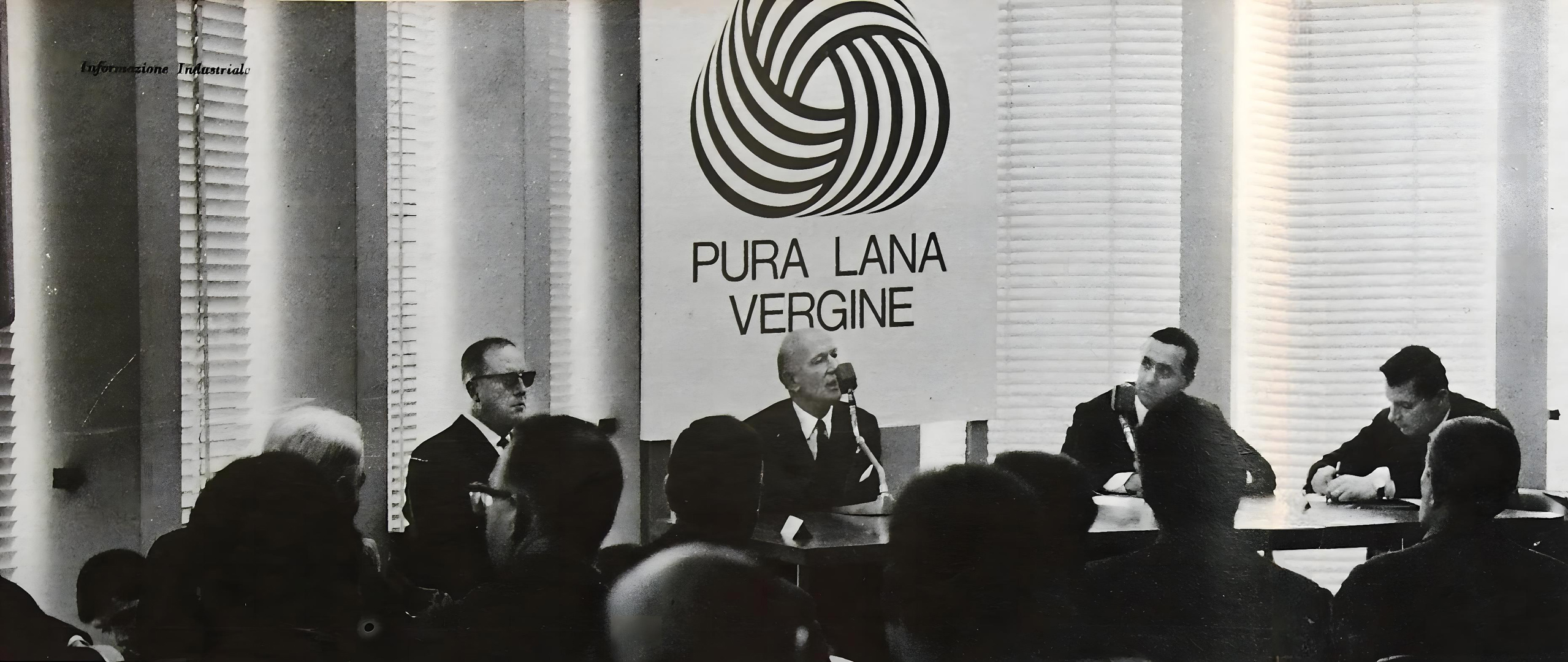
In Italy, after an initial campaign by magazines, Reginald G. Lund – Regional Director of IWS branches in Europe – together with Ulderigo Salvi – IWS Officer in Charge for Italy – and the President of the IWS Advisory Committee, presented the Woolmark on February 19, 1965, in front of 500 retailers from all over Italy. This event took place at the Milan headquarters of the IWS (‘Palazzo di Fuoco’). It was part of ‘Six days of wool’, aimed at studying the means of defending the quality of wool, through meetings held throughout Italy [from ‘Corriere della Sera’, 20 & 21 Feb. 1965]. The journey culminated in Rome, with a special audience with Pope Paul VI, who was presented with a gold medal bearing the Woolmark logo. For Christmas 1965, a long red carpet adorned with the Woolmark was laid down the length of the Galleria Vittorio Emanuele in Milan [from ‘The Times’, 30 Dec. 1965]. The first Italian company to obtain the right to use the Woolmark certification (licence n° 1, granted on May 20, 1964) was ‘Lanificio Ermenegildo Zegna’, “the world’s biggest individual buyer of fine quality wool at Australian auctions” (from ‘Woolmark News’, 22 Sept. 1964), for which Grignani developed a series of innovative ads in the years 1964-1968. He also served as the Artistic Director of the magazine ‘Top‘ (launched in 1966).
The question of the authorship of the Woolmark was raised soon after its creation. However, it was not until years later that Grignani publicly declared that he was the designer of the logo. I found a written source in an interview with Donato Matarelli in the magazine ‘Parete’, n° 15, Apr. 1970, and confirmation from a recent (Oct. 2021) phone interview with Giancarlo Realini (a physicist born in 1938, with whom Grignani collaborated) that Franco stated to him in 1971 that he was the author of the logo inspired by the ball of yarn. But, adding to the confusion, some reporters began attributing it, by similarity, to Bridget Riley [‘The Times’, 21 July 1971].
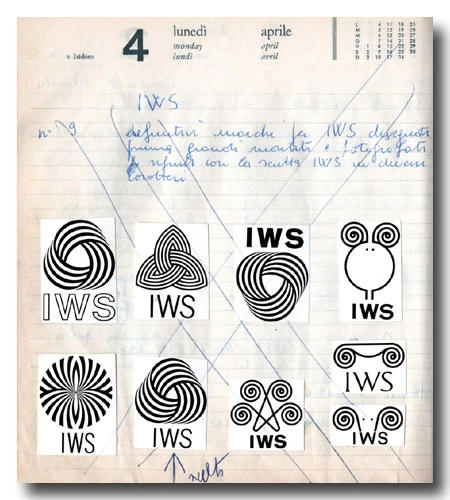
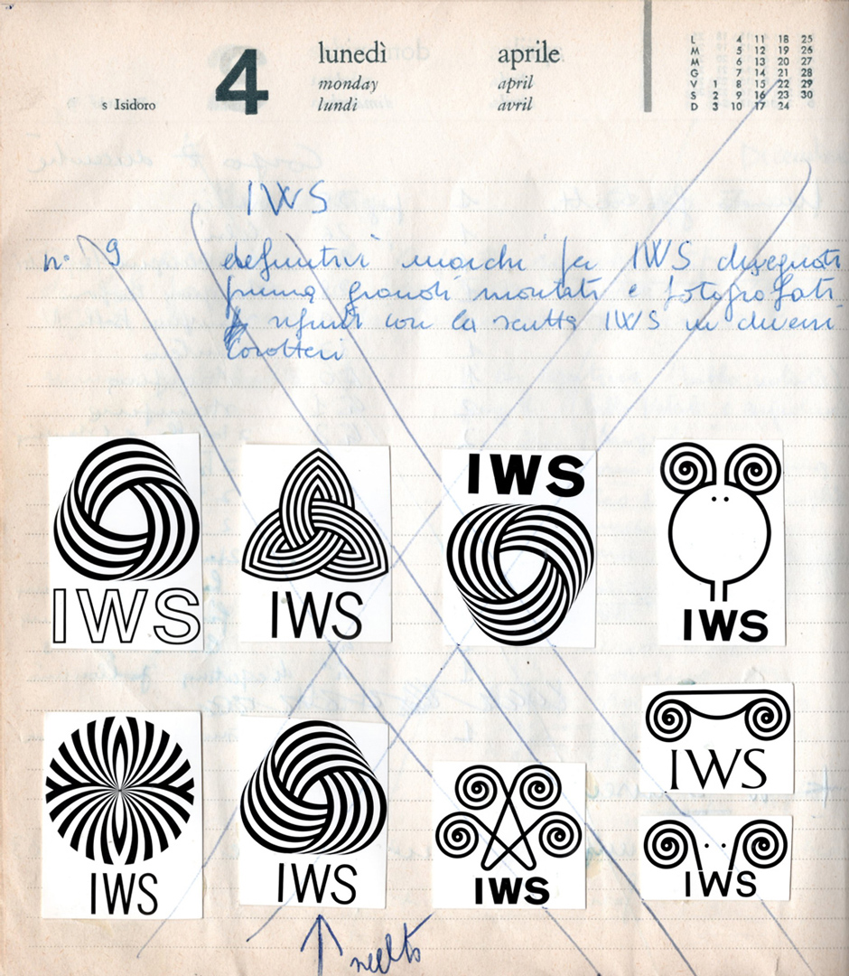
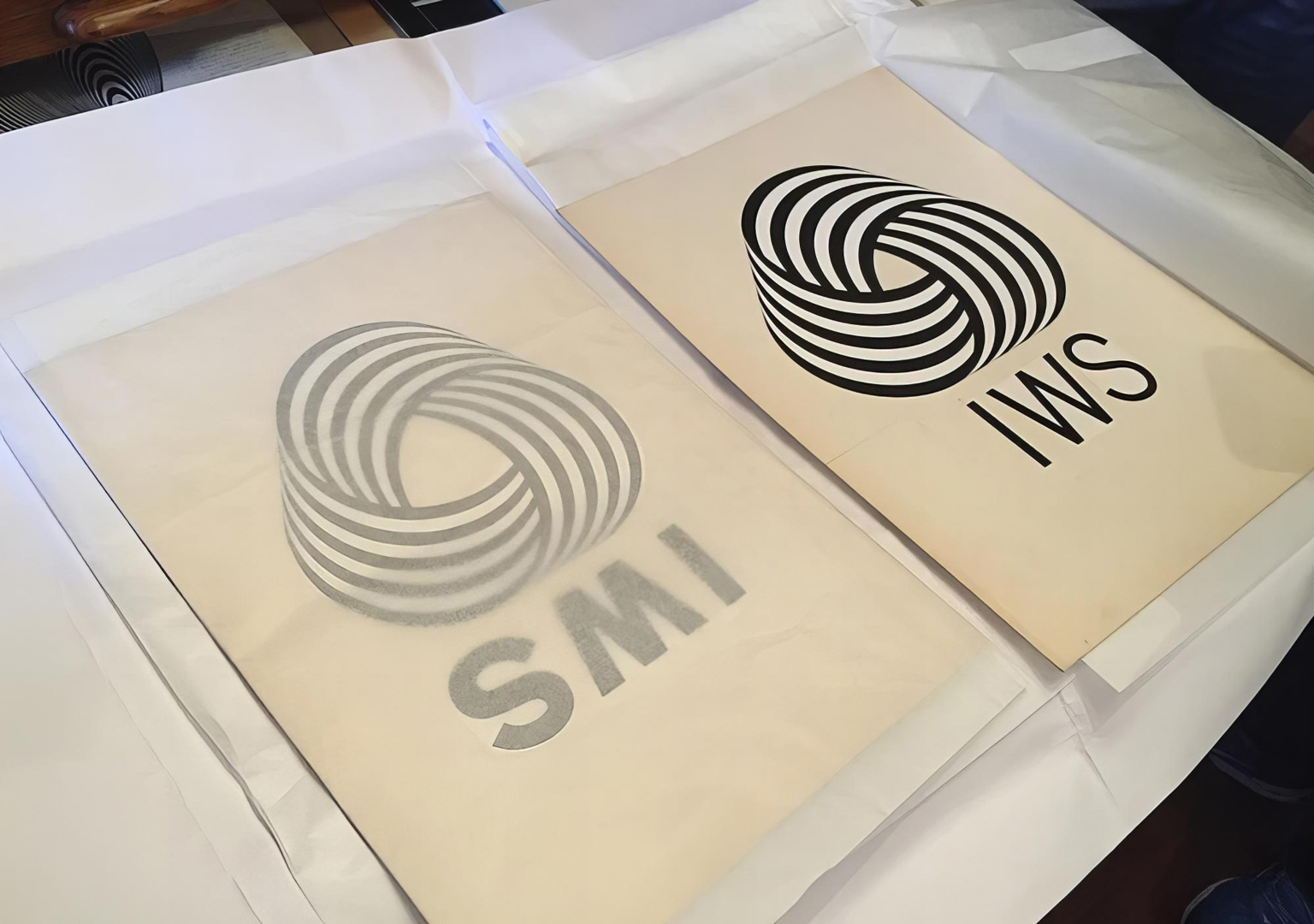
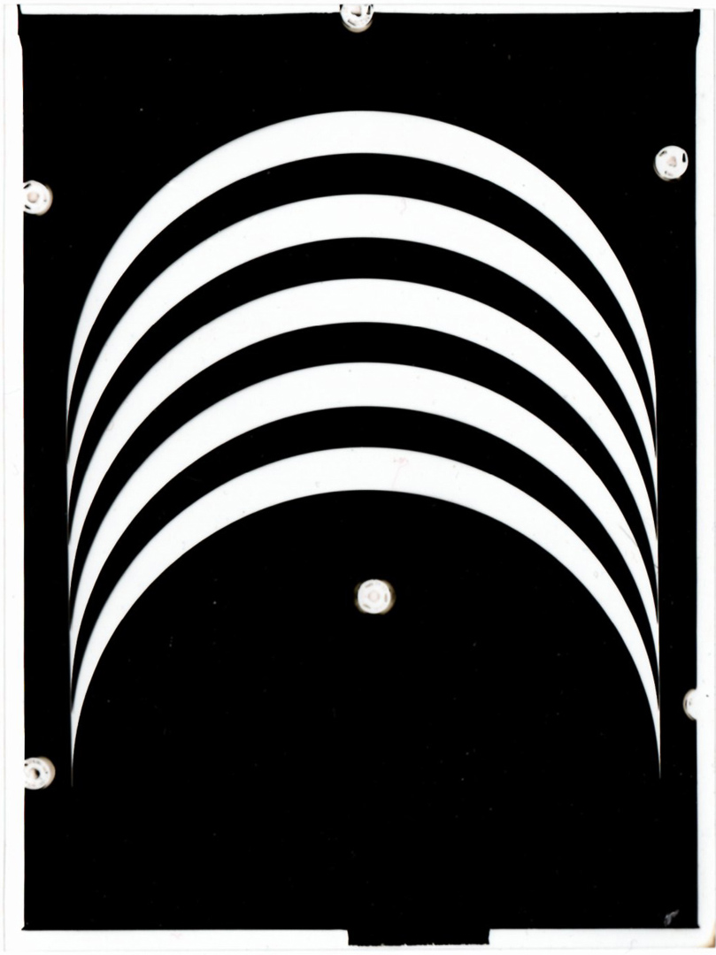
It wasn’t until 1995, when Franco Grignani was 87 years old, that he displayed, at an exhibition for the fiftieth of Aiap, the nine proposals for his logo. These were photographically reproduced in an old organiser from 1960. This organiser was used by his assistant to classify in chronological order some works carried out during 1963-64 (the marked blue crossing on the page means ‘done’); this page refers to works of December 1963:
The original proposals (on cardboards 31.5 x 43 cm) were rediscovered only in 2013 and exhibited in 2014, along with some photographic negatives – representing far more studies than the nine submitted to London – originally stored in metal canisters under the label “IWS”:

The design of a mark, for a designer, is one of the most autonomous and exciting tasks as he tries to pour into the design of a mark all his graphic sensibility: ability, knowledge, the synthesis of sign language.
(from the introduction by Franco Grignani of the volume “3x trademarks“, 1967, published by the Total Design agency in Amsterdam)
Still in 2014, Australian Wool Innovation Chief Strategy and Marketing Officer Rob Langtry declared that “The logo’s strength is in its simplicity: five black bands criss-crossing to form a skein of wool which perfectly represents the softness, elegance and modernity of the fibre. It is one of very few long-running logos that still feels contemporary despite not having been altered since its creation.”
[°] “SPIRITI, Guido, advertising expert, manager Studio 37 Pubblicità Milano; b. 16 May 1911 Milano; Ancest. father trade unionist; Educ. commercial college; Career: after the war with Pirelli and Franck (advertising assistant), since 1946 advertising development for clothing, leather goods and shoes; Publ. contributor to “Milano ha cinquant’anni” and “Novus”; Awards: Rizzoli Prize, Gold Medal for advertising FIP; Member: Associazione Tecnici Pubblicitario, Elenco speciale stampa, Periodica dell’Ass. Italiana Giornalisti; A. Viale Piceno, 19, Milano/Italy.” [from ‘WHO’S WHO in the Common Market’s Press and Advertising‘, 1965 – p. 465]
[°°] The death of Guido Spiriti should be traced back to 1969, as that year Stella Spiriti became “the owner, after the death of her brother, of the periodical ‘Novus‘”, connected to ‘Studio 37 Pubblicità‘ [from ‘Rivista di diritto industriale’, Giuffrè, 1976]; Novus was a quarterly international technical magazine.
[°°°] further researches in historical archives in Milan led me recently to discover these official data: ‘Studio 37 Pubblicità’ di Brancaleon Luigi (who in 1964-66 participated in numerous delegations abroad – USA & Japan – with the management of the famous national newspaper ‘Corriere della Sera’) opened on March 15, 1961, and was located in Piazza Risorgimento, 10 in Milan, then moved on August 1, 1962, to Viale Piceno, 19 (less than 1 km from the previous headquarters), closed on March 31, 1969, and contextually changed its name to ‘Saroglia Studio Pubblicità S.A.S.’ di Saroglia Francesco (born 21/01/1922, lived some 500m from the Studio), but early closed again on March 15, 1971; ‘Woolmark News’, a magazine from International Wool Secretariat HQ Press Office in London, stated in 1964 that Studio 37 Pubblicità in Milan was “the IWS’s advertising agency”.
[a] ‘Design’, n° 185, May 1964
[b] ‘Domus’, n° 430, Sept. 1965
[c] ‘The Times’, supplement on Australia, March 1966
[d] ‘Panorama’, n° 31, April 1965
[*] courtesy of Daniela Grignani
[1] graphéine
[7] AIAP / CDPG Centro di Documentazione sul Progetto Grafico, courtesy of Lorenzo Grazzani
[2] CREATIVE REVIEW
[5] Veder bene, courtesy of Bonifacio Pontonio
[9] Unit Editions Studio, courtesy of Bethan Roberts
‘Celebrating 50 years’ pic from wool.com
[special acknowledgements to Rachel Watson, independent researcher in Canberra, and to Paul Wilson from the Museum of Applied Arts and Sciences in Sydney for their invaluable support]
[thanks also to Daniele Fusi from the “Circolo Giuridico” Library in Siena, Italy]
Listen to the Logo Histories Audio about Franco Grignani’s 1964 logo for Woolmark.
Last Updated on 26/07/2024 by Emiliano