This text has been taken from the Italian version published in Franco Grignani – pitture, sperimentali, grafica – Ricerca come arte, exhibition catalogue, Rondòttanta Centro culturale, Sesto San Giovanni, 1979. The same article was subsequently republished on the occasion of the monographic exhibition on Franco Grignani (Progetti di grafica e comunicazione visiva. La riscoperta di un protagonista della grafica italiana), held at the Aiap Gallery in Milan in June 1995.
The English version of the text was additionally published in 1979 in a special issue (European Trademark and Logotypes) of ‘Idea‘, a magazine focused on graphic design and typography, published quarterly in Tokyo from 1953 till now, for which Franco Grignani designed the cover for issue n° 47, 1961, showcasing the ongoing interest the Japanese had (and continue to have, as evidenced by exhibits in 2014) in his works. ‘Idea’ once again featured more of Grignani’s works in issue n° 223 in November 1990, titled “Franco Grignani’s Signs & Symbols”.

My whole work has been based on, and programmed by the research and analysis, as the fundamental attitude, to emphasize the creativity.
Since I have a background as architect and am interested in technique-science the aesthetic problem was solved through the meeting point of image and perceptive phenomena, or between the process for representation and the functional identity to construct the permanent foundation of mnemonic experience by visual communication.
Through new proposition which science on vision pointed out, and through the observation of pre-visual fragments treated with psychological, illusional phenomena flashing across one’s mind, I have tried to find more secret and forgotten traces so that I might propose them as a new area of intellectual interest for the education on sign. Therefore, it was natural that my activity as graphic designer and creator of symbols should examine these phenomenon not only to seek for the method of research to attain the good work, but to control the concurrent production, develop myself, and also to take up the defects. Reviewing the collection in volume which have appeared successively for the past ten years, it is obvious that many of hundreds of symbols illustrated during the period were largely, merely the filiation of the work which were used for a long time and were not deleted because of their structural qualities and originality.
Especially there existed a constant quality in the dimensional relation in proportion to the structural area such as, by constructing a formal identity, coupled and systematically grouped those symbols by any common character. In Europe, America and Asia all the symbols were identical, and, in the recent years, designers who are sensible to the observation of these problems, oriented their ideas to resolve their marks through the formula of logotype, causing to agree it to a safe, potential alphabetical reading.
Men in the primitive world, who had no alphabet, were convinced to identify their extensive, magic world with small signs sketched on the walls of caverns. The circle was the cosmos, or the dynamism. The square was the space and the reality. The triangle was the divinity. But we live in the civilization of alphabet, or in the one of electric communication, travel with supersonic velocity, and the signs and symbols are extended on the immense area to identify a micro fragment of any object and significance. Each product has a name, a form, a use and an aspect. They try to excel, to make oneself known over and to overcome the competitive symbol. They try to be included in us in the retinae of our eyes, in the sub-consciousness, and in our memories. For these numerous reasons the creative work of graphic designers who are engaged in the specialist area, has become much complex and difficult, and, personally as I belong to the group, I needed to inquire myself if the means to my disposition was sufficient and perfect to realize good result of my work.
On my judgment I have always attached a precise, exterior indication to each symbol as each man has his own face. Although the perceptive action may be complex by irrational situation and space, we should always conquere the incongruity of methodology which is yet unknown to us.
The base of valuation is always human being between two bases of thought and sense. The sense is measurable in the physical grading, but, as human being is limited, it should invent a tool to increase the vision, like eye-glasses and microscope……. The thought stays, instead, in the charge evoking to explode by the significance of our symbols.
Now, when I review some designs of my marks included in the pages of this IDEA Special Issue, it seems right to me to give informations which have guided my projects with the experience of a long professional formation and for the inspired, subjective criterion.
Tutta la mia attività, sin dal suo inizio, si è posta come base e programma, la ricerca e l’analisi, come atto fondamentale per accentuarne l’atto creativo. Provenendo io dall’architettura e da interessi tecnico-scientifici, il problema estetico si è espletato attraverso i punti di incontro tra immagine e fenomeno percettivo o meglio, tra il processo rappresentativo e l’identità funzionale, per costituire con la comunicazione visiva, il fondo permanente della esperienza mnemonica.
Dalle nuove proposte che la scienza del vedere indicava e dalle osservazioni di frammentazioni pre-visuali tratte da balenanti fenomeni psico-illusori, io cercavo di catturare i segni più segreti e sfuggenti per proporli come un nuovo spazio di interesse mentale per l’educazione segnica. Era quindi naturale che la mia attività di graphic designer e creatore di simboli, prendesse in esame questi fenomeni non solo per ricercare i metodi di indagine per il conseguimento di un buon lavoro ma per controllare la produzione concorrenziale, la evoluzione e anche processarne i difetti.
Sfogliando le raccolte nei volumi che in questi ultimi dieci anni si sono succedute, sempre di più fittamente, saltava subito all’occhio che fra le centinaia di simboli ivi illustrati, molti erano semplicemente filiazioni di quei segni capostipiti che, per qualità strutturale e originalità, il tempo e l’uso non riuscivano ancora a cancellare. Esisteva soprattutto una costanza del segno nel suo rapporto dimensionale in proporzione all’area strutturale tale da costituire una identità formale che accompagnava e raggruppava questi simboli in batterie indistinguibili. In Europa, in America, in Asia, tutti i segni erano identici, tanto che negli ultimi tempi, molti designers sensibili all’osservazione di questi problemi, si sono orientati a risolvere i loro marchi attraverso la formula del logotipo, affidando ad esso una sicura potenziale lettura alfabetica.
L’uomo primitivo, non possedendo ancora l’alfabetizzazione era indotto ad identificare con pochi segni tracciati sulle pareti delle caverne il suo esteso mondo magico. Il cerchio era il cosmo, il dinamismo; il quadrato era lo spazio e la realtà; il triangolo, la divinità.
Ma noi viviamo nella civiltà alfabetica, nella civiltà delle comunicazioni elettriche, viaggiamo a velocità supersoniche e i segni e i simboli si sono estesi su immense aree a migliaia di migliaia per identificare una micro-frantumazione di oggetti e di significati.
Ogni prodotto ha un nome, ha una forma, ha un uso, ha un aspetto. Vuol primeggiare, vuol scoprirsi, vuol cancellare il segno concorrente. Vuol inserirsi in noi, nella retina del nostro occhio, nel nostro subconscio, nella nostra memoria; per queste infinite ragioni il lavoro creativo del graphic designer che opera in questa specialistica area è diventato molto complesso e difficile … e personalmente appartenendo a questo gruppo ho avuto bisogno di chiedermi se i mezzi a mia disposizione erano sufficienti e perfezionati per il buon risultato del mio lavoro.
A mio giudizio ho sempre attribuito ad ogni segno una precisa indicazione fisionomica come ogni uomo ha la sua faccia. Anche se l’atto percettivo è complicato da situazioni e spazi irrazionali, si deve sempre, attraverso la sensibilità personale e la preparazione culturale di base scientifica vincere le incongruenze di metodologie a noi ancora ignote. La base di valutazione è sempre l’uomo fra i due capisaldi di senso e di pensiero. Il senso è misurabile nella sua gradualità fisica ma, limitato com’è l’uomo, ha dovuto inventare gli arnesi per aumentare la vista: gli occhiali e il microscopio … Il pensiero sta invece nella carica evocativa che esplode dal significato dei nostri simboli. Ora passando in rassegna alcuni disegni dei miei marchi che in questo numero speciale della rivista “Idea” illustra nelle sue pagine, mi sembra giusto dare quelle informazioni che hanno guidato la mia progettazione con l’esperienza di una lunga formazione professionale e per i suoi criteri soggettivi ispiratori.
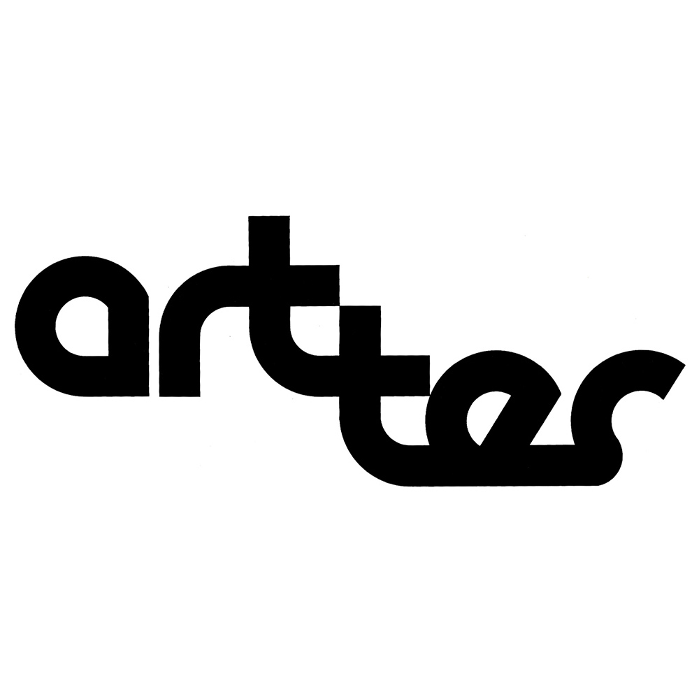 | The mark of “art tes” is constituted with two parts of the Italian words “tessuto d’arte”, and the two symbolizes the needleful of two threads. That is to say, it is the change from two handwritings by characteristics and easy legibility. | Il marchio art tes è costituito da due frammenti di parole tratte dalla frase italiana “tessuto d’arte” dove le due t simboleggiano l’agugliata di due fili; lo spostamento delle due scritte dà la caratteristica e la facile leggibilità. |
| The mark of “Giancarlo Puecher” is dedicated to a world of political culture, that is to say, to persons with the capability to ascertain the relation between form and significance as the specific indication which the culture is not a nationalistic subject, but a knowledge in a wider and coordinated context, or to the ones who have the capability to effectively render to act of the recognition of the square parts symbolized with perpendicular lines. | Il marchio Giancarlo Puecher è dedicato ad un circolo di cultura politica cioè a persone capaci di stabilire rapporti tra forma e significato tale da rendere operante l’atto di riconoscimento della simbologia dei due quadrati posti con rigature ortogonali, per la specifica indicazione che la cultura non è un fatto nozionistico ma una conoscenza che sta in un contesto molto più ampio e coordinato. |  |
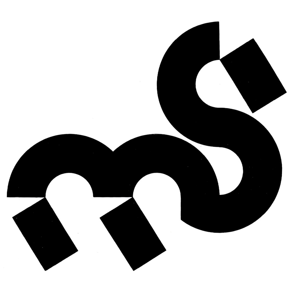 | The logotype “School World” is dedicated to an artistic exhibition of the design for the infant. The letters of m and s (as the diction of the Italian words “mondo della scuola”) are combined to represent the scheme of a pony a symbol of prime, infantile recognition. | Il logotipo School World è dedicato a manifestazioni artistiche del disegno infantile; le lettere m e s (per la dizione italiana: mondo della scuola) sono combinate per rappresentare lo schema di un cavalluccio, simbolo delle prime raffigurazioni infantili. |
| The mark of “Ceramica Falcinelli” is for a maker of the decorative ceramics for wall and floor, and the contour of fan-shape in square emphasizes the exposition of the products and shows the variety of the model of this kind. | Il marchio Ceramica Falcinelli è per una fabbrica di piastrelle in ceramica per rivestimenti e pavimenti, dove la sventagliatura dei contorni dei quadrati sottolinea l’esposizione di questo prodotto e mostra una varietà di questi modelli. |  |
 | The mark of “Carpefin” is dedicated to the product of woven yarn which help to manufacture the texture for house-floor. Symbolically, the yarn is woven intended to represent a flower (beauty) in the part of the curve, and a pattern in the lower part. It is a design produced in quite simplicity and clearness for memory. | Il marchio Carpefin è dedicato alla produzione di un filato che servirà poi alle manifatture per tessere “moquettes” per pavimenti. Nella sua simbologia il filo è inteso nella parte curvata come un fiore (bellezza), nella parte inferiore come trama. Il tutto semplice e facile da memorizzare. |
| The mark “Chemi” is for a chemical company making some basic material. The three C symbolize the decantation and purity of the process of the production. | Il marchio Chemi è per una industria chimica che produce prodotti di base. Le tre C simboleggiano la decantazione e la purezza dei prodotti nelle fasi successive dei procedimenti. |  |
 | The mark “Helycoter Breda Nardi” is for a maker of small type helicopter. It represents the state that a fresh fly-dragon lightly lands on the point like a ballerina. | Il marchio Breda Nardi è per una fabbrica di piccoli elicotteri: una libellula, fresca di ali che atterra lieve sulle punte come una ballerina. |
| The mark “Nono Piano” is for a culture center concerning visual communication. The four cubic form constructed in geometric perpendicular order with emphasis placed on difference between physical reality and intellectual reality, which result in an unbalanced appearance to the eyes. | Il marchio Nono Piano è per un centro di cultura che si interessa di problemi di comunicazione visiva. Le quattro forme cubiche, pur essendo esse combinate in un ordine geometrico ortogonale, risultano all’occhio squilibrate, sottolineando la differenza fra la realtà fisica e la realtà percepita. |  |
 | The mark “Delchi” is for a maker of air-conditioners. The initial D is constructed as it is like filter in order to symbolize the purity of air in an ambient. | Il marchio Delchi è per una fabbrica di condizionatori d’aria, per cui la D iniziale è costruita come se fosse un filtro per simboleggiare la purezza dell’aria in un ambiente. |
| The mark “AerHotel” is for a company of programming an air tour. The dynamism of the rear part of an airplane flying is impressive. | Il marchio AerHotel è per una organizzazione che programma viaggi turistici attraverso i servizi aerei e alberghieri. Il dinamismo impresso nella forma sfuggente ricorda la parte posteriore di un aereo. | 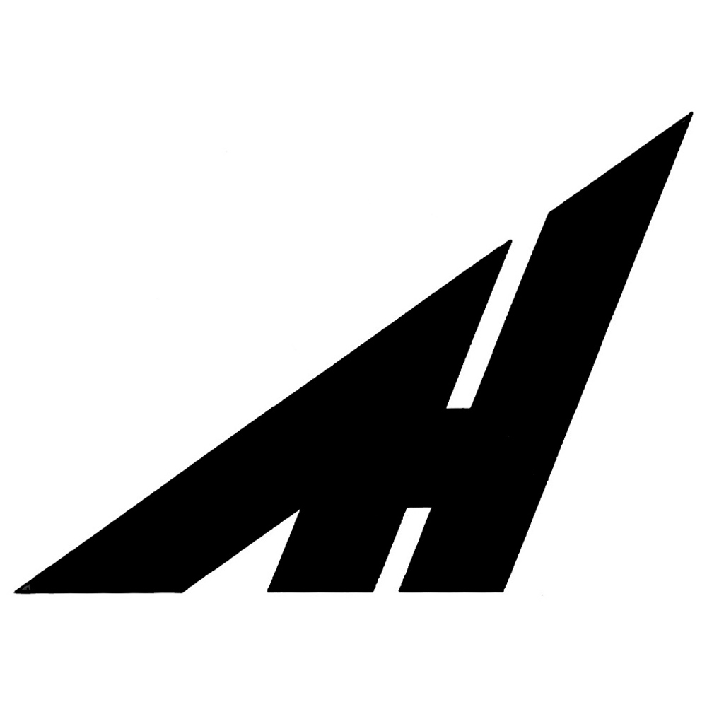 |
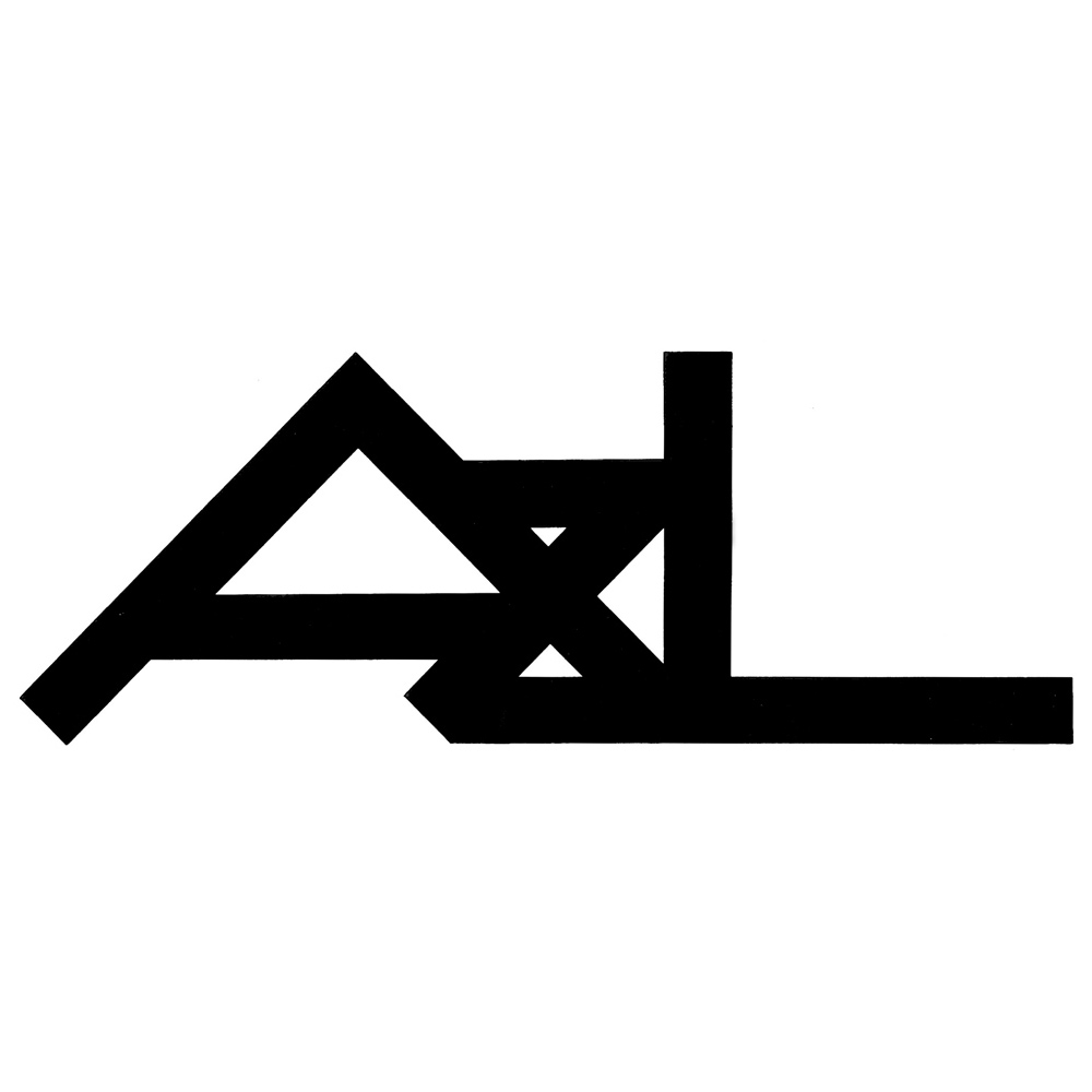 | The mark for a printing company Alfieri & Lacroix was intended to illustrate the equipment in the mill, being completed as the logotype representing winding of symbolic roller. | Il marchio per la tipografia Alfieri & Lacroix è inteso a illustrare l’attrezzatura degli impianti, ecco il logotipo avvolgere il cilindro di una simbolica rotativa. |
| The symbol for the Experimental Museum of Livorno is designed for the use of the publicity of a project. The d is two-dimensional in the layout, and at the same times becomes three-dimensional to symbolize the products. | Il simbolo per il Museo sperimentale di Livorno è stato disegnato per una manifestazione di progettazione e di sviluppo nel campo del Design. La D è bidimensionale nel progetto e contemporaneamente diventa tridimensionale per simboleggiare il manufatto. | 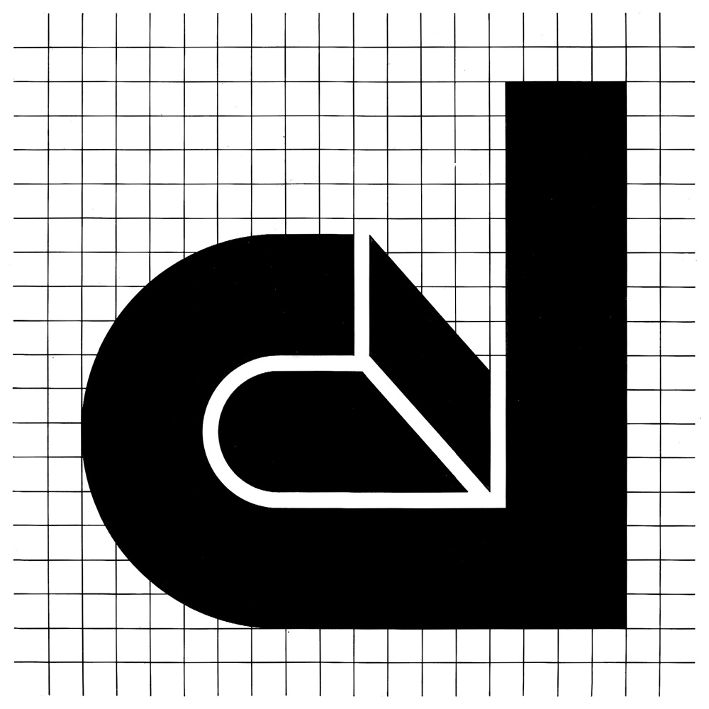 |
The above mentioned examples are listed to indicate the correlation between the form and the significance. But it should not be forgotten that the form is the total of the qualities visually treated as configuration of space. The most essential and logic image of mark avoids insignificant decoration and does not wish repetitive diffusion and is penetrated in the memory. Let us inquire ourselves in this respect: how much does a mark value?
The answer will be given by a graphic designer himself when he works with his entire responsibility.
Questa breve elencazione è stata fatta per indicare per ogni marchio, le correlazioni tra la sua forma e il suo significato, ma bisogna pensare che la forma è anche la somma delle sue qualità apparenti imposte alla percezione dell’occhio tramite la sua configurazione spaziale. I fenomeni di tensione e di induzione racchiusi nella sua struttura aiuteranno l’osservatore ad incidere nella memoria i suoi connotati. Il marchio, questa immagine, la più essenziale e la più logica, eviterà la gratuita decorazione e non vorrà essere un segno alla moda. Sarà durevole nel tempo, perché il marchio è un grosso investimento economico e con la sua diffusione ripetitiva educherà alla individuazione e si inciderà nel ricordo.
A questo punto ci chiediamo: quanto vale un marchio? … La risposta la può dare anche il graphic designer quando impegna tutta la sua responsabilità.
more logos in the post Trademarks and the Gallery…
[all pics from Grignani archive – courtesy of Daniela Grignani]
Last Updated on 21/10/2024 by Emiliano