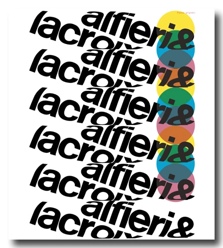


Alfieri & Lacroix (to be pronounced as ‘Lah-crwàh‘) holds a significant role in the history of the Italian graphic industry.
Established in Milan in 1898 by Edoardo Lacroix and Emilio Alfieri, Alfieri & Lacroix was a major print house specialising in fine art printing. Lacroix handled the technical aspects, while Alfieri managed finances and administration. Since 1923, the management of the photoengraving department was managed by Dario Morani (a pharmacist, sportswriter and director of an avant-garde gallery in Pavia [a]), who later in 1942 [b] joined as general manager. In 1924, in addition to Morani, Antonio Crespi, who acquired the society from its founders, brought on board Antonio Boggeri, a musician and photographer and Crespi’s former military school classmate, to join the team.
Boggeri learned to manage the printout in its complete process, from design to the final product, and by 1933 he founded the legendary Studio Boggeri, a masterpiece in graphic design history and one of the world’s premier design studios. The studio boasted collaborations with luminaries such as Albe Steiner, Aldo Calabresi, Armando Milani, Bob Noorda, Bruno Monguzzi, Bruno Munari, Carlo Vivarelli, Enzo Mari, Erberto Carboni, Ezio Bonini, Fortunato Depero, Franco & Jeanne Grignani, Imre Reiner, Marcello Nizzoli, Max Huber, Remo Muratore, René Martinelli, Roberto Sambonet, Walter Ballmer, Xanti Schawinsky, and many others.
Alfieri & Lacroix pioneered a then-new form of printing technique known as zincography, or photogravure. In the postwar era, Morani needed to restore the printing house’s status as a high-quality commercial firm that remained technologically cutting-edge. To achieve this, he enlisted the expertise of another collaborator from Studio Boggeri: Franco Grignani.
Boggeri held the belief, as reported by the Ticino-born Bruno Monguzzi, that perfection, akin to the Swiss credo, was not enough in graphics (referred to as ‘the cobweb theory‘). In his own way, Grignani managed to “de-sterilize the rigor”, and in a joyful and unrepeatable period within the so-called ‘milanesi terribili’, contributed to the amalgamation of two cultures: “the Swiss, logical and constructive, and the Italian, poetic and libertarian” [Bruno Monguzzi, 2011]. Grignani was aware that “normally the graphic composition in Italy and Switzerland (taken as a model) tended towards a distribution of elements in a position of rest. But communication itself is dynamic” [from the Italian-French magazine ‘arte e società’, 6/7, 1973].
“Though some trends in the world of design, in the teaching that is done in the schools, are for stressing the need for balance among similar spaces, to produce a feeling of contemplative motionlessness, all the rules of strict form and all balanced structurings yield silence.”
[from the text read on the occasion of ‘Vision 65‘, the first ‘World Congress on New Challenges to Human Communication’, Carbondale, U.S.A., 1965]
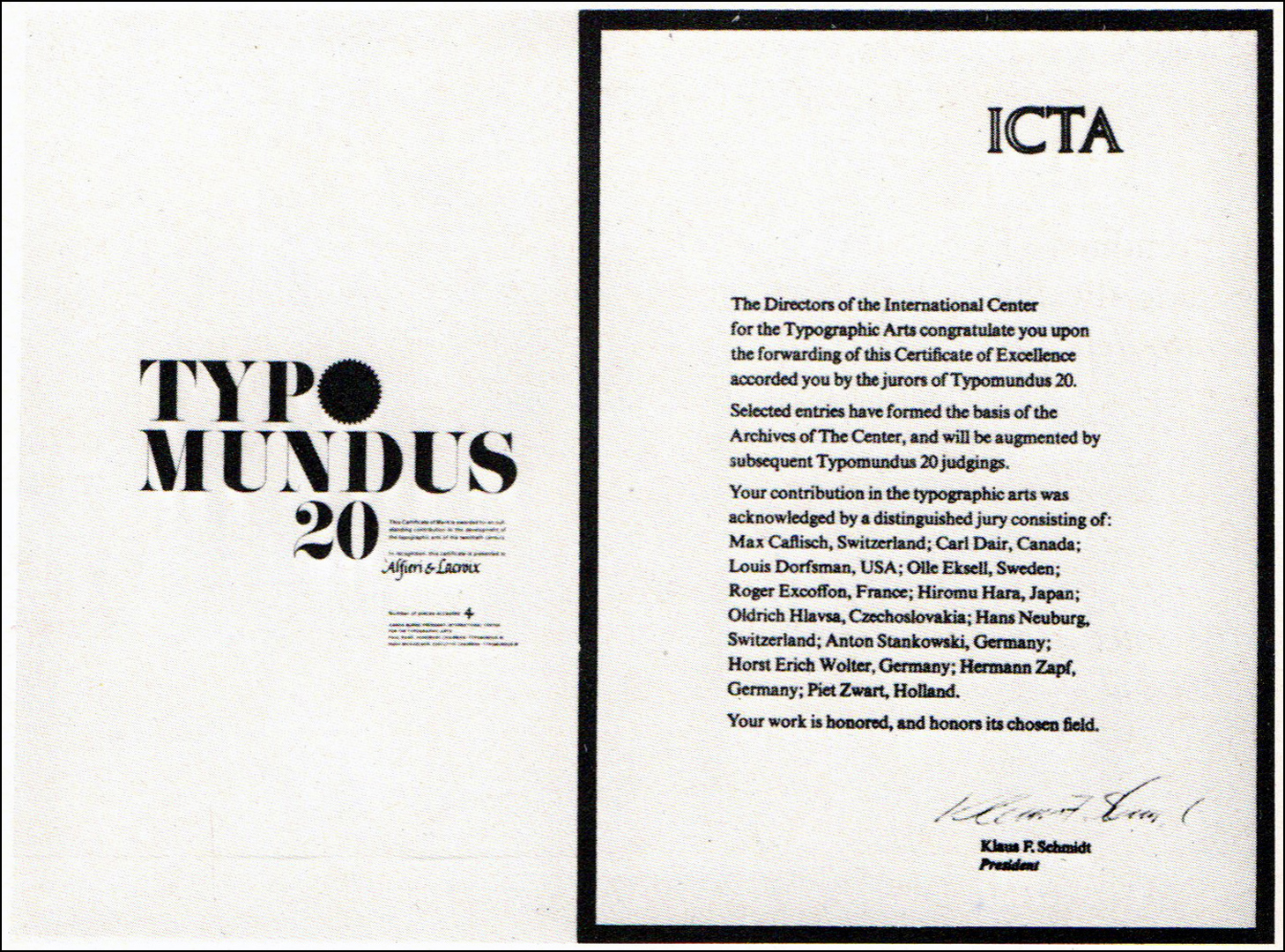
With a modern promotional concept, the advertising campaign carried out by Franco Grignani (all in black with often no more than three colours) garnered recognition from several graphic magazines around the world. It earned him the gold medal of the 11th National Advertising Award for specialized advertising for technical magazines (‘XI Premio Nazionale della Pubblicità per l’annuncio specializzato per riviste tecniche’) [from ‘notiziario Sipra’ n° 9/10, 1961 and ‘Il Poligrafico Italiano’ n° 2, 1962 & 1967] in 1961, and, in 1967, the highly coveted recognition merit of the I.C.T.A. – International Center for the Typographic Arts – of New York for ‘Typomundus 20‘.
“It is difficult to distinguish who deserves the greatest credit for a style that has subverted every current concept of advertising. The speech set out by Grignani in the pages by Alfieri & Lacroix dates back to 1950. It was a disruptive speech. Faced with the possibilities of carrying out an advertising campaign for a graphics industry, Grignani felt the need to operate outside the box and to propose an experimental research. And the fact that he believed in that does not surprise, today, any of those who know his sensitivity as an artist.
[…] When I went to meet him [Dario Morani, Ed.], asking him to tell me about this extraordinary recognition by I.C.T.A., he replied: «You need to talk to Grignani, the credit belongs to him».
Steno Baldi, ‘All’Alfieri & Lacroix il riconoscimento dell’I.C.T.A.’, inside “Estetica Grafica”, July 1967, quoted in [b]
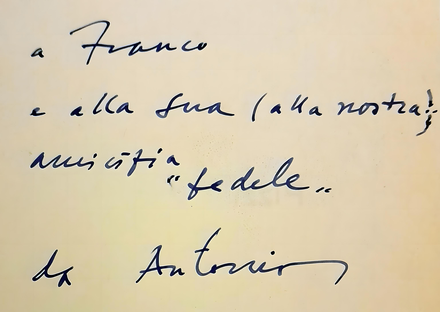
But Grignani immediately stated: «Without Morani I would have done nothing. It’s thanks to him that I was able to work with freedom».”
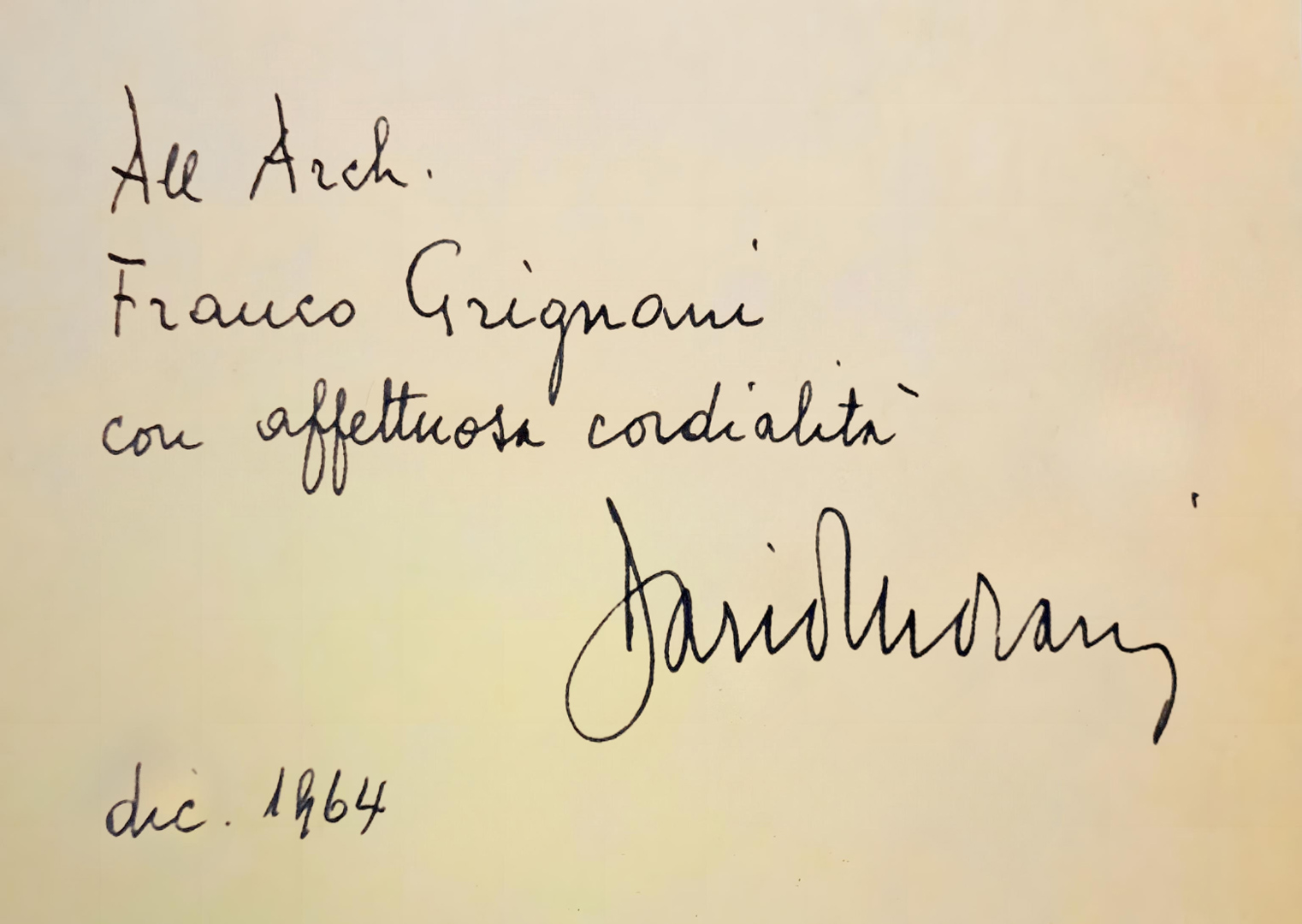
The one with Morani was really a strong friendship, and the condolence letter sent to his wife upon his death in 1980 reflects this sentiment: «We will always remember him because he was also a model of immense humanity» (Jeanne and Arch. Franco Grignani).
Various A&L ads were showcased at solo and group exhibitions in the USA in the 1960s. An advertising poster for Alferi & Lacroix from 1964 was awarded “from the Central Office of Art Studios“ at the first Warsaw International Poster Biennale in 1966 and it is currently at MoMA in NY.
“Grignani neither had to promote the product nor the name of his client, but his only task was to demonstrate the whole variety of possibilities and applications which the technical facilities of his client’s modern enterprise offer the artist.”
[Raimondo Hrabak in Gebrauchsgraphik issue n° 4, 1962]

“The phenomenon is rare, perhaps even unique: a series of graphic designs intended to advertise a large company in the graphic industry and having little or no direct reference to the product, but making continual allusion to the medium used”, wrote in 1966 the art critic Gillo Dorfles in the Swiss magazine Graphis issue n° 126, 1966 (a periodical committed to presenting and promoting the work of exceptional talent in international graphic design, advertising, photography, art, and illustration).”[…] Anyone who glances through the complete series of these designs is getting an authentic lesson in the use and manipulation of the graphic medium for the purpose of investing it with aesthetic and informatory value. […] to my mind the really outstanding aspect of his work is the metaphoric quality he lends to every composition. The graphic sign is almost always shifted from its normal connotation to another, so that it assumes a metaphorical, transposed, metonymical meaning which may either evoke a smile or, by its elements of surprise, may effectively put over a piece of information. […]
No other documentation could demonstrate quite as impressively to the reader just what potentialities a letterpress and offset printing establishment can offer to an artist who is gifted and perspicacious enough to make full use of them.”

In 1965, at the aforementioned first ‘World Congress on New Challenges to Human Communication’ (‘Vision 65‘), Grignani recounted: “In 1952 I was asked by a large Italian printing establishment, Alfieri and Lacroix, to devise a programme of advertising. This firm, after it came through the war, had been built up again and had doctored its war wounds. It was established in 1890 and had always been considered a pioneer in the printing field for having been the first to introduce certain technical procedures up to that time unknown in Italy. When it was made over new it needed to get back to its position of leadership. A commercial publicity house would have had few developmental connections and this would have been reflected under the heads of quality of work, service and drawing power, and the competition could have talked along just the same lines. Needing to find my directions in the advertising world and among technicians and graphists, that is, in a category of people with specialized training, I suggested that I be allowed a certain latitude in which to manipulate a bit, so as to dig into the typographic business and prepare an entirely new language based on experimental graphics. Here was the problem: What was this new typography to be? How could I visualize the new scripts as regards speed and reading time? What should the form and design of the letters be like? What should this new symbolic language be? Alteration of vision as seeking and as expressive comment? How to define the boundaries between signs and space? How to create and then refer to my symbols? How to conduct studies on tensions and on graphic induction? This kind of graphics taught me freedom and courage; it also aided the experimentation of other graphists. I obtained the ‘Golden Palms’ for the quality and originality of my work and it brought Alfieri and Lacroix very great prestige.”

Later, in 1984, he pointed out: “typography was born to be read through the stripping of the sign from its visual form, encoding the letters, and extracting their meaning. The written word, in this case, is not remembered as an image but it remains only a word that is understood as an idea. The same is true of the typeface for a page in a book or newspaper, where the voids and the solids of the letters, the justification or length of the line, the body or size of the font, the interlining or the space between the lines, the margins of the page, combine to provide those basic ingredients that make reading easy and inviting. But my professional interests, aesthetic and creative, have always been directed, experimentally, towards a typography of highly visual appeal in favour of communication in an environment saturated with signs, such as, for example, in the advertising sector, where the sentences are designated to be short and consistent, sometimes assuming the role of figuration.”
Grignani also penned the copy, establishing a contrapuntal relationship between the words and visual images. “The graphic designer’s work is as it were the musical accompaniment of the copy-writer’s message, it is its dramatization and pictorial translation […] [remaining] aware of the fact that the effect of advertising rather rests on the expressive force of the picture than on the word”, added Raimondo Hrabak in the aforementioned article in Gebrauchsgraphik issue n° 4, 1962. The reference to the futurist ‘paroliberismo‘ (‘words-in-freedom’) is evident, extending beyond the creation of more or less experimental images, establishing a true poetic dialogue:
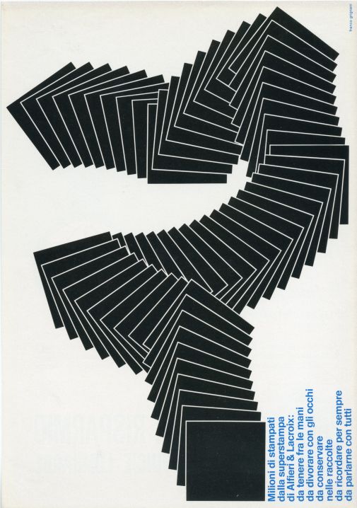 | “Millions of prints from the Alfieri & Lacroix superprint: to hold in your hands, to devour with your eyes, to keep in collections, to remember forever, to talk to everyone about” |
| “Typolytozincography is a neologism only for Alfieri & Lacroix; it means a complete cycle of the graphical activity. Alfieri & Lacroix was the first in Italy to make the coloured clichè, now, in technological century it is still the first as regards to method, organization, equipment and quality of printing” | 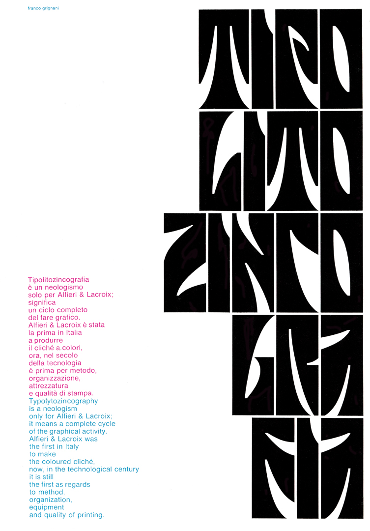 |
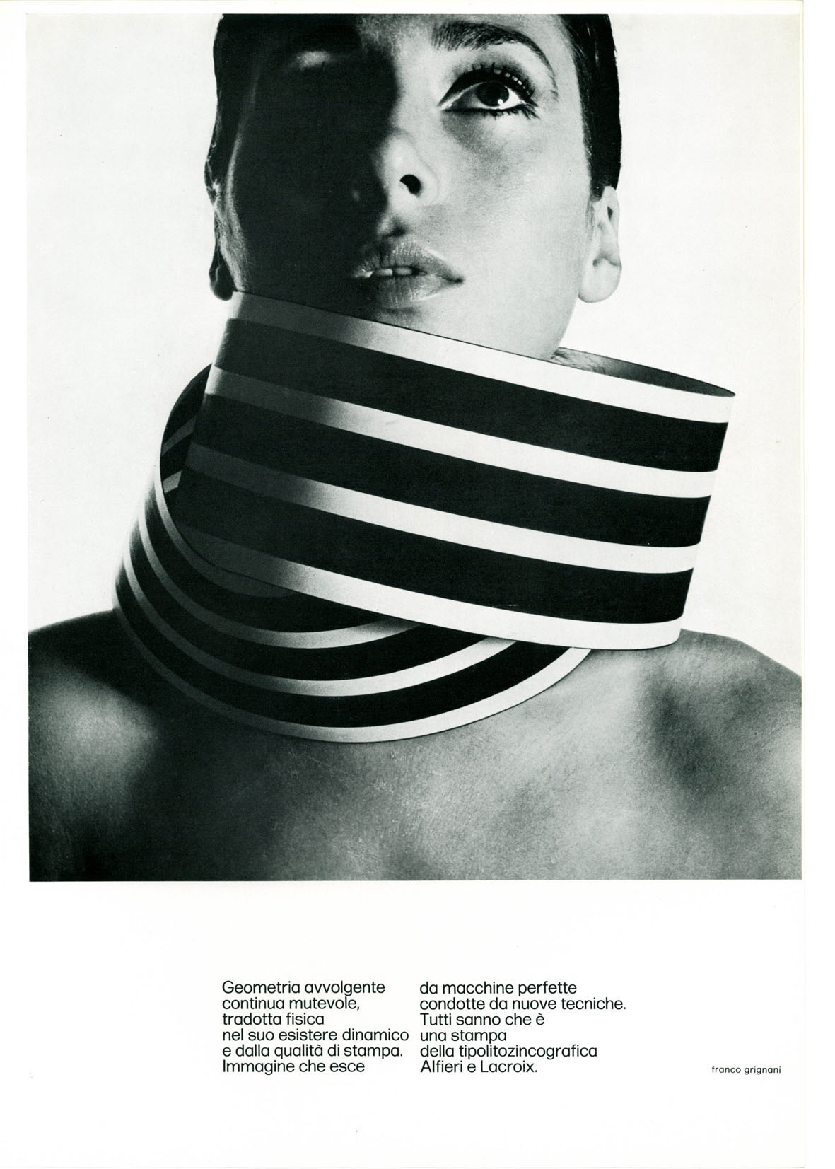 | “Continuous changing enveloping geometry, translated physically into its dynamic existence and by print quality. Image that comes out of perfect machines driven by new techniques. Everyone knows that it is a print of Alfieri and Lacroix typolytozincography.” |
| “Seeing beyond is linked to the experimental mind of the man; it is therefore evident that there is a super sign reality that graphics enhance and make fantastic, as fantastic as the print quality of Alfieri & Lacroix.” | 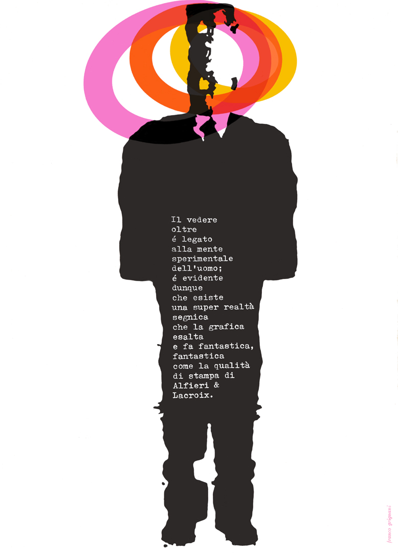 |
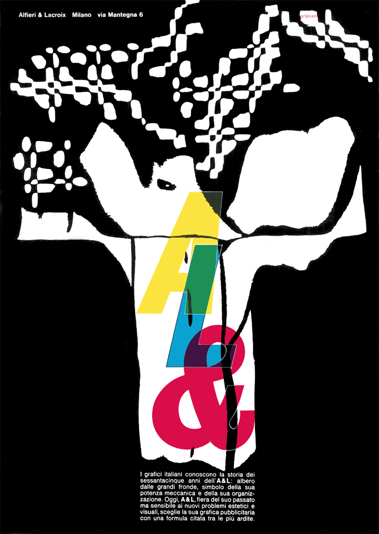 | “The Italian graphic designers know the history of the sixty-five years of A&L: a tree with large branches, a symbol of its mechanical power and its organization. Today, A&L, proud of its past but sensitive to new aesthetic and visual problems, chooses its graphics advertising with a formula cited among the most daring.” |
| “bump, break, huge, rubble, nightmare, collapse, black, stormy, heavy, ooh! useless, wall, horrid, roar, disaster, structure, escape, gasp, load, boulder, ruin, GRAPHICS CREATE EMOTION” | 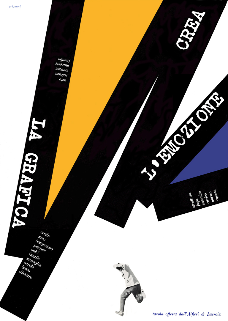 |
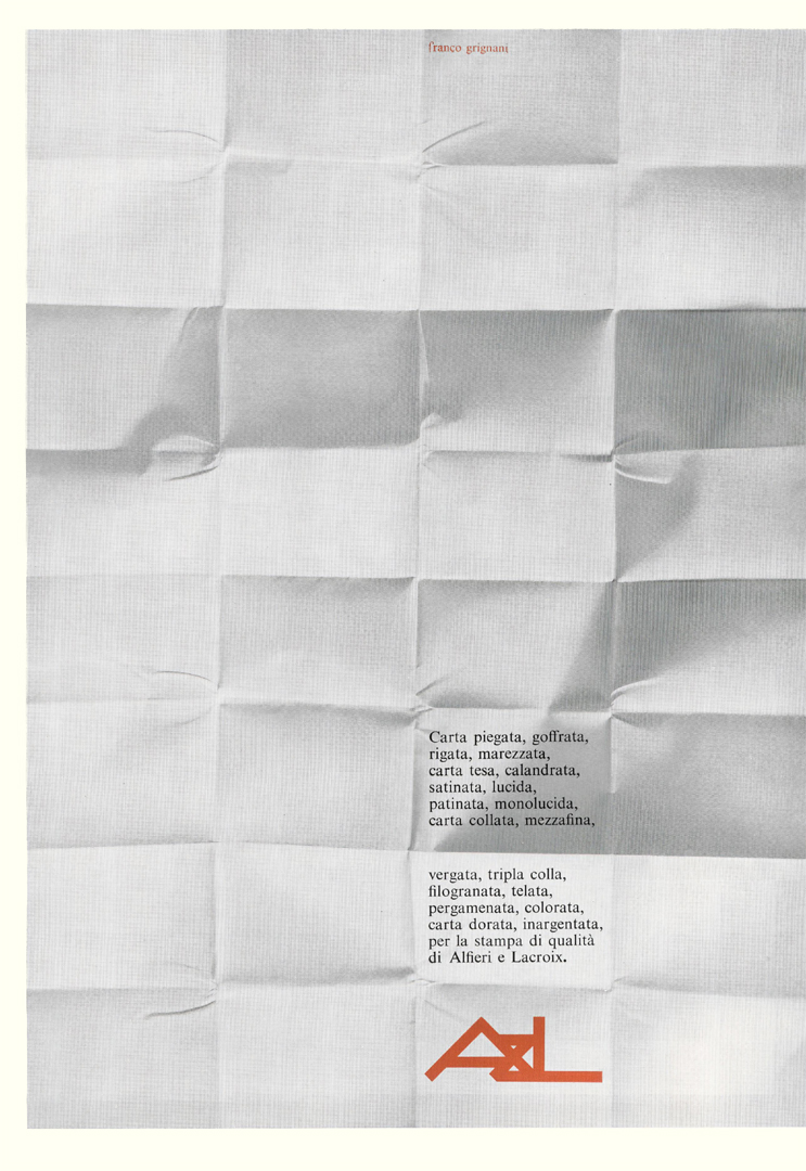 | “Folded, embossed, striped, moiré, stretched, calendered, satin, glossy, coated, monolucid, dressed, half-fine, laid, triple glued, watermarked, canvas, parchment, coloured, gilded, silvered paper, for printing quality of Alfieri and Lacroix.” |
| “Yesterday Optical Art was born and that was announced by the American magazine LIFE on December 28th. In this space, every month and for years, Alfieri & Lacroix proposes visual problems in a very suitable area: graphics. Alfieri & Lacroix is lively and modern, associating communication problems with the most rational and complete organization for quality printing.” | 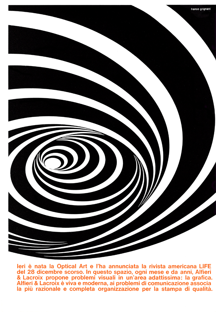 |
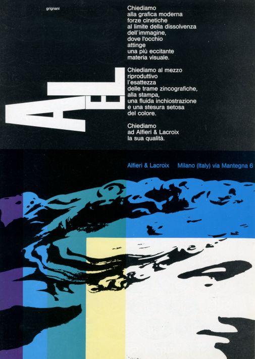 | “We ask modern graphics for kinetic forces on the verge of fading the image, where the eye draws on a more exciting visual material. We ask the reproductive medium for the accuracy of the zincographic textures, the printing, for a fluid inking and a silky application of the colour. We ask Alfieri & Lacroix about its quality.” |
| “The future of typography is in the future of the man and we know no rest; seventy years of life, development, organization, equipment, updating, level, research. Yesterday, today, tomorrow: Alfieri & Lacroix, with the new, the best, the safety, the guarantee, the quality, the support for the solution of every graphic problem.” | 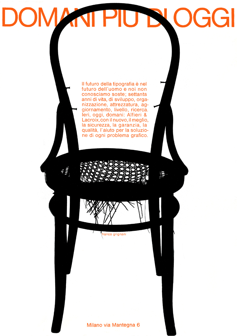 |
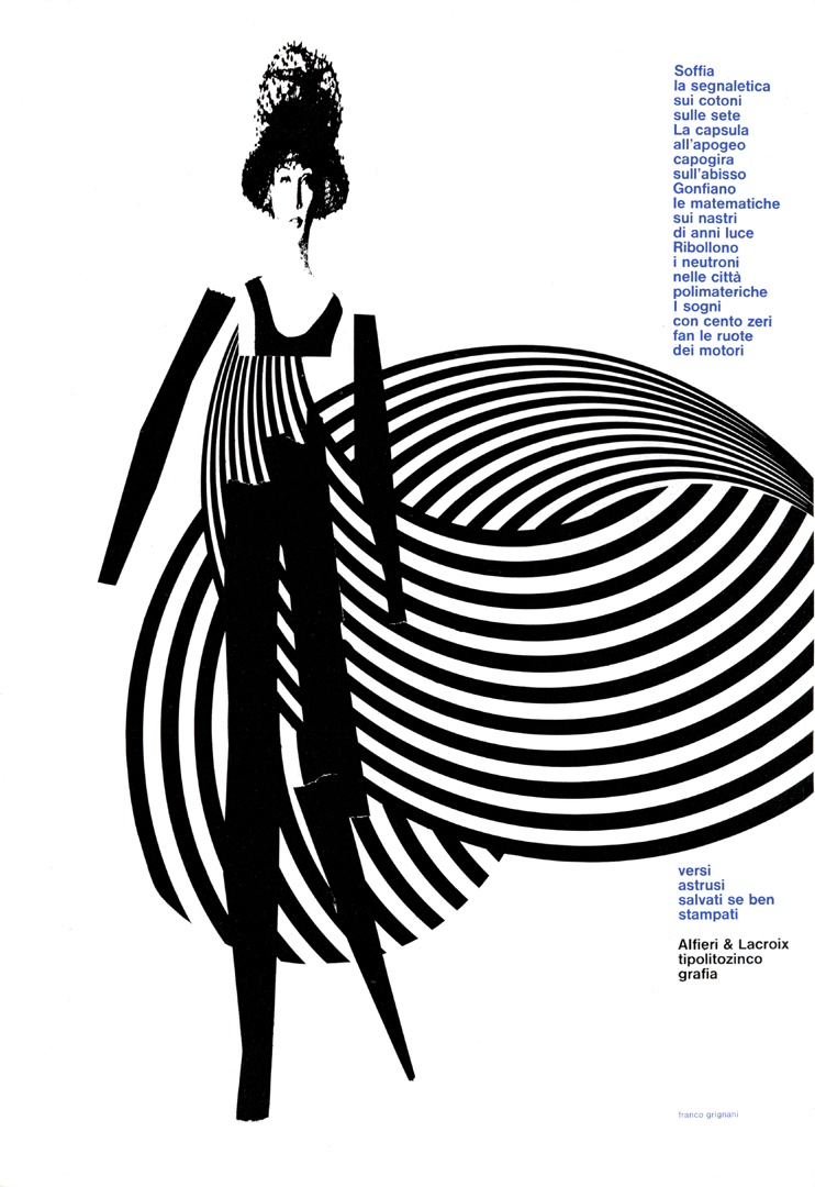 | “Blow the signs on the cottons on the silks. The capsule at the apogee dizzies over the abyss. They swell the maths on the ribbons of light-years. Neutrons boil in polymathic cities. Dreams with a hundred zeros make the wheels of engines – abstruse verses saved if well printed” |
| “This too is an allusive, imaginative, emotional, evocative symbolic tale: The beauty of typography lies in its becoming in the relations of sign and space in its exactness imprinted in its rhythmic colours an orderly and safe work in the Alfieri and Lacroix rotary presses.” | 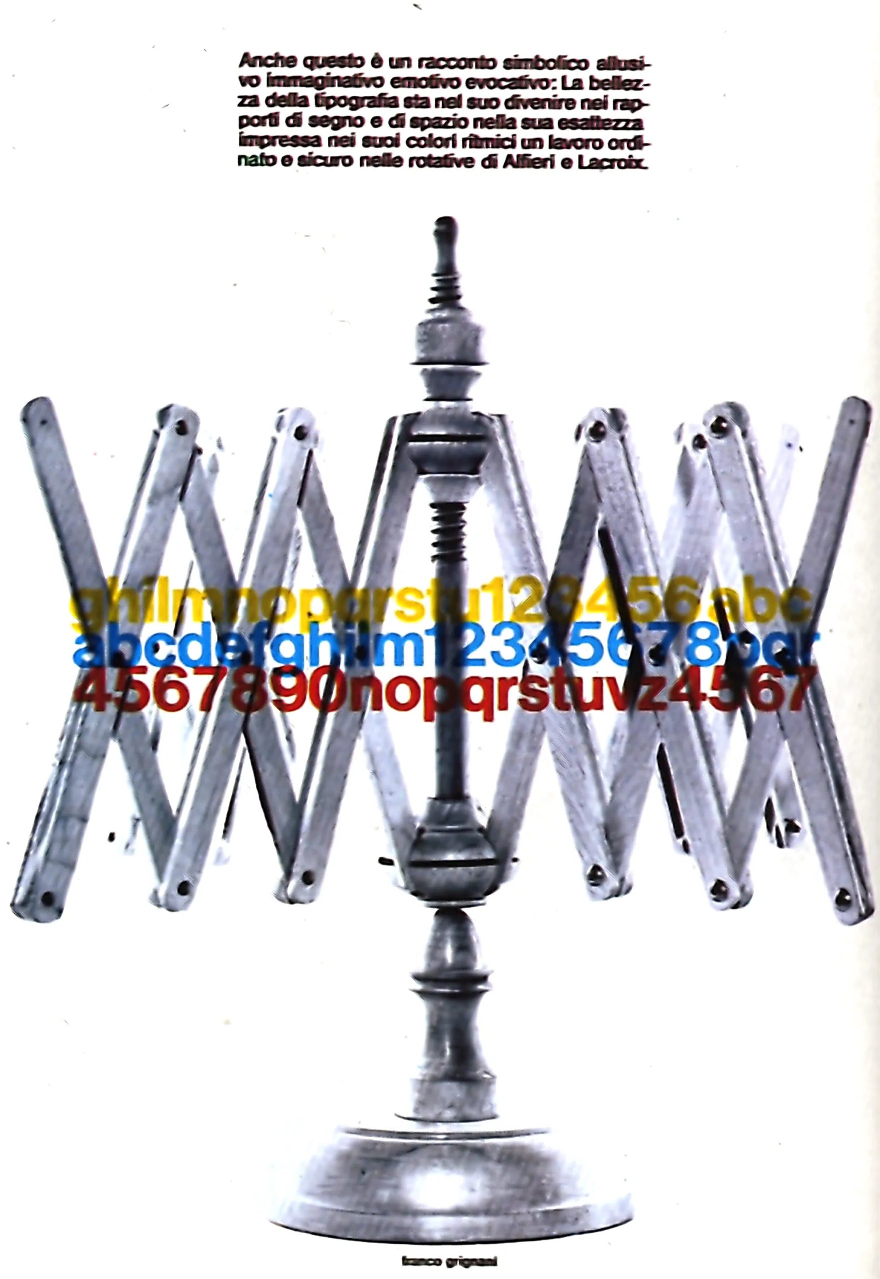 |
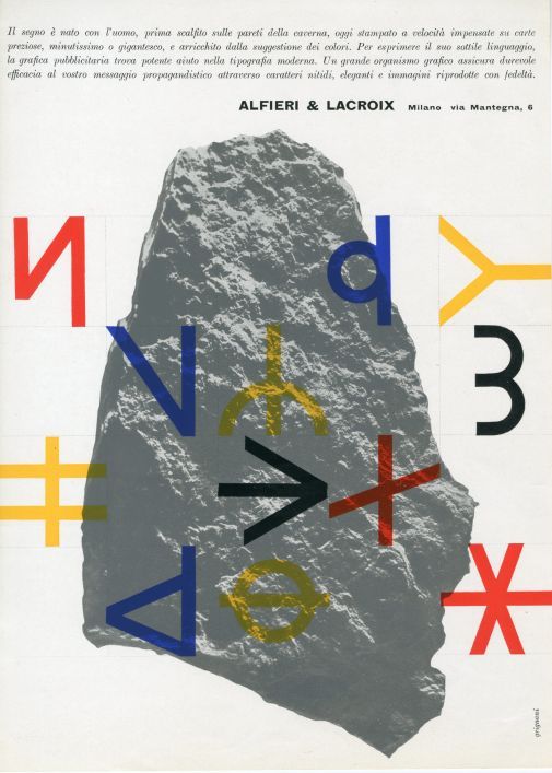 | “The sign was born with man, first scratched on the walls of the cave, now printed at unexpected speeds on precious papers, tiny or gigantic, and enriched by the suggestion of colours. To express its subtle language, advertising graphics find powerful help in modern typography. A large graphic body ensures lasting effectiveness to your propaganda message through sharp, elegant typefaces and images reproduced with fidelity.” |
| “The fate of a bad print is irremediably sealed. In the advertising field, an efficient idea and a happy setting for the artistic part are not enough. These elements are subordinate to the graphic realization, because a badly executed print irritates the sight and alienates the sympathy. The vast availability of an expert and powerfully updated graphic complex ensures that precision of results which, through the clear elegance of the typefaces and the fidelity of the colours, will make your propaganda message appreciated and remembered.” | 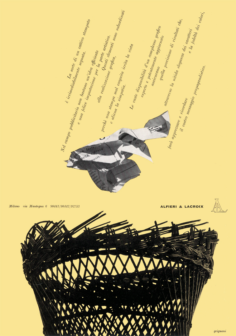 |
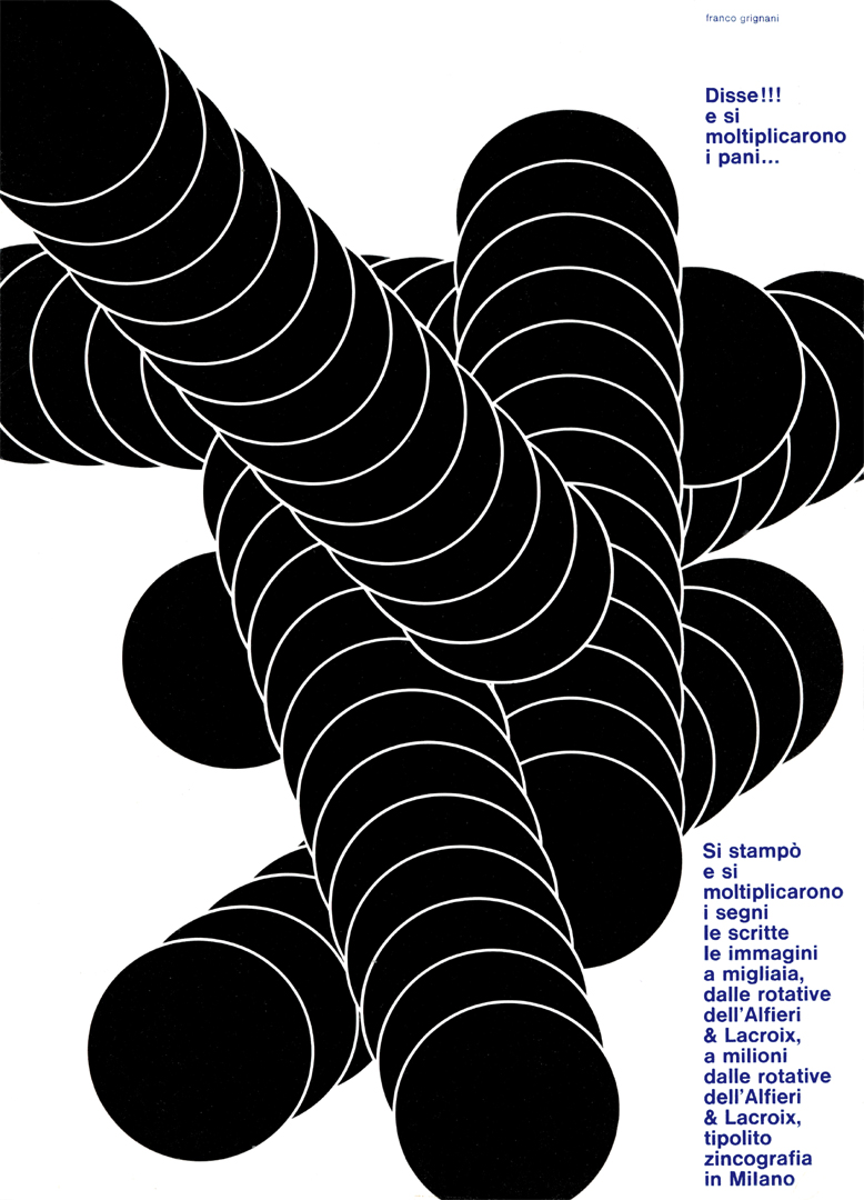 | “He said!!! and the loaves multiplied … Signs, writings, images were printed and multiplied to thousands, from Alfieri & Lacroix presses to millions from Alfieri & Lacroix presses typolytozincography in Milan” |
| “Advertising communication is grafted on sensory experiences lived and catalogued along the life span of an individual and formal traces interfere with each other based on their similarity, sometimes the structural ambiguity of certain graphic signs used as reactive can generate infinite interpretations, but an exact simple living reality is the quality in the printing of Alfieri and Lacroix.” | 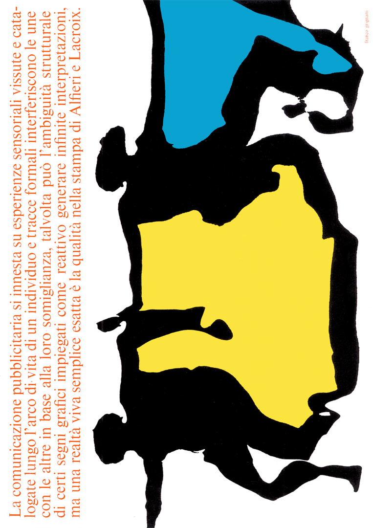 |
 | “order, logic, disposition, duty, harmony, location, coordination, measure, system, symmetry, rule, method – quality constitution, talent, form, grade, value, prerogative, requirement, worth, essential peculiarity in the printing of Alfieri & Lacroix typolytozincography in Milan” |
| “AT THIS POINT ARE WE STILL ARTISTS? CREATIVITY AND TECHNIQUE TAKE OVER TO MODIFY THE MEDIA, THE INVESTIGATIONS, THE SENSATIONS – ALIVE TYPOGRAPHY APPROACHES THESE PROBLEMS AND SOLVES THEM LIKE ALFIERI AND LACROIX SOLVES TECHNICAL PRINTING PROBLEMS TO ALWAYS GIVE QUALITY” | 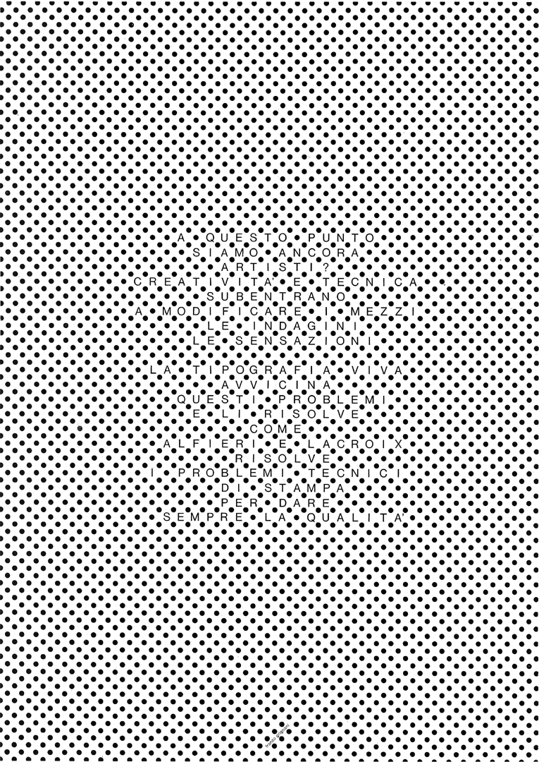 |
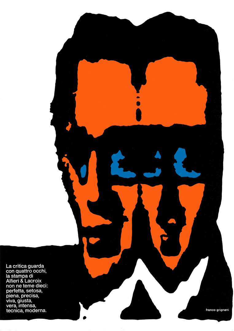 | “Critics look with four eyes, the Alfieri & Lacroix print does not fear ten: perfect, silky, full, precise, lively, right, true, intense, technical, modern.” |
| “the graphic man – now the man walks on the lines, darting on the arrows, flutters with a tie in circles, admires textured paintings, types, offers geometry and knows the quality of printing by Alfieri & Lacroix” | 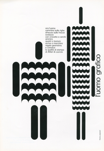 |
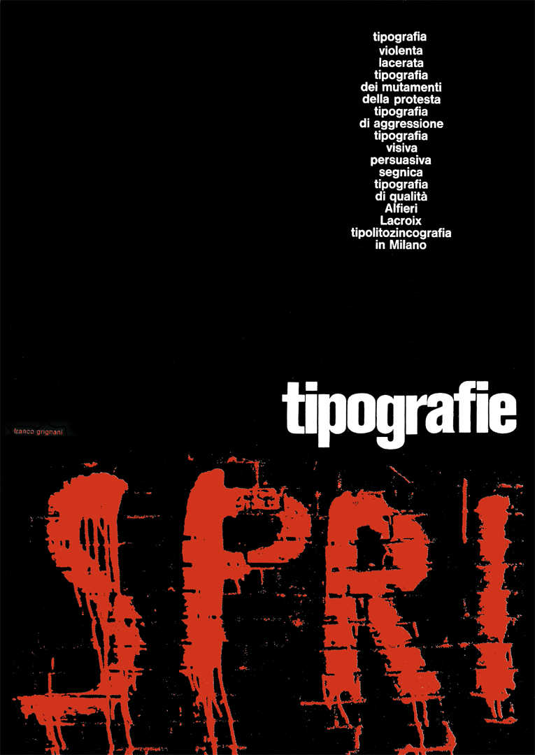 | “violent, lacerated typography, typography of changes, of protest, visual, persuasive, sign typography, quality typography Alfieri Lacroix typolytozincography in Milan” |
| “Modern graphics have always tried to propose the plastic dimension in every visual organization. On the sheet, the illusory of the third dimension enhances the physical touchability of things, the images projected within the eye take on material qualities, and, with the virtual movement, the figural influences are emphasized in the unconscious of man. So does the exact and constant printing of the signs, of the colours spread in their tissue structures, velvety or shiny, the discomfort of relationships in the iterative typographic sign. This is the print in Alfieri & Lacroix quality.” | 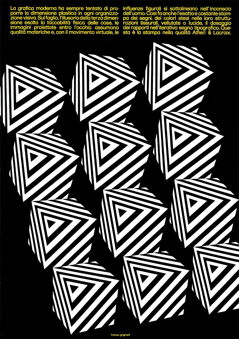 |
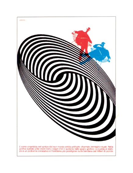 | “Man organizes in the vortex of his world unified entities called visual images. In graphics, these visual units are signs that guide us in the graphic space. Print quality is a correlative problem and the most prestigious emblem on the Alfieri & Lacroix flag” |
| “It seems that the introduction of the liberty memory is causing modern graphics to tremble. We observe the vigour, the freedom of invention that are manifested in these typefaces; can we forget, now, that graphics are above all a visual spectacle? – Your problems, with Alfieri & Lacroix for the future of graphics” | 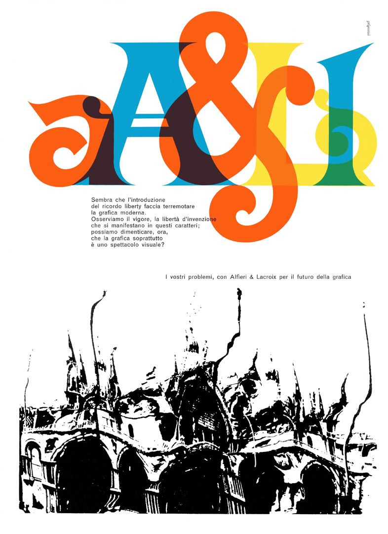 |
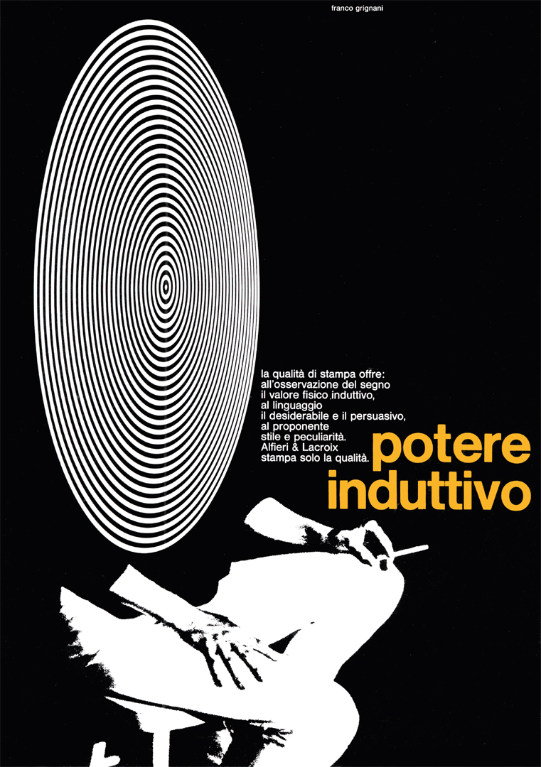 | “The print quality offers the inductive physical value to the observation of the sign, the desirable and the persuasive to the language, style and peculiarity to the proposer. Alfieri & Lacroix only prints quality. – inductive power.” |
| “New technical and psychological procedures are being introduced into the new graphic language so that the eye, already excited by shapes and images of the world around it, is able to capture a sign. The dynamic and tensive component with its visual absorption charges the sign of apparent motion. This problem of graphic creativity needs a great reproductive quality: Alfieri & Lacroix!” | 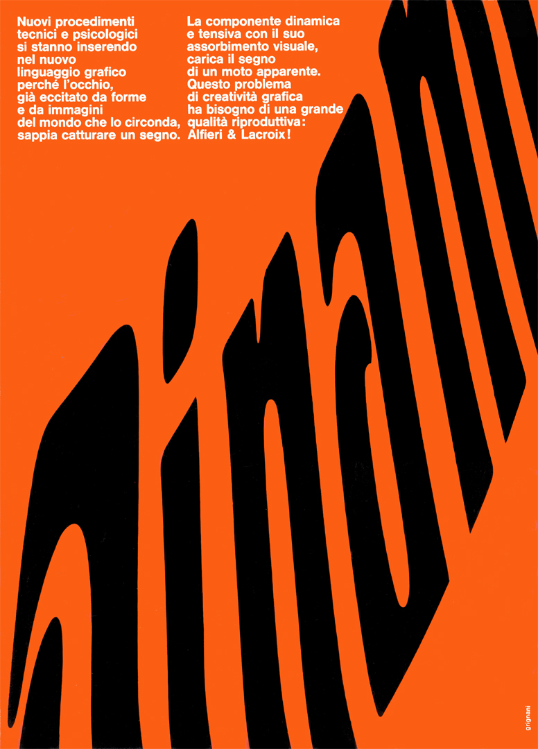 |
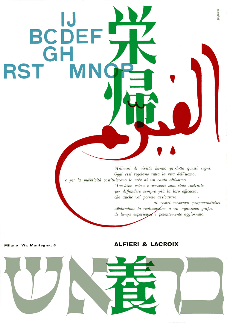 | “Millennia of civilization have produced these signs. Today they regulate the whole life of man and for advertising they constitute the notes of a very high song. Fast and powerful machines have been built to spread their effectiveness more and more, which you too can assure your propaganda messages, entrusting their realization to a graphic organization with long experience and powerfully updated. Alfieri & Lacroix.” |
| “the fear of abstract emotion – how much beauty in the limpid and pure sign that we recreate from the usual image. graphics invents a new space and a new time, loves the absolute idea, the figurative emblem. we seek the truth, behind the facade of things worn out by words and the indifferent lazy eye” | 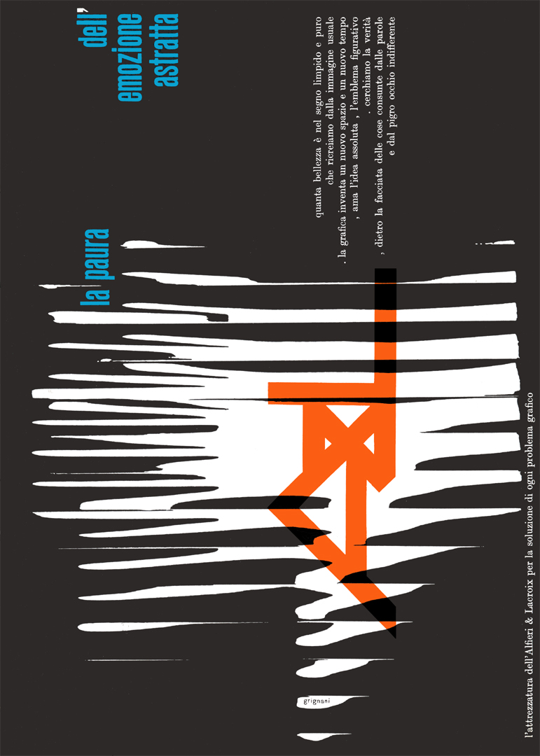 |
further related posts & pages:
- A virtual exhibit on Alfieri & Lacroix
- lecture held by Greg D’Onofrio in NY focused on Grignani’s use of type and graphics in advertising design from the late 1940s through the 1970s
- Franco Grignani and the US
- Gallery – advertising & covers
[a] from “Futurismo Pavese” [“Futurism in Pavia”], ticinum edizioni, 1983
[b] from “Dario Morani”, Pavia, 1982
[pics and original Italian texts from AIAP / CDPG Centro di Documentazione sul Progetto Grafico, courtesy of Lorenzo Grazzani]
Last Updated on 25/07/2024 by Emiliano