
The Piaggio & C. Company of Genoa, founded by Rinaldo Piaggio in 1884, initially specialized in locomotives and railway carriages. Towards the end of the First World War, it transitioned to the military sector and subsequently expanded its focus to include vehicles.
With Rinaldo’s passing in 1938, the company’s leadership transferred to his sons, Enrico and Armando. After the Second World War, Enrico Piaggio sought to diversify the company’s endeavours, recognizing a growing demand for a modern and affordable mode of transportation for the Italian mass market. In 1946, Piaggio introduced the iconic Vespa (Italian for ‘wasp’), and within a decade, over a million Vespas were produced.
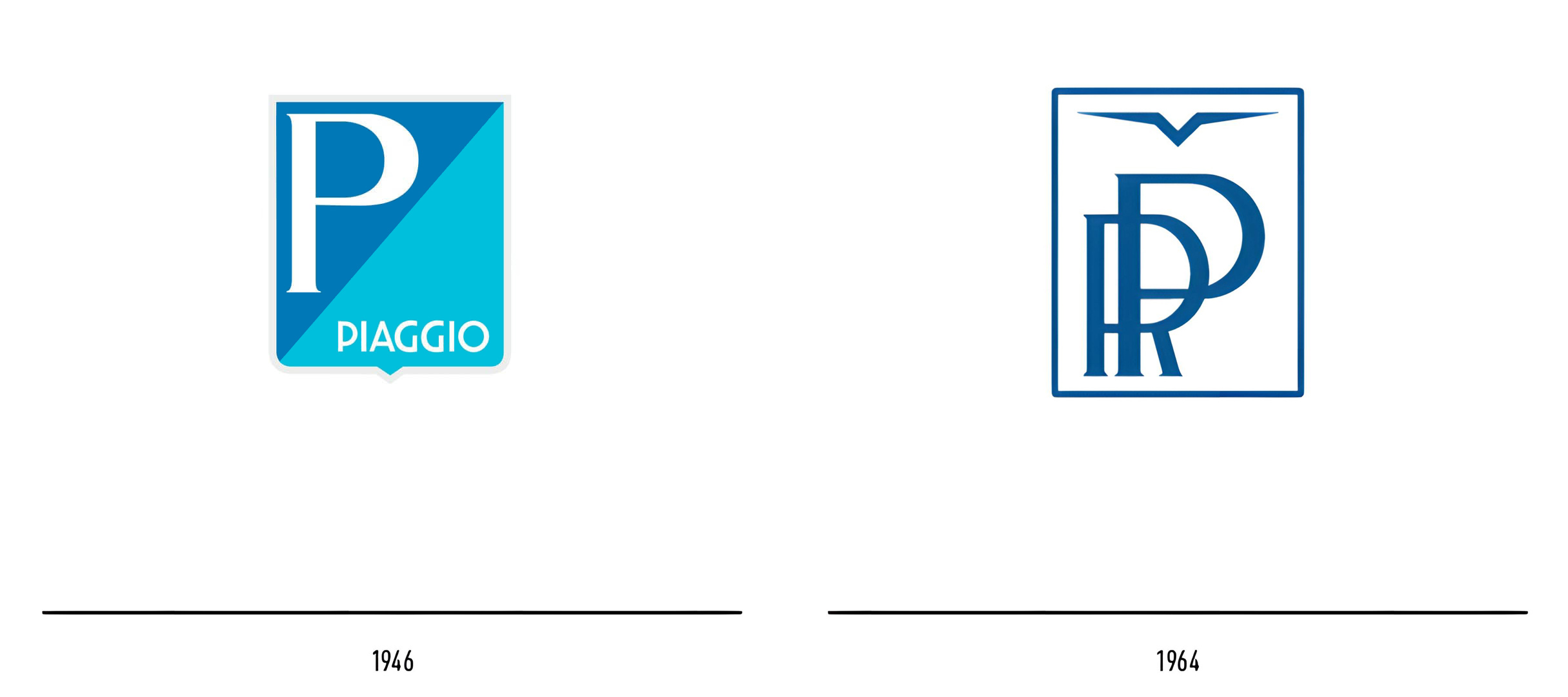
In 1959, Piaggio came under the ownership of the Agnelli family, renowned proprietors of the major Italian car manufacturer Fiat SpA. The year 1964 witnessed the separation of Piaggio’s aeronautical and motorcycle divisions into two distinct entities: ‘Rinaldo Piaggio Industrie Aeronautiche Meccaniche’ and ‘Piaggio & C.’ for vehicles. The former sported a logo featuring the founder’s initials (RP) alongside a stylized bird. The original Piaggio logo from 1946 showcased a shield split transversely into two sections, with the letter ‘P’ on a blue background and the Piaggio logotype on light blue. Tragically, in 1965, Enrico Piaggio passed away at the age of 60. His son-in-law, Umberto Agnelli, succeeded him and later assumed the role of the company’s managing director.
In June 1966, the company allocated 3,000,000 Lire (equivalent to roughly 30,000 euros in 2020) to award a prize for a new logo through a contest that would distinguish the future production.
The contest specifications stipulated that “each sketch must be presented in a double version: one in black and white, the other in two or three colours. […] The technique of execution is entrusted to the free choice of the artist who will, however, have to create the logo so that its practical reproduction in metal, plastic, and any other material is permitted.”
The president of the jury was Franco Mosca, president of the Italian Advertising Artists Association (AIAP), supported by Armando Testa, one of the most prominent Italian advertisers of the time (known for campaigns for Punt and Mes, Lavazza, Simmenthal, Galbani, Pirelli …), and Erberto Carboni, another influential advertiser from the legendary Studio Boggeri.
A total of 509 logo proposals were submitted, each with one, two, or more sketches and, “in the opinion of the Jury, all of excellent quality.”
In a press release dated November 1966, 11 prizes were awarded. The absolute winner was Franco Grignani, receiving a prize of 2,000,000 Lire, while 10 additional prizes of 100,000 Lire each were awarded to young designers born after 1935 for having “presented works worthy of particular mention”.
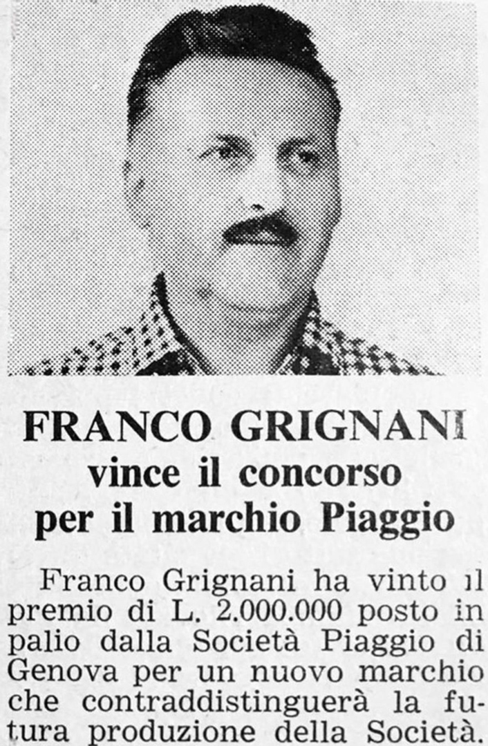
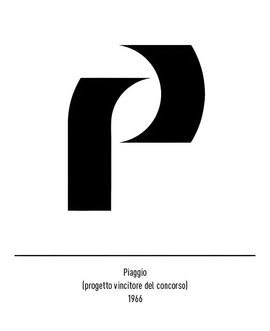
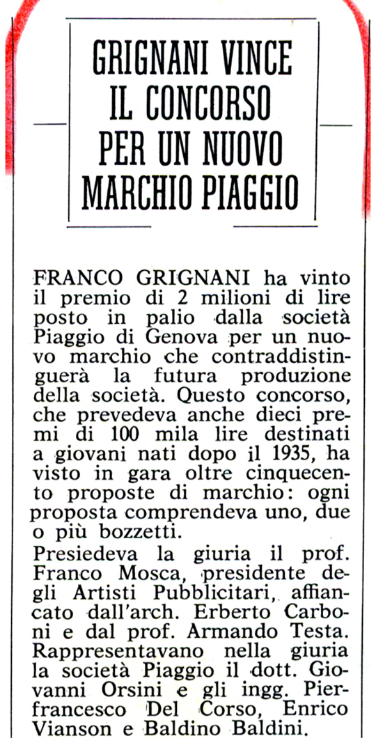
Franco Grignani participated with as many as 19 sketches, all of which were subsequently donated to the company.
The motivation for the award had a particular significance:
“It, therefore, acquires even greater value the fact that the last, and certainly most heated, discussion had as its object two works both signed by you […]. In the impossibility of awarding the prize to one of the two competing sketches, the Jury unanimously decided to assign the prize to your person, rather than to the sketch.”
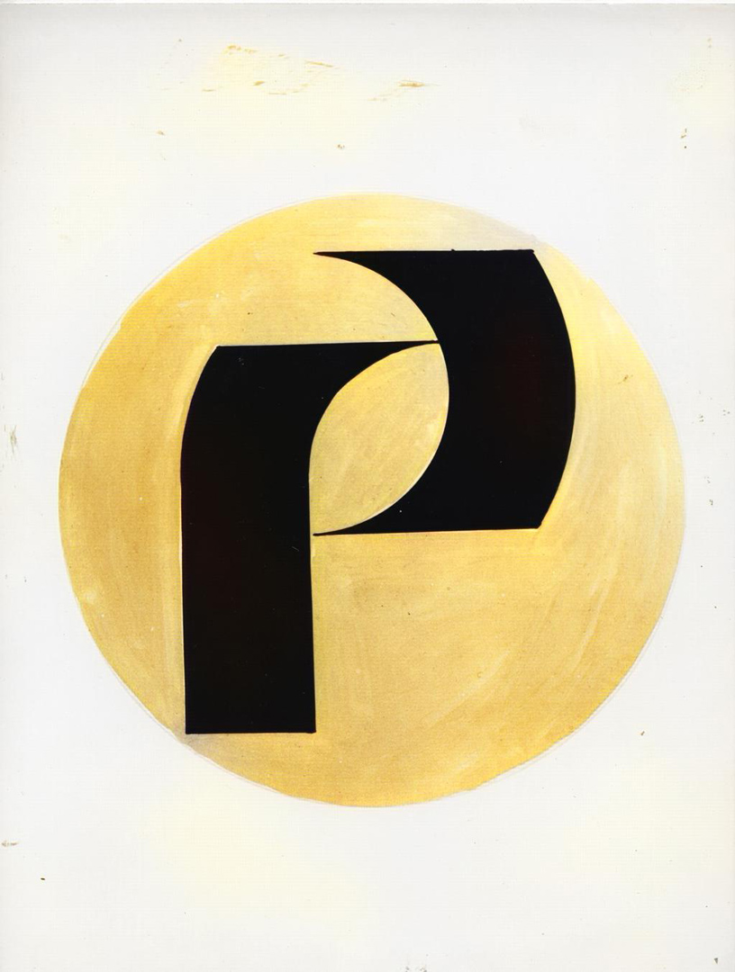
It was believed that these 19 sketches had been lost, but in January 2022, Mrs Mariamargherita Scotti of the Piaggio Historical Archive was lucky enough to discover the photographic reproduction of 12 of them. The photos are in B&W, but with a recolouring reverse process, we can assume that the light grey was actually a pale yellow:
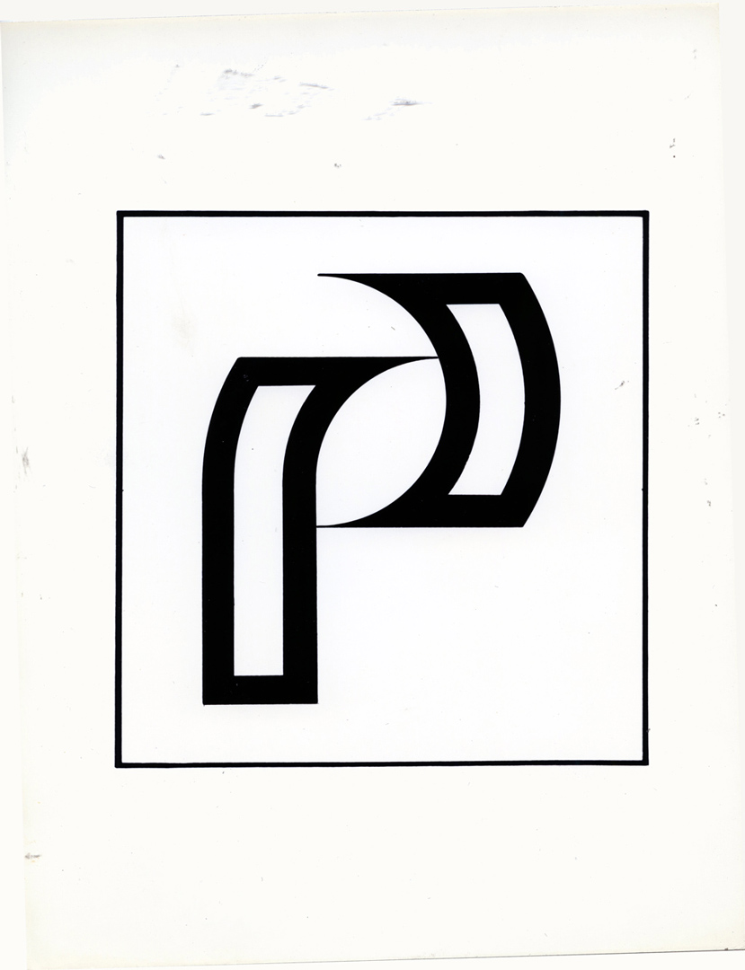
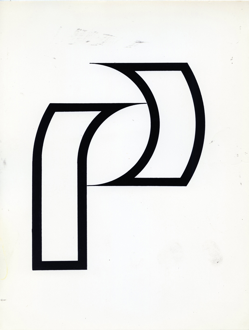
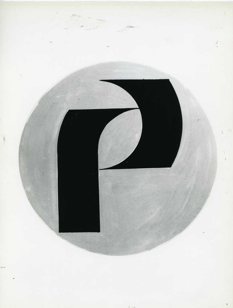
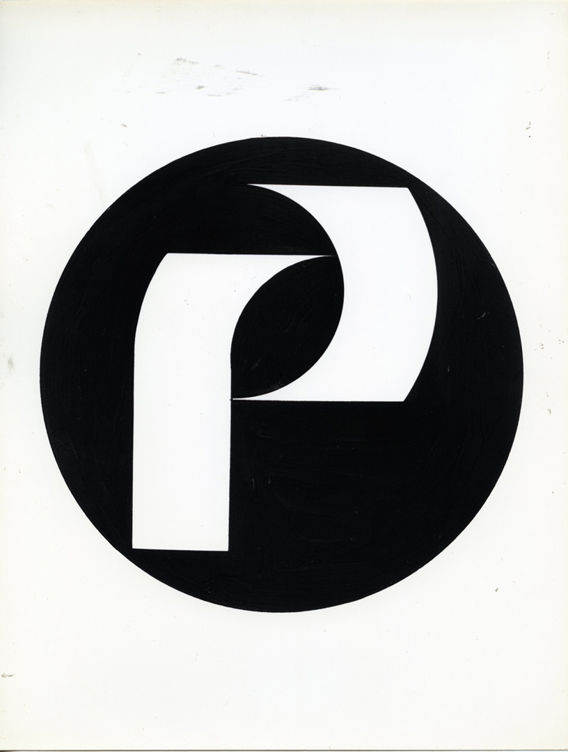
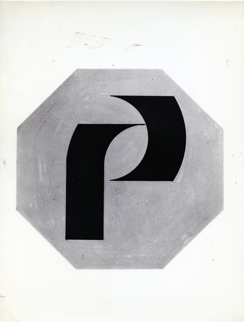
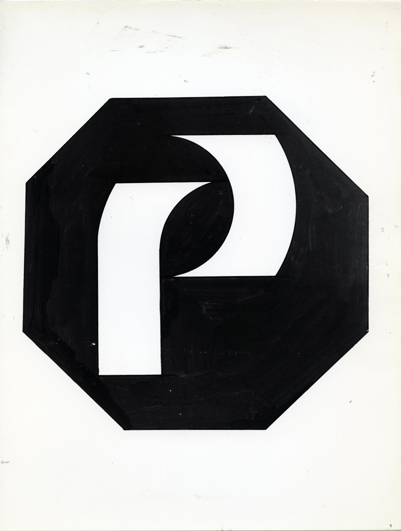
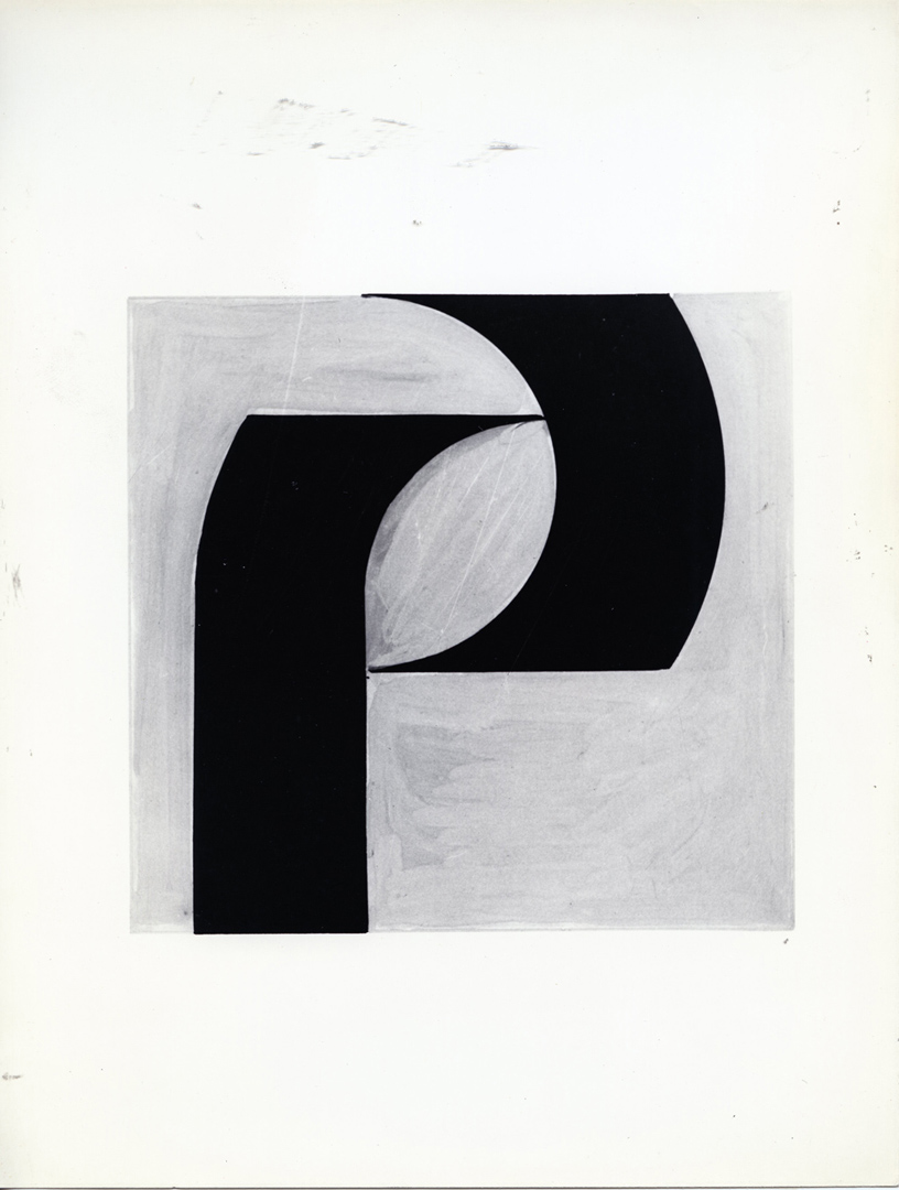
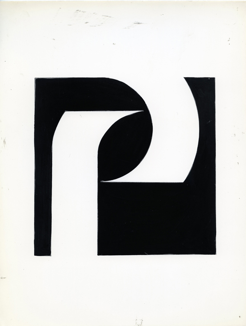
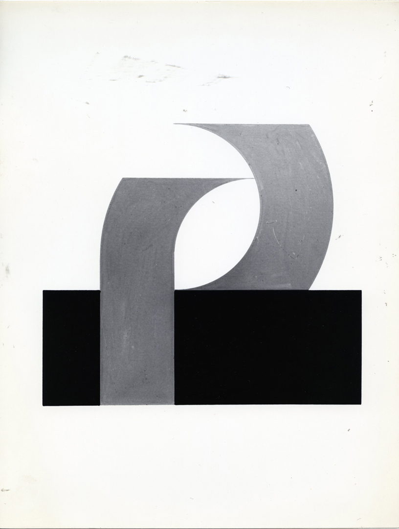
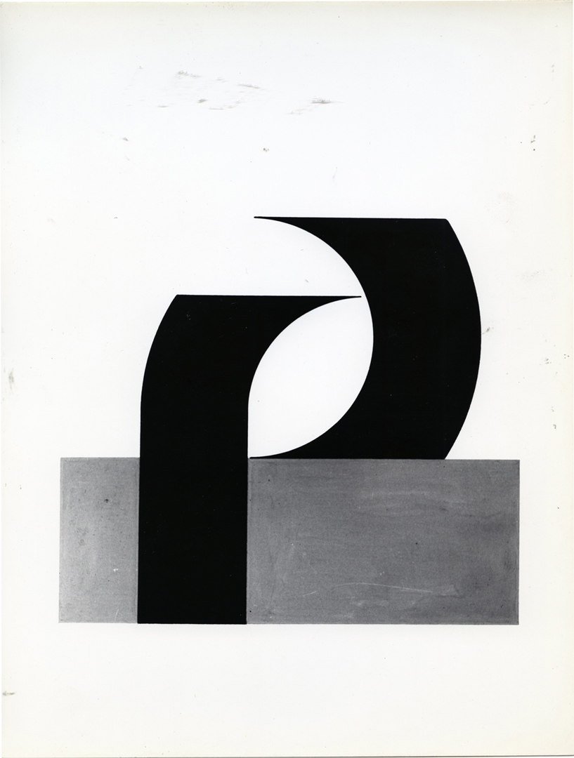
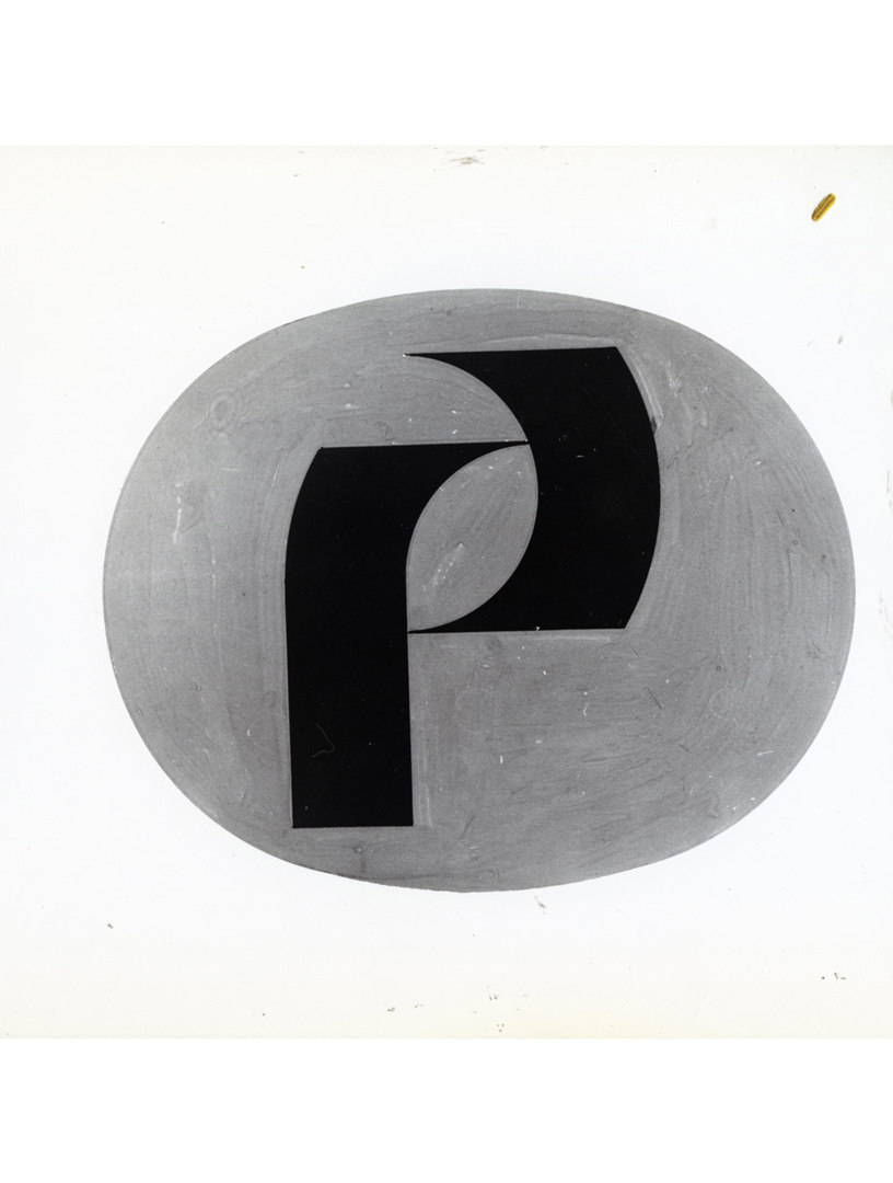
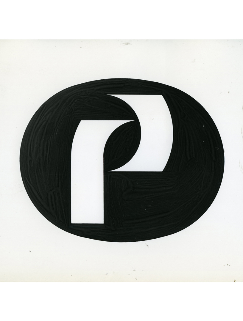
The press release of Grignani’s victory is dated November 2, 1966. Two days later, the Piaggio factories suffered significant damages from the flood of the Arno river (incidentally, following the flood, Grignani donated to the new Museum of Contemporary Art in Florence a beautiful painting, now at MUSEONOVECENTO). However, the company reacted promptly, and the works continued…
Two Vespa shields, the latest models, were promptly sent to Franco Grignani to conduct all the necessary tests for the new logo. The fact that two sketches had been chosen jointly, each one presented in black and white and colour version, posed indeed an “important and urgent” problem, as “we will absolutely not be able to adopt two logos”.
The solution to the problem was then left to Franco Grignani himself. Additionally, Agnelli was pressing for the use of his lucky colours (light blue and white), and the situation was creating a “vague sense of discouragement” within the company.
The story ended six months later in an unexpected way, even for the company itself. Agnelli decided to adopt another logo that he himself chose and had done directly by the architect Franco de Silva of Turin, despite the beauty of Franco Grignani’s logo that “no one has ever doubted”, as stated by Ettore Zancani, the chief of Piaggio’s press office at the time.

The real motivation for this change was never communicated, but it can be assumed that Agnelli would have preferred a more ‘product-oriented’ logo. In fact, de Silva’s logo explicitly recalled the company’s two flagships: a wasp (‘Vespa‘) or a bee (‘Ape‘). The two mirrored letters ‘P’ were stylized to resemble an insect with outstretched wings inserted in a hexagon that recalled the cell of a beehive.
[this post has been edited thanks to the precious contribution of Mariamargherita Scotti of the Archivio Storico Piaggio]
[a] ‘il millimetro’, Dec. 1966
[b] courtesy of Archivio Storico Piaggio
[4] Museo del Marchio Italiano
[12] Typeroom, courtesy of Loukas Karnis
Last Updated on 20/06/2024 by Emiliano
