
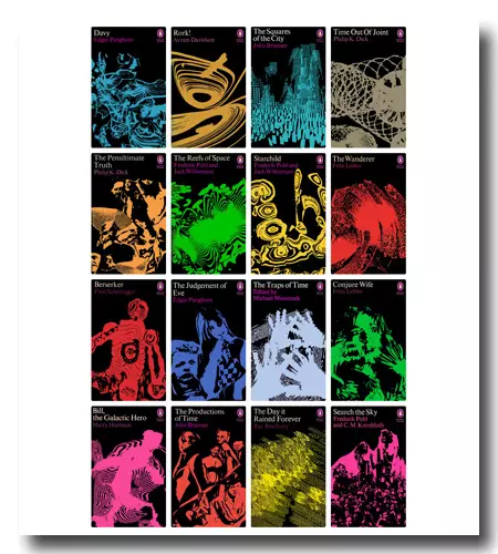
In 1968, amidst financial challenges at Penguin Books, the publishing house brought in David Pelham as the fresh art director for their fiction division. His initial step was to entrust Franco Grignani with designing the covers for sixteen science fiction novels scheduled for publication over the following two years. This particular collection marked the onset of a new and prosperous period for Penguin, encompassing not only Pelham’s own cover art, which would soon follow and become highly sought-after collector’s editions. The new design approach for the Sci-Fi series reintroduced the black covers introduced by Alan Aldridge in 1966, as well as the Sci-Fi label, which had been overlooked by the panic tops of 1968. Pelham, previously an illustrator and art editor at the British art magazine ‘Studio International’ before joining Harpers Bazaar and later Penguin, had long been captivated by Grignani’s artistic production.
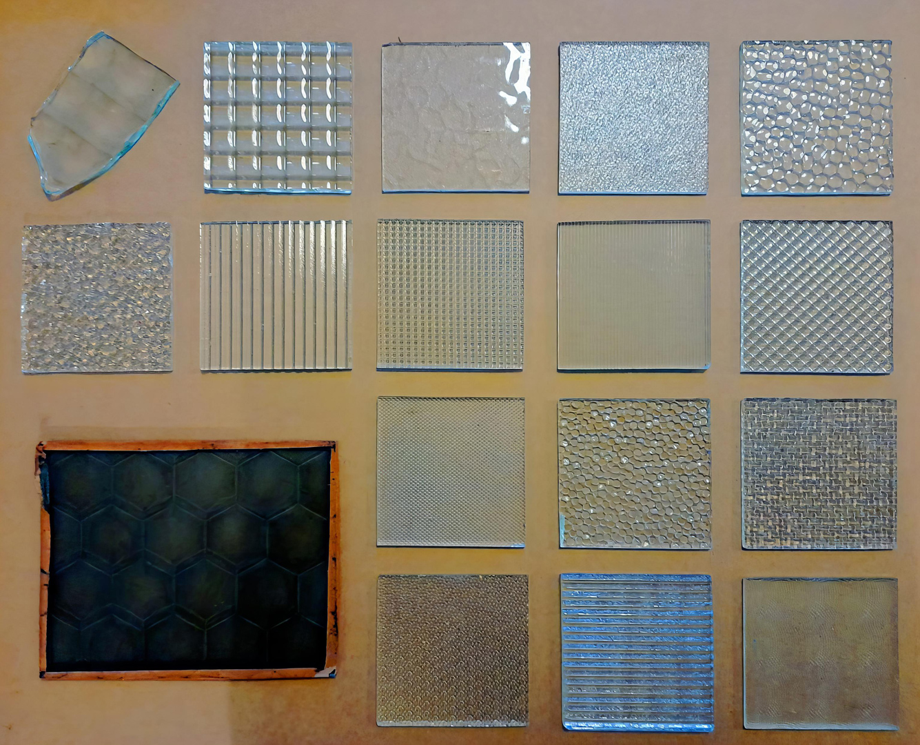
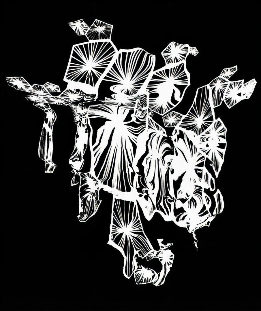
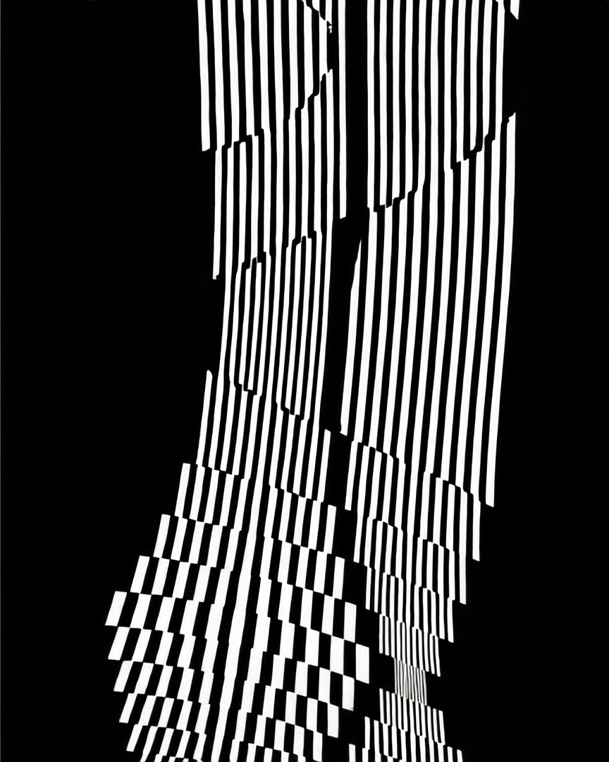
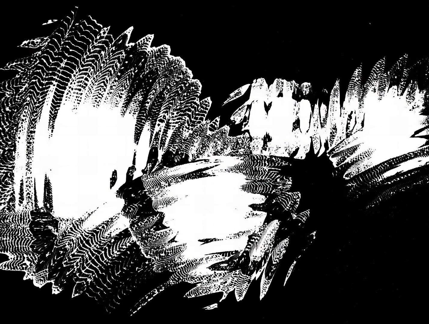
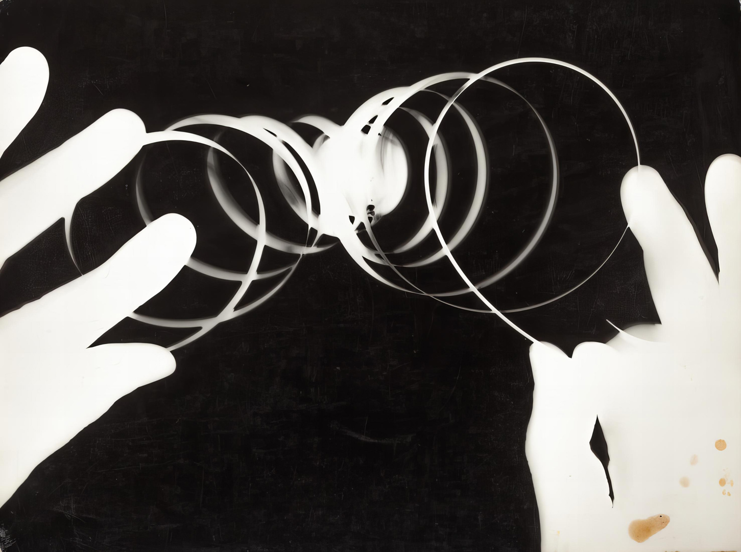
Grignani was a prominent figure in the realm of experimental photography, with a career that harkened back to around four decades of earlier involvement with photograms. This journey led him to explore various techniques rooted in conventional photography. He would subsequently project and manipulate these images using an assortment of tools, including lenses, fragments of glass, shards of broken mirrors, as well as substances like oil and water (see Gallery).
In the covers created for Penguin Books, it is indeed possible to discern certain references and progressions from his earlier experimental works.
“Pocketbooks must advertise themselves. Their covers should therefore be especially attractive, and one title in a series should help to sell the others.”
from ‘Identity value in paperbacks’, ‘Graphis’, n° 103, Feb. 1963

Grignani’s art was ideal for this project because it evoked a sense of otherworldliness, seamlessly aligning with the science fiction genre. He leveraged his experiments to create veritable artworks, using black backgrounds with illustrations that featured distortion or tension in a single colour, extending from the front to the back cover. These designs reflected the narrative content of the novels, predominantly presenting abstract forms that engaged with the observer’s subconscious in the enigmatic realm of science fiction.
These cover designs are therefore not just individual works; they also carry significant weight in connection to the extensive experimental and scientific endeavours that captivated the artist throughout his entire career.

As pointed out by James Pardey,
“Grignani’s black covers and single-color images form a kaleidoscope of shimmering dreams and shattered nightmares. They are like a free association of thoughts mapped out in watery reflections that briefly coalesce and then disperse, leaving memories of figures trapped in the fragments of a looking-glass. They hint at other dimensions and warped worlds where space swims and time shudders.”
Grignani’s covers had the chance to welcome readers into the narrative of some of the best writers in science fiction, such as Ray Bradbury and Philip K. Dick.


Davy by Edgar Pangborn: it’s a dystopian novel that portrays a post-apocalyptic world created by the collapse of civilization imagined at the end of the twentieth century. This decay seems to find an echo in the studies made with silver bromide salts (‘Diradamento e distorsione tensiva‘, 1953, see: https://issuu.com/10a.m.artgallery/docs/franco_grignani_subperception/76), in which figures appear suspended between organic, almost fungal forms and amorphous shapes. [back cover: Davy is adrift in the Third Century after the Age of Confusion, where life is as murky and violent as it was in the days of the Vikings: raw, brutal, tribal, ruled by fear, superstition and the Church. The Twentieth Century is a dim tantalizing echo of how things could be, and the only hope is for Davy to escape from the dark turbulent land they used to call America. Escape to the Old Countries where there is hope for just a few survivors. ‘Davy’ is a randy, rumbustious historical novel set in the future, where all the chaos and horror of the Dark Ages are relived.]
Rork! by Avram Davidson: this novel is an example of the relationship between image and plot. It is a novel in which the protagonist wants to remain alone to the point that he decides to embark on an unknown and remote world in the galaxy. The cover of this novel reflects an experiment published in Linea Grafica, issue n° 56, 1962, as well as another one called ‘La goccia obesa‘ (‘The obese drop’, see: https://issuu.com/10a.m.artgallery/docs/franco_grignani_subperception/54), from 1953. In these compositions, expanded spots created with coloured paints evoke the orbits of foreign, silent, and lost planets. The artwork conveys a sense of suspension, with a dynamic yet unhurried movement along an imaginary orbit, resembling a planet bathed in an almost alien orange light. [back cover: The rorks were giant, nightmare spider beasts that talked – and they lived right in the middle of the redwing, which were the source of a medicine that mankind desperately needed. Which was why the alcoholic Guildsmen on Pia 2 – home of the rorks and the redwing – always drank ‘to dead rorks’ …]


The Squares of the City by John Brunner: the graphics draw inspiration from Grignani’s experimentation with techniques involving filtered images through textured and fragmented industrial glass, as in ‘Struttura filtrata da un vetro industriale quadrettato e rigato‘ (‘Structure filtered by a squared and striped industrial glass’, see: https://issuu.com/10a.m.artgallery/docs/franco_grignani_subperception/48), created in 1952. In this case, the artwork alludes to a fragmented city skyline, as well as the theme of the game of chess present in the novel. [back cover: ‘The Squares of the City’ is a first-class fantasy thriller that will hold the reader through to its disturbing climax – a climax that poses serious questions about how and to what degree man is to be governed and whether potentially bloody conflicts can be resolved by subterfuge without morally denigrating all mankind. – New York Times]
Time Out of Joint by Philip K. Dick: the solarisation techniques are used by the designer to suggest a sense of temporal dispersion in which the protagonist is enveloped, with repeated spirals that could allude to a sort of oppressive metaphorical cage. Similarities with ‘Solarizzazione su fasce curvate‘ (‘Solarization on curved bands’, see: https://issuu.com/10a.m.artgallery/docs/franco_grignani_subperception/94), 1955 and ‘Fotogramma con rete a spirale‘ (‘Photogram with spiral net’, see: https://issuu.com/10a.m.artgallery/docs/franco_grignani_subperception/7), 1929. [back cover: Ragel Gumm described himself as a bum. He spent all day doing puzzles in the newspaper and fooling about with his neighbours’ wife. He was also aware of another world and another time that seemed to be conspiring against him. But it wasn’t a simple case of being a paranoiac drop-out. Ragel Gumm was the centre of the Universe – the Universe of 1969 – or was it 1959?]


The Penultimate Truth by Philip K. Dick. [back cover: It’s A.D. 2025. The world’s population lives underground in small factories called ‘Tanks’. They are making complex robots to fight World War III. Information about the war effort comes from a few brave politicians chancing their lives on the highly radioactive surface. What the few brave politicians forget to mention is that the war finished ten years ago. And the robots make great servants on their thousand-acre estates. What they do mention is that anyone who comes to the surface will die instantly and horribly from the enemy’s bacteria. If you think mankind is too advanced for this kind of medieval oppression, read ‘The Penultimate Truth’.]
The Reefs of Space by Frederik Pohl and Jack Williamson (part one of the Starchild trilogy, first published July–November 1963 as a three-part serial in If magazine). [back cover: Steve Ryland knew more about his future than he did about his past. His past was a fog of forgetfulness. Especially the three days when he committed the crime that made him a prisoner of the Plan of Man. His future was much more certain. If he didn’t develop ‘jetless drive’ he would suffer the horror of the body bank. His body would be dismantled piece by piece, for ‘spares’ surgery, while he was still alive. Around his neck, a collar containing explosive made escape a deadly risk. Unfortunately, the impossibility of his task made it necessary.]


Starchild: the cover resumes an experimentation dating back to 1953, called ‘Spazialità telecerchiata’ (‘Tele-circled spatiality’). [back cover: During the third millennium A.D. Earth is ruled by a computer that has replaced freedom with order. And the world is ticking over efficiently. Boringly, but efficiently. Then things go wrong and Machine Major Boysic Gann has to find out what. The trouble is coming from the Reefs of Space, where a group of Earth people had been exiled. Putting the Sun out was just one of their annoying little tricks. But the more Machine Major Boysic Gann finds out, the more he becomes confused. Freedom, for instance, was banned a long time before he was born. But, from what’s happening on the Reefs of Space, it seems to have its good points.]

The Wanderer by Fritz Leiber. [back cover: This strange planet just turned up one day and parked itself next to the Moon. Because it was so large it started to play havoc with the tides. It caused earthquakes that started to craze the surface of the world. And fear caused man’s veneer of civilization to peel off. It wasn’t a case of: would someone do something? More a case of: could anyone do anything?]

Berserker by Fred Saberhagen (the first eleven stories in the Berserker series, first published as a collection in 1967). [back cover: No one knew where Bersekers came from. Everyone knew what they had come for. They were mechanical killers; their brain a computer programmed to destroy all forms of life. And Bersekers were illogical. The random disintegration of atoms could select any one of infinite means of destruction. Already planet after planet had been pounded into steam and dust. Only one kind of being could beat the Berseker. A race whose history had been spent developing more powerful weapons. A race conditioned to throw away their lives for the title ‘hero’. The race was called man.]
The Judgement of Eve by Edgar Pangborn. [back cover: It is the end of the Twentieth Century. Not long after 1984 and not long before 2001. The One Day War of the early seventies left only a few survivors (many mad or sterile) scattered adrift in the overgrown ruin that was once America. Three of them – Claudius, Ethan and Kenneth – set out on foot to rediscover the continent and maybe start a community; a new world. One night they stumble upon a remote farmhouse, and find Eve. Eve is beautiful, innocent, wise, fertile. All three fall in love with her. And Eve in turn loves all three in different ways. To test them, she sends them out alone into the wilderness world. After six months’ journeying each will return with his story. And Eve will decide. What follows is a tale that grew into a myth in the world that rose out of the ashes. Like Edgar Pangborn’s remarkable ‘Davy’, ‘The Judgement of Eve’ is a historical novel of original power set in the not so distant (and not all that improbable) future.]

The Traps of Time edited by Michael Moorcock (nine stories and an essay, first published as an anthology in 1968). [back cover: We are the slaves of time. But could we ever rise up and be its masters, moving as freely in this dimension as we do in space? In this book ten writers explore some of the appalling implications of man’s relation to history and to time. There are nine stories, most of them originally published in science-fiction magazines, and one eccentric essay by Alfred Jarry (on the construction of a time machine). Michael Moorcock’s collection ranges from a Brian Aldiss classic about an astronaut who returns to Earth from a disastrous Mars expedition living 3.077 minutes ahead of everybody else (‘Man in His Time’) to J. G. Ballard’s outrageous fantasia on a theme of the Oedipus Complex (‘Mr F is Mr F’). In a world obsessed by the clock, this makes disturbing reading …]
Conjure Wife by Fritz Leiber (first published April 1943 in Unknown Worlds magazine). [back cover: Take a look at your wife. Or, if you’re not married, take a look at anyone else’s wife. Now imagine her as a witch. Imagine that all women are witches … and everything that we men think we do from our own free will is just exactly what women have made us do with their spells. You think that’s ridiculous? That’s what Norman Saylor thought. So, when he found his wife practising witchcraft, he forced her to stop. Then all hell broke loose. And we mean ‘hell’.]

Bill, the Galactic Hero by Harry Harrison (first published August–October 1965 as a three-part serial in New Worlds magazine). [back cover: Bill wasn’t a hero for nothing. It cost him an arm. They gave him another one, but it wasn’t quite right (different colour for a start). The Empire didn’t care about its heroes – or its human beings. They lived like pigs and were treated like rats. What could they expect? The whole Universe was at war, and war in space turned out to be as dirty and painful as anywhere else. Bill’s journey to the steel labyrinth of Helior, centre of this Dark Age of space, is a pilgrim’s progress spiced with wit and savagery.]

The Productions of Time by John Brunner (first published August–September 1966 as a two-part serial in The Magazine of Fantasy and Science Fiction). [back cover: Until he became an alcoholic, Murray Douglas was one of Britain’s leading actors. Now, after treatment, he’s ready to resume his career. But his first come-back part wasn’t exactly what he thought it would be. The idea was to create an avant-garde play where the actors made up the script as they rehearsed. Unusual but hardly frightening. What was frightening was the rest of the cast. Like Murray, they all had some kind of problem. One was a lesbian, another was a drug addict, another a sadist. And each of them was given access to whatever had twisted them. It was doubtful if the play would ever entertain the public. But it seemed to entertain the director.]

The Day it Rained Forever by Ray Bradbury (collection of short stories previously released in the US as Medicine for Melancholy). [back cover: On Earth and beyond it … Ray Bradbury has the reader ‘drifting awake’ in a fantasy world, where the laws of time and probability cease to exist. In this volume there are twenty-three short stories by the American master of science fiction, author of ‘Fahrenheit 451’. Weird, grotesque, on fanciful … they are all compelling.]
Search the Sky by Frederik Pohl and C. M. Kornbluth (satirical Sci-Fi novel). [back cover: It was 1400 years since the first colonists had landed on Halsey’s Planet. And all was not well. Ross could see it all around him: the decay, the boredom, the falling population figures. So he’s sent out to discover if other planets are in the same predicament. On the first planet, forty-year-olds are still considered children. On the second, women rule the roost, treating men worse than Sultans treated their concubines. The third planet is even stranger. Whatever is upsetting the natural order of things is tied in with a mysterious formula. And to find the answer Ross has to go to Earth. But what he finds when he gets there is hard to believe. Or it would be, if it wasn’t beginning to happen now.]
Viewed as a set, the sixteen covers could easily find a place on the walls of an art gallery – like the featured pic in this post – and have likely caught the attention of collectors eager to assemble the complete series.
In 2011, Grignani’s Penguin Sci-Fi covers received recognition in the design magazine Creative Review‘s award-winning Monograph.
In 2016, the British publishing house Vintage Books, a part of the Penguin Random House group, released a new series of Sci-Fi books named Vintage Future. This collection featured nine classic dystopian novels. The covers can be animated with a black plastic sheet with slots, sold together with the books. When this sheet is moved across the covers, it creates the illusion of a moving image. Remarkably, joining the back of all the books unveils ‘Strutturazione centrifuga e centripeta‘ (‘Centrifugal and centripetal structure’), designed by Franco Grignani in 1965, and now exhibited in Milan, Museo del Novecento.
one more video about The Art Of Sci-Fi Book Covers (Grignani is @ 03:00)
Related video:
[1] graphéine
[6] GARADINERVI, courtesy of Robert Rebotti
[34] Justseeds, courtesy of Josh Macphee
[this post is not CC BY-NC 4.0 due to some adaptations from it.wikipedia, The Art of Penguin Science Fiction, Designer Daily]
Last Updated on 05/06/2024 by Emiliano