An increasing number of young individuals, whether they are designers or simply design enthusiasts, have developed a keen interest in the artistic contributions of Franco Grignani.
In this video created by Emanuele Abrate (ITA), you can delve into the process of recreating his iconic Woolmark logo from 1963.
Legend has it that during a casual lunch, Grignani sketched a series of rotating arches using the prongs of his fork on a pristine white tablecloth, leading to the conception of the renowned ‘wool ball’. However, the history of the Woolmark logo is far more intricate than this anecdote suggests.
As you closely compare it to the original logo, you might notice subtle distinctions. Can you spot the difference? (The answer can be found in the YouTube comments section of the video)
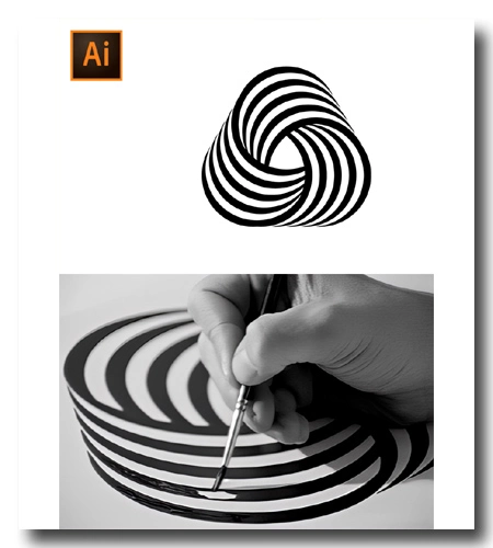
Panter Vision proposes a more advanced tutorial in English, but once again there is something different from the original shape:
Finally, inspired by my video on YT, Zhalgas Kassymkulov produced a new tutorial, which is worth mentioning because it’s the only one on the web that puts the triangle in the centre slightly rotated, as it was in the original one of 1964:
Last Updated on 20/06/2024 by Emiliano